Still working on street photos - C and C appreciated
Aug 29, 2013 11:28:37 #

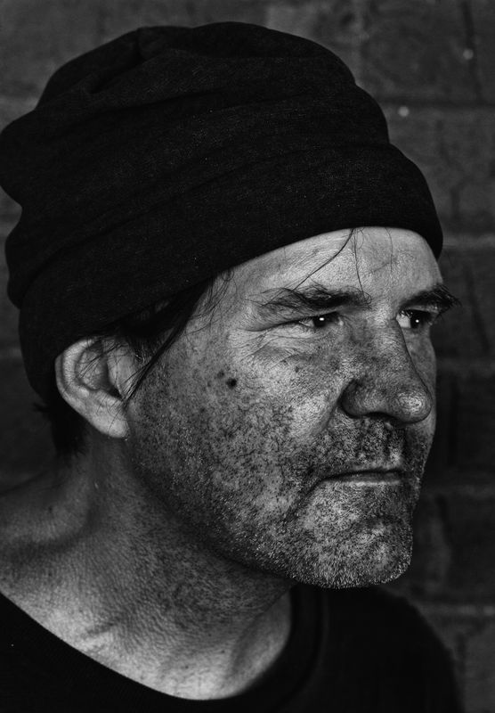
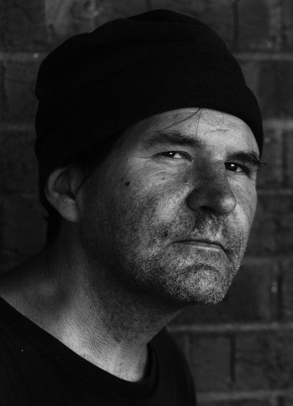
Here are a couple of street pics converted to black and white. I'm always looking to improve techniques so C and C always welcome.
Aug 29, 2013 11:48:35 #

gym wrote:
Here are a couple of street pics converted to black and white. I'm always looking to improve techniques so C and C always welcome.
I'm trying to learn more about street photography myself and liked your shots. I like the pensive pose in the first shot the best. You did a great job taking both shots but I think the gentleman portrays more negative emotion in the second shot. It is real life, though, so the gentleman probably has good reason to express those feelings. Thanks for sharing. I learned something.
Aug 29, 2013 12:22:11 #

Aug 29, 2013 19:47:36 #

Gym,
Your processing is pretty good.
Composition in 1 is problematic. Nose should typically not break or come close to breaking the plane of the cheek. (I have one example of an image that does break this rule ,but it is a very strong image!)
Light ring around the neck creates a secondary light focal point.
Catchlights look unnatural. They look non reflective but look like they are generating light.
Correcting these things in the future will improve your images.
It's more compositional than anything.
Typically you need more room out front on a nose in shot. (I break this rule too but it's more obvious here.)
Good luck and congrats on the shots!
Aug 29, 2013 19:55:28 #
PalePictures wrote:
Gym, br br Your processing is pretty good. br br... (show quote)
Thanks Russ. I'll work on the catch lights. I was trying to keep the nose and the eye from breaking the lateral plane, but as you said, the nose came very close. I'm still trying new things in PP, but have a very long way to go.
Aug 30, 2013 10:56:27 #

PalePictures wrote:
Gym, br br Your processing is pretty good. br br... (show quote)
I understand and agree with your comments except for the nose. Would appreciate further explanation. Thanks
Aug 30, 2013 11:10:20 #
PalePictures wrote:
Gym, br br Your processing is pretty good. br br... (show quote)
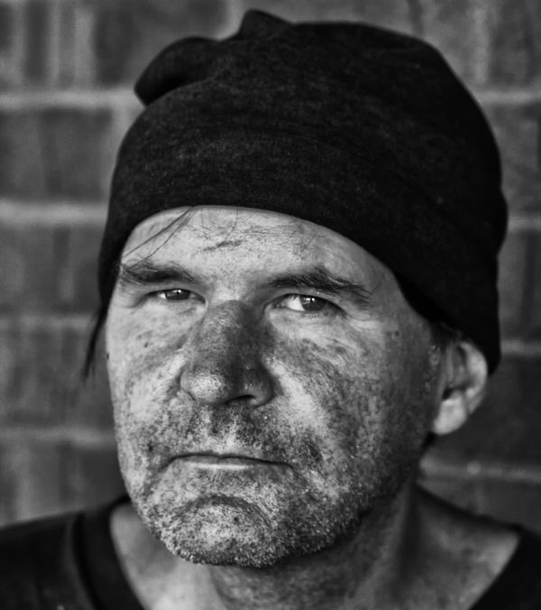
Here's another from the same shoot and this time I did not try to add to the catch lights. I just did minimal enhancing of the ones that were naturally there.
Aug 30, 2013 12:45:30 #
ecobin wrote:
I understand and agree with your comments except for the nose. Would appreciate further explanation. Thanks
It is generally considered not good practice to have the nose come close to or break the plane of the face. How far the turn of the head is relative to the camera is subjective. The idea is that it makes the nose look large especially on females. I use this rule on my street shots generally. I have included a link that states the rule.(See rule #16.) and gives an example.
http://desmond-downs.blogspot.com/2010/05/40-rules-of-portraiture.html
Aug 30, 2013 14:45:23 #

PalePictures wrote:
It is generally considered not good practice to have the nose come close to or break the plane of the face. How far the turn of the head is relative to the camera is subjective. The idea is that it makes the nose look large especially on females. I use this rule on my street shots generally. I have included a link that states the rule.(See rule #16.) and gives an example.
http://desmond-downs.blogspot.com/2010/05/40-rules-of-portraiture.html
http://desmond-downs.blogspot.com/2010/05/40-rules-of-portraiture.html
great article! thanks for the link.
Aug 30, 2013 21:50:47 #
PalePictures wrote:
It is generally considered not good practice to have the nose come close to or break the plane of the face. How far the turn of the head is relative to the camera is subjective. The idea is that it makes the nose look large especially on females. I use this rule on my street shots generally. I have included a link that states the rule.(See rule #16.) and gives an example.
http://desmond-downs.blogspot.com/2010/05/40-rules-of-portraiture.html
http://desmond-downs.blogspot.com/2010/05/40-rules-of-portraiture.html
Thanks very much.
Aug 30, 2013 21:50:48 #
PalePictures wrote:
It is generally considered not good practice to have the nose come close to or break the plane of the face. How far the turn of the head is relative to the camera is subjective. The idea is that it makes the nose look large especially on females. I use this rule on my street shots generally. I have included a link that states the rule.(See rule #16.) and gives an example.
http://desmond-downs.blogspot.com/2010/05/40-rules-of-portraiture.html
http://desmond-downs.blogspot.com/2010/05/40-rules-of-portraiture.html
Thanks very much.
If you want to reply, then register here. Registration is free and your account is created instantly, so you can post right away.