WPC 1333sc - (Speed Challenge) - Flowers ANALYSIS
Aug 24, 2013 01:29:46 #

arlar has graciously volunteered their WPC 1333sc - (Speed Challenge) - Flowers entry for critique and analysis to find out what they could have done to make it better. Be nice, but be honest as this will help everyone with their craft. Thank you arlar and thank you everyone!
from WPC 1333sc - (Speed Challenge) - Flowers RESULTS http://www.uglyhedgehog.com/photo_contest_ratings.jsp?pcnum=74
from WPC 1333sc - (Speed Challenge) - Flowers RESULTS http://www.uglyhedgehog.com/photo_contest_ratings.jsp?pcnum=74
canyon hike wildflower
Aug 24, 2013 02:18:43 #

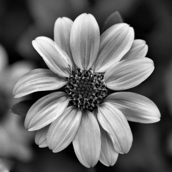
Lovely shot. The only distraction for me is the other flower behind it on the left. Even though it is only a portion of the flower and is blurred, it is still bright enough to draw my eye away from the main focus flower. Photoshop that out and the picture would be great.
Aug 24, 2013 07:22:37 #
arlar
Loc: Tennessee
Thank you. And yes, I think you're right about editing out the background flower. I'm going to have to give it a try!
Aug 24, 2013 14:10:57 #

St3v3M wrote:
arlar has graciously volunteered their WPC 1333sc - (Speed Challenge) - Flowers entry for critique and analysis to find out what they could have done to make it better. Be nice, but be honest as this will help everyone with their craft. Thank you arlar and thank you everyone!
from WPC 1333sc - (Speed Challenge) - Flowers RESULTS http://www.uglyhedgehog.com/photo_contest_ratings.jsp?pcnum=74
from WPC 1333sc - (Speed Challenge) - Flowers RESULTS http://www.uglyhedgehog.com/photo_contest_ratings.jsp?pcnum=74
I loved this one, and I did vote for it. Nice work :thumbup:
Aug 24, 2013 18:20:15 #
Aug 25, 2013 10:12:50 #

This has an almost-physical texture! I wonder if more mid-range separation of grays might have brought out the seeds.
Aug 25, 2013 11:44:39 #

must be my old eyes, (like to think my monitor!)... a "downloadable" image always looks better to me, so i may be missing something.
the flower on the left may make a difference, but i think i'd like to see more contrast - the whites whiter and the blacks blacker... my thought is the image would pop, sizzle and sparkle and the background thus fade away?
and yes the image is nice!
the flower on the left may make a difference, but i think i'd like to see more contrast - the whites whiter and the blacks blacker... my thought is the image would pop, sizzle and sparkle and the background thus fade away?
and yes the image is nice!
Aug 25, 2013 12:12:08 #
I don't think the blurred flower off to the left is a distraction. It gives the photo some depth and a contextual reference. (Very subjective preference) I do agree that the image could use a bit more contrast without blowing out the highlights. Also more detail may be revealed in the center of the flower by some careful dodging.
Aug 26, 2013 05:01:49 #
Flowers are colourful and attract attention (from insects, animals and humans). Having a monochrome image next to a coloured one makes it look less attractive and therefore has less chance of winning, all other things being equal.
For this image, at the taking stage, I would frame it so that the top and bottom petals are not pointing straight up and down, but more in a diagonal direction. You could still achieve that by rotating the image without cutting off the tips. The out-of-focus background flower can be a bit of a distraction that would split the judges. Another reason to lose points.
If the flower is actually white, it should be brighter and more white looking. And if it is not, it could do with a bit more contrast and lightness.
Nice, sharp and well framed image.
Aug 27, 2013 20:16:37 #
arlar
Loc: Tennessee
Thanks to all of you for your critiques and encouraging comments. I think I'll go back to my original and do another one...I'm just learning to use my editing software and haven't advanced too far yet. This will be a good exercise for me.
Sep 18, 2013 08:36:31 #
bsdml
Loc: Chicago il.
I agree I think it needs more contrast and that would make this photo seems bit sharper. To my old eyes it just doesn't appear to be tack sharp.
If you want to reply, then register here. Registration is free and your account is created instantly, so you can post right away.