WPC 1333 - Youth ANALYSIS
Aug 24, 2013 01:01:51 #

DebAnn has graciously volunteered their WPC 1333 - Youth RESULTS entry for critique and analysis to find out what they could have done to make it better. Be nice, but be honest as this will help everyone with their craft. Thank you DebAnn and thank you everyone!
from WPC 1333 - Youth RESULTS http://www.uglyhedgehog.com/photo_contest_ratings.jsp?pcnum=73
from WPC 1333 - Youth RESULTS http://www.uglyhedgehog.com/photo_contest_ratings.jsp?pcnum=73
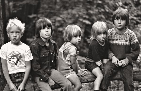
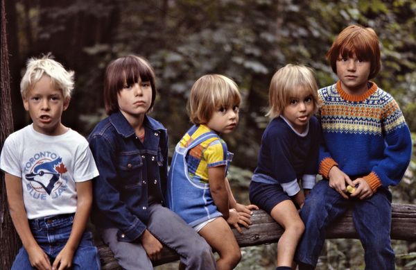
Cousins at the Cottage
Aug 24, 2013 11:01:30 #

It's hard to beat photos of kids not really posing, just sitting naturally. The only thing, in retrospect, I might have done differently is that the camera could have been held lower instead of looking down on the beautiful children.
Aug 24, 2013 13:25:21 #
lesdmd wrote:
It's hard to beat photos of kids not really posing, just sitting naturally. The only thing, in retrospect, I might have done differently is that the camera could have been held lower instead of looking down on the beautiful children.
Concur w/lesdmd. DOF appears to be dead-on. If you've ever viewed any b&w from Vivian Meier" http://www.vivianmaierprints.com/ you have captured the essence of what she did over a career of thousands of photos, slides, film, and negatives. Continue on the path you are on. I like what you did! (The tongue sticking out captures an unintended treasure in a photo that will prove precious!)
Aug 24, 2013 14:09:10 #

St3v3M wrote:
DebAnn has graciously volunteered their WPC 1333 - Youth RESULTS entry for critique and analysis to find out what they could have done to make it better. Be nice, but be honest as this will help everyone with their craft. Thank you DebAnn and thank you everyone!
I think you captured this perfectly DebAnn. I didn't notice it when I was voting, but I would have voted for it, had I seen it. Sometimes the photos with more in them don't stand out in the thumbnail view. With so many, it's hard to find time to download each one. Nice work though :thumbup:
Aug 25, 2013 08:17:53 #
Aug 25, 2013 10:18:00 #
I have to apologise, because just like Nightski I also missed your pic. Beautiful capture, maybe it is slightly out of focus but perhaps that gives it a soft look, which is possibly what you were after! Anyway which one is John-Boy Walton, LOL.
Aug 25, 2013 11:32:03 #

Thanks all for your comments. The original photo was shot on slide film and was definitely in focus - it has been blown up to large poster size very successfully. However, I don't remember which lens was used and it may have had a soft-focus filter on it. I like the effect nevertheless. Thanks again for commenting.
1066 wrote:
I have to apologise, because just like Nightski I also missed your pic. Beautiful capture, maybe it is slightly out of focus but perhaps that gives it a soft look, which is possibly what you were after! Anyway which one is John-Boy Walton, LOL.
Aug 25, 2013 16:35:21 #
DebAnn wrote:
Thanks all for your comments. The original photo was shot on slide film and was definitely in focus - it has been blown up to large poster size very successfully. However, I don't remember which lens was used and it may have had a soft-focus filter on it. I like the effect nevertheless. Thanks again for commenting.
Errr, you still haven't answered my question..."Which one is John-boy", oh, and is your surname Walton by any chance, LOL.
Aug 25, 2013 16:56:56 #
Not a John among them - that's Sam, Ben, Dan, Joe & Tom. How do you like the easy one-syllable names? We're not Waltons but we do have lots of kids in our family.
1066 wrote:
Errr, you still haven't answered my question..."Which one is John-boy", oh, and is your surname Walton by any chance, LOL.
Aug 25, 2013 18:28:52 #
DebAnn wrote:
pppNot a John among them - that's Sam, Ben, Dan, Joe & Tom. How do you like the easy one-syllable names? We're not Waltons but we do have lots of kids in our family.
Thanks for the info,my dad had 7 brothers and 5 sisters in his family, probably had something to do with having no TV in those days, lol.
Aug 26, 2013 06:00:03 #
Thats a nice image DebAnn in that you have captured their moods (playful, uninterested, uneasy). If this was a conversion from a colour slide, I feel that has a lot to do with the overall darkness and graininess of the image. The background, although out of focus, is not providing sufficient separation between the kids and the background. This has more to do with it being quite dark rather than not out of focus enough. The whitish leaves dotted about are also a distraction. I feel if you can reduce the darkness of the background it may look better. In Photoshop, the colour channel is a good feature to use instead of just desaturating the colour image. There is a selection of options that gives you a different B & W look with different coloured filters. As the kids are wearing different coloured clothes, you might not end up with the perfect conversion. You win some, you lose some.
The cropping of the image is also not quite perfect. You need a little bit more space on either side, especially the left side as the boy's sleeve is cut off. His fingers are also cut off.
The grouping of the kids work quite well except that the boy on the left has a white shirt on and his hair is pretty white too. This means that my attention is drawn to him at once and stays there too long. As a group picture, I would like to see them as a group first and then explore them individually, not the other way round. It would work better if he was standing in the middle of the group and behind the log, giving a triangular formation. His brightness will also be balanced by the darkness on both sides. What you will also have then is the 2 kids on the sides having their bodies turned inwards, keeping your attention within the group.
I know I have been picky, but that's how I analyse my own images for a competition. I give the judge NO reason to deduct points for the technical and compositional aspects of the image. My image should only fail on the basis that other entries are also technically perfect but has a better 'Wow' factor in the subject matter in the judge's eyes. In a club competition 2 months ago, I scored 10 out of 10 marks for 4 out of my 6 entries and still didn't win the image of the night! How is that for frustration. I know you can't change the grouping of the kids in the above image, but it is something to think about for next time.
Aug 26, 2013 18:05:41 #
Thanks for the feedback. I'm afraid this wasn't shot with any kind of plan or a photo contest in mind. A couple of kids were sitting on the log in a forest so I got the others to join them. It's really just a family picture which everyone loves because it captures the kids to a T. I scanned the slide on my Canoscan 4200F - there are no doubt better scanners out there - and I converted it to B&W to my liking. Some people like a lighter look. I've attached the colour version for comparison.
Chinaman wrote:
Thats a nice image DebAnn in that you have capture... (show quote)
Aug 26, 2013 18:16:46 #
DebAnn wrote:
Thanks for the feedback. I'm afraid this wasn't shot with any kind of plan or a photo contest in mind. A couple of kids were sitting on the log in a forest so I got the others to join them. It's really just a family picture which everyone loves because it captures the kids to a T. I scanned the slide on my Canoscan 4200F - there are no doubt better scanners out there - and I converted it to B&W to my liking. Some people like a lighter look. I've attached the colour version for comparison.
I love the b&w. It's a classic. After all is said and done, I still think this photo is one that will be cherished in your family for years. Great capture :thumbup:
Aug 26, 2013 18:51:29 #
Thank you Nightski. I appreciate your kind comments.
Nightski wrote:
I love the b&w. It's a classic. After all is said and done, I still think this photo is one that will be cherished in your family for years. Great capture :thumbup:
Aug 26, 2013 20:35:52 #

I personally like the color photo better. The B&W looks so dark, I think Chinamans comment about the backround is spot on. In the color photo the darker backround works for me.
If you want to reply, then register here. Registration is free and your account is created instantly, so you can post right away.