WPC 1331 - Still Life - Flowers ANALYSIS
Aug 9, 2013 23:32:20 #

JoeS has graciously volunteered their WPC 1331 - Still Life - Flowers RESULTS entry for critique and analysis to find out what they could have done to make it better. Be nice, but be honest as this will help everyone with their craft. Thank you JoeS and thank you everyone!
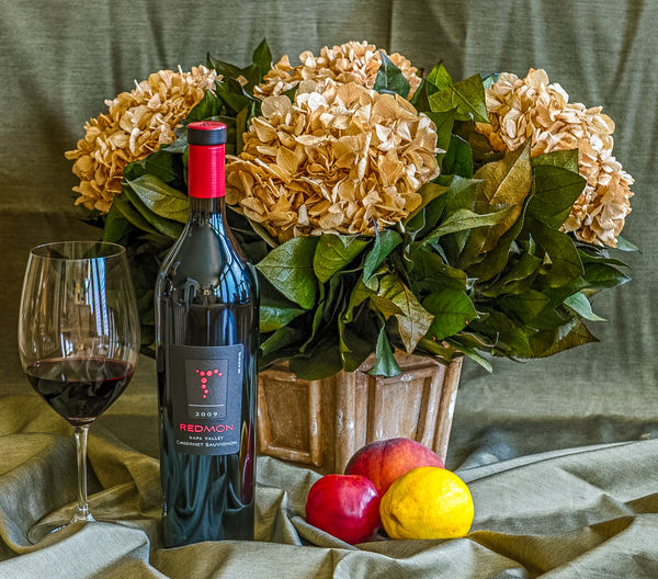
from WPC 1331 - Still Life - Flowers RESULTS http://www.uglyhedgehog.com/photo_contest.jsp?pcnum=71
from WPC 1331 - Still Life - Flowers RESULTS http://www.uglyhedgehog.com/photo_contest.jsp?pcnum=71
Wine Time!
Aug 10, 2013 03:54:12 #

To start with, the bottle should be OPEN since there is wine in the glass.
Oh! Photographically .... A bit lighter would be nice. As pleasant a grouping as it is I find the colour theme to be too green in the background. Mebby a contrasting colour? And a lemon with wine!!!
Beautiful shot though! 😇
Oh! Photographically .... A bit lighter would be nice. As pleasant a grouping as it is I find the colour theme to be too green in the background. Mebby a contrasting colour? And a lemon with wine!!!
Beautiful shot though! 😇
Aug 10, 2013 04:44:39 #

I don't do still life often but the whole image is a bit too sharp for me, especially the wrinkled drapes in the background. I'd move the table further out so the drapes are much softer/blurred. Also maybe a larger lens opening so the foreground is also softer so the sharpest part of the image is central around the flowers.
Aug 10, 2013 05:45:25 #

Crisp photo. Maybe an optical illusion, but the whole shot looks tilted ever so slightly to the right. Haven't done this type of photography yet, but posts like this are helping me learn. Thanks for sharing and volunteering for critique. Woodsy
Aug 10, 2013 06:14:38 #
St3v3M wrote:
JoeS has graciously volunteered their WPC 1331 - Still Life - Flowers RESULTS entry for critique and analysis to find out what they could have done to make it better. Be nice, but be honest as this will help everyone with their craft. Thank you JoeS and thank you everyone!
from WPC 1331 - Still Life - Flowers RESULTS http://www.uglyhedgehog.com/photo_contest.jsp?pcnum=71
from WPC 1331 - Still Life - Flowers RESULTS http://www.uglyhedgehog.com/photo_contest.jsp?pcnum=71
I don't do still life at all and as such probably should just shut up. But I like the shot - it's bright, colourful and sharp. Having said that there is too much vying for attention I think. Maybe it would benefit from some artistic lighting to create dark and light and to focus attention. Just a thought.
Aug 10, 2013 06:21:48 #
I'm not a flower person, and not into still life at all, so it's kind of child's eye view. But what I see is a bunch of dead or dyeing flowers, the brown foliage would make me keep on walking right past this one.
Aug 10, 2013 06:43:46 #
The theme is still life-flowers, but your main interest (as proven by the comments before me) is the wine bottle, glass and fruits. I agree with the sharp background needing to be less sharp and dying flowers (real or not) not being the best choice.
But as a still life of a tabletop arrangement, it is a good shot, but need a lighting more like 'infocus' has suggested but less dark. And I would give the left side a bit more space to have a better balance.
But as a still life of a tabletop arrangement, it is a good shot, but need a lighting more like 'infocus' has suggested but less dark. And I would give the left side a bit more space to have a better balance.
Aug 10, 2013 07:39:51 #

I know still life is staged and this image obviously meets the criteria. However, as others pointed out, the staging is too unrealistic for my taste. Not fond of the sharp, crisp feeling as it negatively affects the mood. That said, photographing still life is not easy and I applaud the effort that went into making this image.
Aug 10, 2013 09:15:03 #

When I saw the image first posted to the contest, I thought the reflections on the wine bottle and glass were really nice. I do like that part very much.
Ultimately, when all entries were in, this as still life seemed a bit "seen it before" with fruit and wine as part of the subject matter. Just not quite original enough for me.
Ultimately, when all entries were in, this as still life seemed a bit "seen it before" with fruit and wine as part of the subject matter. Just not quite original enough for me.
Aug 10, 2013 11:08:00 #
I agree with the comments regarding the sense of tilt to the right and the crispness of the background detail. In addition, I have a problem with the composition. To me, the image is overly weighted on the left. The neutrality of the colors in most of the photograph makes the eyes go to where the colors are...and they are mostly concentrated on the left. Also, the objects, wine bottle, glass, fruits, are all in a straight line. I would suggest recomposing the objects, including the flowers, keeping in mind where the artist wants the eyes to go. This is done with color (the brightest color draws the eye), sharpness (the eye goes to the sharpest edges) and contrast (where is there the greatest difference between dark and light). The elements are all in this photograph....and it is a good picture. It just needs some tweaks and rearranging. iMHO. Thanks for allowing us to make comments. That says a lot about you as an artist who's willing to take chances and learn.
Aug 10, 2013 11:12:45 #
My first reaction was that the flowers looked dead. Well, I guess that could be making a statement, but I had a negative reaction to it. Also, for whatever reason, the combination of flowers, wine and fruit seemed off, perhaps a bit busy. I didn't notice the unopened bottle, but GC is right. Very nice lighting on the bottle and glass. One last thing: the bottle, glass and fruit were all in the same plane. It might have been better if they were arranged to give more depth.
Aug 10, 2013 11:36:51 #
charryl wrote:
I agree with the comments regarding the sense of t... (show quote)
What clear and thoughtful critique! I never thought about the "all on one plane" as you and RMM mentioned. We all learn when one is willing to have a photo dissected :) So a big thank you to Joe for that!
Aug 10, 2013 13:23:43 #
Linda From Maine wrote:
What clear and thoughtful critique! I never thought about the "all on one plane" as you and RMM mentioned. We all learn when one is willing to have a photo dissected :) So a big thank you to Joe for that!
I second that. I've decided to try still life photography to keep me shooting during the long, cold New England winter. I've just gotten a great first lesson by reading these comments.
As a note to Joe, I was in the wine business for 40 years before retiring. I LOVE your focus on the wine. Open that beautiful bottle of wine and I'll join you for a drink. Thank you for sharing.
Aug 10, 2013 21:20:03 #

Woodsy wrote:
Crisp photo. Maybe an optical illusion, but the whole shot looks tilted ever so slightly to the right. Haven't done this type of photography yet, but posts like this are helping me learn. Thanks for sharing and volunteering for critique. Woodsy
Looks straight to me. I think the apparent tilt is the angled crea in the cloth on the right. Really nice shot, and not too dark for my personal taste
Aug 10, 2013 21:20:37 #
Murray wrote:
Looks straight to me. I think the apparent tilt is the angled crea in the cloth on the right. Really nice shot, and not too dark for my personal taste
Aargh . I meant "crease"
If you want to reply, then register here. Registration is free and your account is created instantly, so you can post right away.