HDR & Special Effects
Aug 8, 2013 11:13:46 #
dpanzenbeck
Loc: Long Island, NY
I am fairly new at HDR photography. In addition, I use CS5 and Perfect Effects to bring in other effects to my photos. I would certainly appreciate any feedback on the following pictures. Is the subject matter interesting? Do you have any suggestions on getting rid of the ghosting effects (color variations) of the HDR processing, especially the sky on the Autumn Drive photo. Please make your critique and or suggestions as frank as possible. Thanks
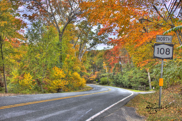
Autumn Drive, Coldspring Harbor, NY
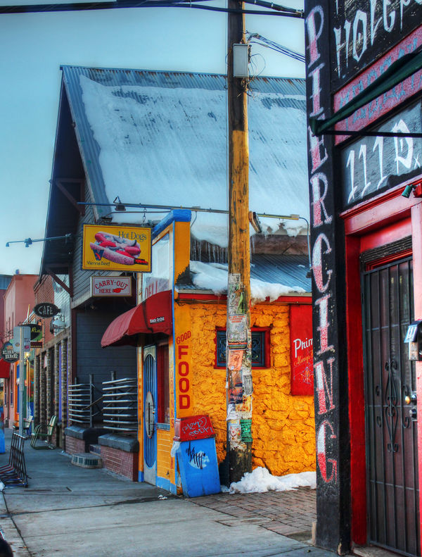
Winter in Flagstaff, AZ
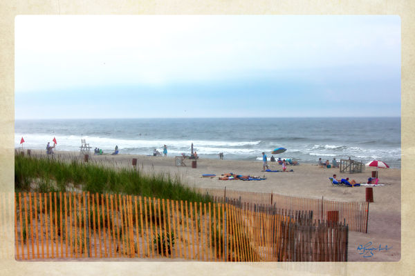
Robert Moses Beach, Long Island, NY
Aug 8, 2013 11:36:42 #
Aug 8, 2013 11:38:40 #

Aug 8, 2013 11:38:55 #
Aug 8, 2013 11:45:20 #
Dan. As frank as possible? OK.
1. The top pic borders on the cartoony, or flat, side of HDR. Increasing contrast would help a lot to make it more on the "photorealistic" side of HDR. In fact, I do not see the need for HDR techniques for this image, as it is not a high contrast subject. The utility lines do not add to the image and a higher POV would better show the curve in the road.
Hope this critique was constructive.
2. I rather like this very colorful image. The utility lines at the top are unfortunate and could be cloned out. I understand you wanted to keep the PIERCING letters on the building. Moving back a bit would possibly been a better POV and would include more of the sidewalk and buildings on the left.
3. Where do I start on this image? The horizon is crooked, there is no real subject, the fence is cut off in the composition, the overall composition is quite static, with the horizon dividing the image in two. Lowering the camera angle would include the complete fence and possibly some interesting foreground. But then again, there is no focus or apparent subject of interest in ths image.
Aug 8, 2013 12:09:51 #
Aug 9, 2013 05:44:19 #
Architect has said it all but to add, the top picture could be straightened.keep going,HDR can be good.
Aug 9, 2013 07:45:31 #
I actually like the third one best. It looks like a vintage, maybe hand colored, photograph. I remember having/using some photograph specific paints when I was much younger that gave results similar to what I see in this picture.
Aug 9, 2013 09:53:49 #
MOO = HRD is another tool in our art. Over use of the tool produces unusual images, true but proper use (a learned talent) enhances the image.
White I agree with Architect's CC - I feel the 1st part to learn is which subjects are best for the tool, and to what degree it can be used on that subject.
:thumbup: #1 :thumbup: :thumbup: #2 :| #3
White I agree with Architect's CC - I feel the 1st part to learn is which subjects are best for the tool, and to what degree it can be used on that subject.
:thumbup: #1 :thumbup: :thumbup: #2 :| #3
Aug 9, 2013 10:03:06 #
architect wrote:
Dan. As frank as possible? OK. br br 1. The top p... (show quote)
:thumbup: :thumbup: #1 needs a black point set for proper contrast.
Aug 9, 2013 14:54:42 #

DragonsLady wrote:
I actually like the third one best. It looks like a vintage, maybe hand colored, photograph. I remember having/using some photograph specific paints when I was much younger that gave results similar to what I see in this picture.
I agree. It looks like a vintage postcard. Very nice.
Aug 9, 2013 21:24:14 #
greymule wrote:
:thumbup: :thumbup: #1 needs a black point set for proper contrast.
Yes. Easily done using Levels.
Aug 9, 2013 21:28:02 #
DragonsLady wrote:
I actually like the third one best. It looks like a vintage, maybe hand colored, photograph. I remember having/using some photograph specific paints when I was much younger that gave results similar to what I see in this picture.
I agree it does have the hand colored look, if that is the aesthetic that means everything to you. But everything else I critiqued about the third image I stand by. It is not a good photograph by any standard, in my opinion.
If you want to reply, then register here. Registration is free and your account is created instantly, so you can post right away.