Your Opinion
Aug 6, 2013 15:32:37 #
Literati
Loc: South Carolina
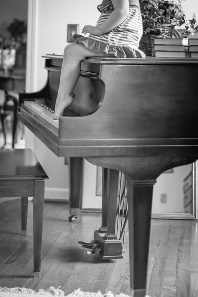
I had the opportunity of shooting a beautiful toddler. I have posted a few shots from two sets. I would be interested in your opinions of which edits work the best and why.


Aug 6, 2013 15:51:11 #

I like 1-st and last. I think B&W is not for such nice girl with blue ice and colorful dress.
Literati wrote:
I had the opportunity of shooting a beautiful toddler. I have posted a few shots from two sets. I would be interested in your opinions of which edits work the best and why.
Aug 6, 2013 16:02:23 #

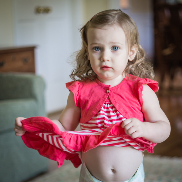
Lovely photos except #5, showing too much. I appreciate the B&W regardless. Number #3 is the best for me, her face Says it all!
Aug 6, 2013 16:27:31 #

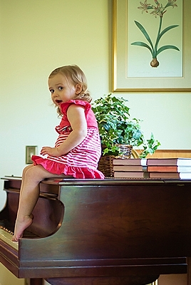
In my opinion, the dining room through the doorway detracts from the photo. I'd crop it out to the doorway. See attached photo.
Literati wrote:
I had the opportunity of shooting a beautiful toddler. I have posted a few shots from two sets. I would be interested in your opinions of which edits work the best and why.
Cropped shot
Aug 6, 2013 22:20:09 #
Aug 7, 2013 07:41:17 #
Aug 7, 2013 10:14:06 #

I agree, the dinning room is a distraction; but if you crop - than it gets too cropped. I like the close up pictures more, except for the one showing her diaper (not attractive). I do like the B&W ones, but as another mentioned then you miss those blue eyes. Overall you did a good job.
lnightng7 wrote:
In my opinion, the dining room through the doorway detracts from the photo. I'd crop it out to the doorway. See attached photo.
Aug 7, 2013 12:52:10 #

First & last for me too.
Literati wrote:
I had the opportunity of shooting a beautiful toddler. I have posted a few shots from two sets. I would be interested in your opinions of which edits work the best and why.
Aug 7, 2013 12:55:58 #
I really like one and six and the cropped shot is outstanding. really nice. Thanks for sharing.
Aug 7, 2013 13:18:29 #

lnightng7 wrote:
I like your crop, If it could be done the room thru the door way could be blurred or blocked, the crop could allow the girl to face into the photo. Great subject. I would redo it. DavidIn my opinion, the dining room through the doorway detracts from the photo. I'd crop it out to the doorway. See attached photo.

Aug 7, 2013 20:18:18 #
Literati
Loc: South Carolina
Thanks again for the input. I was working in a about a 11 x 13 foot room with bright window light to her back...had a hard time positioning myself and her...two year olds are a treat...just have to snap when I see the emotion.
Aug 7, 2013 20:34:49 #

She is adorable and the pics are nice. I agree with most..I love the cropped shot in either bnW or color. The first is a little distracting but she is a cutie.
Aug 8, 2013 01:07:28 #

Aug 8, 2013 08:55:09 #

I like the first and the last as well. I'm a huge fan of B&W, but as stated earlier, this one really needs color. In the last one, just clone out the bright spot above her head.
As for the first--yes the doorway is distracting. But simply cropping it out loses part of the piano. I would suggest cloning it out. Would be hard (for me) due to how the light is hitting the wall, but it could be done. If you go that route, take out the light switch as well.
Personally, I'd lose the plant and one stack of the books--perhaps even the framed picture on the floor.
Still...great images.
Aug 8, 2013 11:32:40 #

no b/w! the eyes and dress scream for color. legs and piano shot looks like a mistake. closeups are the best.
If you want to reply, then register here. Registration is free and your account is created instantly, so you can post right away.