WPC 1326 - Symmetry ANALYSIS
Jul 6, 2013 04:19:51 #

Tony R has graciously volunteered their WPC 1326 - Symmetry RESULTS entry for critique and analysis to find out what they could have done to make it better. Be nice, but be honest as this will help everyone with their craft. Thank you Tony R and thank you everyone!
from WPC 1326 - Symmetry RESULTS http://www.uglyhedgehog.com/photo_contest_ratings.jsp?pcnum=66
from WPC 1326 - Symmetry RESULTS http://www.uglyhedgehog.com/photo_contest_ratings.jsp?pcnum=66
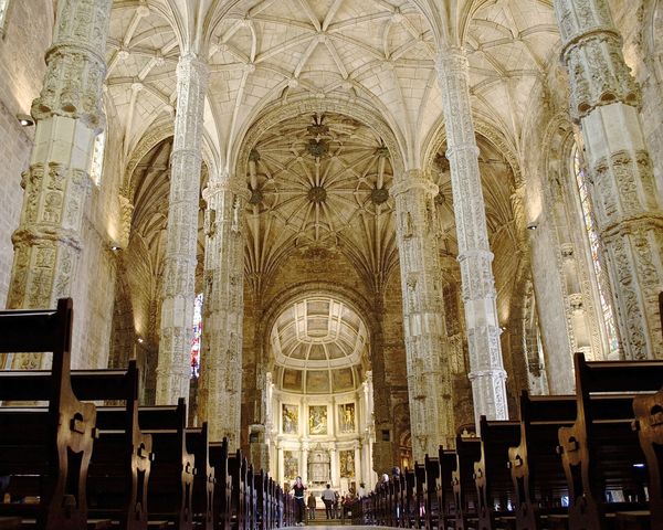
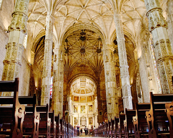
Down the Isle
Jul 6, 2013 04:29:51 #
fthomas
Loc: Philippines
An exceptionally well exposed shot considering the range.
To bring a greater sense to the theme "Symmetry" I simply would have raised the camera level a bit and shown more of the isle and converging line of pews with less ceiling. I beleive all of the other elements in the image would support this change in perspective and strenthened the feeling of symmetry.
To bring a greater sense to the theme "Symmetry" I simply would have raised the camera level a bit and shown more of the isle and converging line of pews with less ceiling. I beleive all of the other elements in the image would support this change in perspective and strenthened the feeling of symmetry.
Jul 6, 2013 06:00:26 #

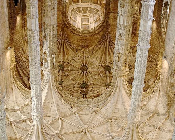
In abstract art the joke is that the artist becomes famous when his abstract is hung upside down and that elevated it to excellence. :shock: IMO the original has conflicting elements and the winner is the row of dark heavy uninteresting pews. 8-) :thumbdown:
Unfortunately, the true symmetry is in the beautiful dramatic upper areas that confuse the eye based on perspective and competition with the dark pews. So, to demonstrate this the photo was flipped and cropped. Note that there is a diagonal symmetry anchored by a circular center, button like, element. COMMENTS ARE WELCOME: :idea: :?:
Unfortunately, the true symmetry is in the beautiful dramatic upper areas that confuse the eye based on perspective and competition with the dark pews. So, to demonstrate this the photo was flipped and cropped. Note that there is a diagonal symmetry anchored by a circular center, button like, element. COMMENTS ARE WELCOME: :idea: :?:
FOCUS ON ARCHITECTURAL SYMMETRY
Jul 6, 2013 06:36:25 #
St3v3M wrote:
Tony R has graciously volunteered their WPC 1326 - Symmetry RESULTS entry for critique and analysis to find out what they could have done to make it better. Be nice, but be honest as this will help everyone with their craft. Thank you Tony R and thank you everyone!
from WPC 1326 - Symmetry RESULTS http://www.uglyhedgehog.com/photo_contest_ratings.jsp?pcnum=66
from WPC 1326 - Symmetry RESULTS http://www.uglyhedgehog.com/photo_contest_ratings.jsp?pcnum=66
As mentioned already, I think I would have raised the camera perspective a bit. I don't think that I would have turned the photo upside down. I understand the exercise in symmetry and it does work upside down; but that changes too much in my opinion. This is, after all, a church and while symmetry is the thematic goal, placing things on their head seems to be going to extreme lengths to achieve that thematic goal.
Jul 6, 2013 08:59:59 #
ebrunner stated in part: "This is, after all, a church"
From the architectural symmetry analytical standpoint it does not mater if it is a church or a brothel. As stated this is an approach to analysis of the thematic goal that is often used to analyze even photographic composition.
I fully agree with the prospective comments, definitely more elevated would be much better. In fact,I personally think the pews while in them selves symmetrical detract from the architectural elegance and should not be in the photo. The pews are dark and foreboding vs the uplifting emotion of the buildings structure.
ebrunner also said in part: "I understand the exercise in symmetry and it does work upside down; but that changes too much in my opinion." When Googling "turn painting upside down" there are many references. One I glanced at lists 5 reasons for flipping. Simply an analytical technique. I also suggest that were a lot of strong color is present that one should try a cracked glass or similar filter to analyze composition.
http://www.finearttips.com/2012/12/struggling-with-your-painting-turn-it-upside-down/
I fully agree for the finished product un-flipping is comfortable. In the case of this beautiful structure, perhaps the parishioners should walk into an open hall and stand in exaltation. To that end I offer to make things right-side-up.
INDEED A BEAUTIFUL STRUCTURE
Jul 6, 2013 09:13:02 #
This discussion is getting very interesting. I probably should not have made the comment: "it is, after all, a church". The implication here is that the fact that the structure being a church somehow changes the aesthetic. Certainly this is not the case. The point is symmetry. That in mind, I like your use of the upside down picture as an instrument for analysis. I also like the crop of the latest edit you posted. Good stuff, here and certainly food for thought.
Jul 6, 2013 10:16:11 #
ebrunner said in part: Good stuff, here and certainly food for thought. :thumbup:
The good stuff here is opinions and debate and learning. I certainly have learned a lot from UHH and it forces me to look up things and do a lot of reading. If it were not for you I would not have googled for information to see if I was right. Hummm, a thought, what would changing the color to bright red, or sad blue do for the photo..or even B/W? Personally I like the sandstone/marble combo look that it has. Also, what if those pews were light wood grain rather than the darkness that has nothing to do with the structure?
I learned the flip and squint technique from an art instructor when in college. Did I take art classes, heck no, I was a boring Chem student. The Chem dept was filled with dullards... but the art dept was a wild and woolie group... I was invited to audit one professors courses,, I assure you that the organic in figure drawing was much more interesting than the organic in the study of benzene rings.
Jul 6, 2013 12:43:00 #
Tony R
Loc: Westport, CT
Interesting insights. Funny how one looks at their own work so differently. Turn it upside down; what a great idea.
Jul 6, 2013 12:44:55 #
Tony R
Loc: Westport, CT
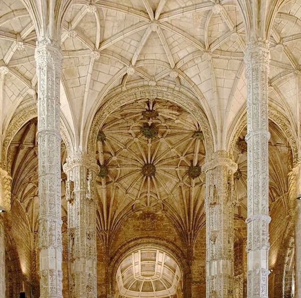
Actually, I did shoot one on that order but I wan't pleased with the number of people in the shot. Here it is for a look....

Jul 7, 2013 09:18:52 #
:thumbup: :thumbup: :thumbup: Image #1 Sym.
I actually prefer the sym of the shot containing people, 5 area's of sym,
People add life to static building.
I actually prefer the sym of the shot containing people, 5 area's of sym,
People add life to static building.
Jul 7, 2013 10:41:20 #

The pews seem to overly dominate the shot. Doing some dodging and burning, I tried to harmonize the shot while bringing out what I thought important, the architectural detail and scale (by bringing out the people).
Jul 7, 2013 11:39:39 #
Ditto. And moving the camera a bit to the right.
fthomas wrote:
An exceptionally well exposed shot considering the range.
To bring a greater sense to the theme "Symmetry" I simply would have raised the camera level a bit and shown more of the isle and converging line of pews with less ceiling. I beleive all of the other elements in the image would support this change in perspective and strenthened the feeling of symmetry.
To bring a greater sense to the theme "Symmetry" I simply would have raised the camera level a bit and shown more of the isle and converging line of pews with less ceiling. I beleive all of the other elements in the image would support this change in perspective and strenthened the feeling of symmetry.
Jul 7, 2013 12:57:18 #
David Popham
Loc: French Creek, British Columbia
This discussion is why I subscribe to the "Hog". I remember reading about turning an image upside down for an analysis, a long time ago, too long! I found the discussion really meaningful, a technique that I can use to examine my own work. Thank you all for such an informative debate.
Jul 7, 2013 13:44:25 #

dpullum wrote:
In abstract art the joke is that the artist become... (show quote)
I like your upside down and cropping. It gives it an, other worldly look and feel. I also agree the pews and people were a distraction.
Jul 7, 2013 13:45:26 #
Mr. B wrote:
Ditto. And moving the camera a bit to the right.
If we look at the support pillars to get the spacing correct moving the camera right will do the trick. Yep,Check the camera to the edge of the photo spacing... :idea: :?: :!:
If you want to reply, then register here. Registration is free and your account is created instantly, so you can post right away.