Too Corny For Fun Senior Picture??
Nov 25, 2011 00:53:42 #
Nov 25, 2011 03:04:11 #
turn book over. lol like the way the view wall of the fountin leads you around try that with her too. think it will make her stand out more. the concrete seems pronounced
Nov 25, 2011 10:44:15 #

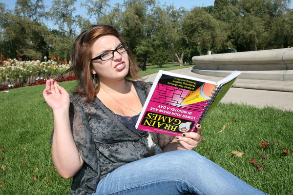
Presidential Material. It's way overexposed, but you may have been going for that look. Content-wise, A+.
Nov 25, 2011 10:47:36 #

Sherrie wrote:
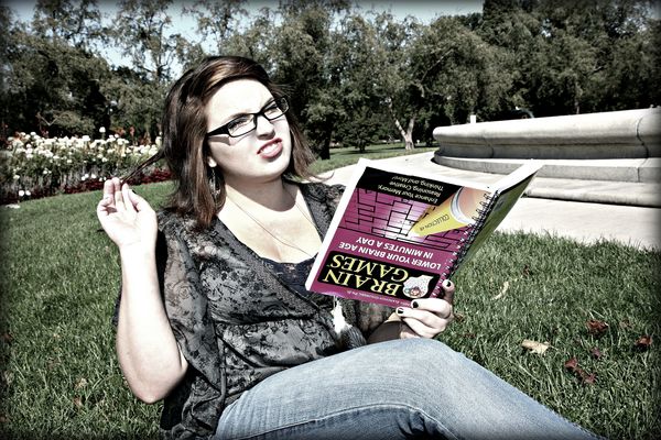
Tell me what you think.......
LOL great sense of humor... perfect for someone who was voted "Class Clown" or will be remembered for their twisted sense of humor!
For that reason... creativity and uniqueness ... I give it an A+
It's a little too contrast-y for me... is it HDR? If so, that would explain it....
But over all... I think it's really cool and definitely memorable *snickers*
Nov 25, 2011 11:02:06 #
JimH wrote:
Presidential Material. It's way overexposed, but you may have been going for that look. Content-wise, A+.
Trying to learn photoshop too....... I guess I will be learning how to not overdo things!!
Nov 25, 2011 11:03:04 #
tilde531 wrote:
LOL great sense of humor... perfect for someone who was voted "Class Clown" or will be remembered for their twisted sense of humor!
For that reason... creativity and uniqueness ... I give it an A+
It's a little too contrast-y for me... is it HDR? If so, that would explain it....
But over all... I think it's really cool and definitely memorable *snickers*
Sherrie wrote:
Tell me what you think.......
LOL great sense of humor... perfect for someone who was voted "Class Clown" or will be remembered for their twisted sense of humor!
For that reason... creativity and uniqueness ... I give it an A+
It's a little too contrast-y for me... is it HDR? If so, that would explain it....
But over all... I think it's really cool and definitely memorable *snickers*
Thanks Tilde.... I may try to photoshop it again and not go so crazy this time.lol
Nov 25, 2011 17:01:12 #
Sherrie wrote:
Trying to learn photoshop too....... I guess I will be learning how to not overdo things!!
See how her forehead is almost pure white? A little too much brightness slider.. ?JimH wrote:
Presidential Material. It's way overexposed, but you may have been going for that look. Content-wise, A+.
Trying to learn photoshop too....... I guess I will be learning how to not overdo things!!
Nov 25, 2011 19:24:48 #
JimH wrote:
Sherrie wrote:
Trying to learn photoshop too....... I guess I will be learning how to not overdo things!!
See how her forehead is almost pure white? A little too much brightness slider.. ?JimH wrote:
Presidential Material. It's way overexposed, but you may have been going for that look. Content-wise, A+.
Trying to learn photoshop too....... I guess I will be learning how to not overdo things!!
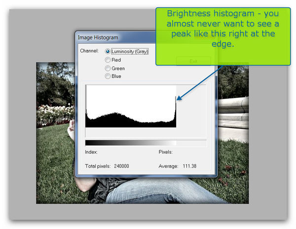
Thank you. Another thing I need to learn is how to read a histogram.
Nov 25, 2011 19:35:39 #

I am not sure exactly what you are looking for.
The idea behind the photo (upside-down book) is cute
the harsh shadows and over exposed skin is..yucky.
Also the leaves n the grass- rake it.
If I was taking this I would use a reflector for fill to reduce shadows
and increase my aperture to blur the background.
And not over process.
The idea behind the photo (upside-down book) is cute
the harsh shadows and over exposed skin is..yucky.
Also the leaves n the grass- rake it.
If I was taking this I would use a reflector for fill to reduce shadows
and increase my aperture to blur the background.
And not over process.
Nov 25, 2011 19:37:59 #
Nov 25, 2011 20:09:27 #
Sherrie wrote:
Tell me what you think.......
Okay.....so here is the unedited version
Nov 25, 2011 20:15:16 #
I really like the idea, there is so much you could do Post with it.
The unedited version is much better than you first go of editing. You just went to far.
The unedited version is much better than you first go of editing. You just went to far.
Nov 25, 2011 20:29:23 #

The first picture is better, because everything is off balance from the girl pulling hair and contorted expression to the book to the color shift.
To me this is what senior pictures should be like, fun, unexpected, AS LONG AS the client goes for it.
Don't change a thing, show both versions your client/model, she can select. My bet is toward the altered version. The original is 'flat' compared to what you did after. VERY good job and I am picky.
This one goes with the welder pictures, memorable.
Nov 25, 2011 20:31:39 #
JimH wrote:
You should write some tutorial on you page profile, you are good at it.
Nov 25, 2011 23:25:26 #
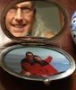
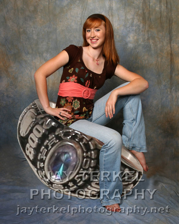
Would I want it? No, but the only thing that matters is does she like it. If that's her personality, and she likes it, that is all that matters.
Here's a corny senior image, but she loved it. (That's her ring that sh's sitting on)
If you want to reply, then register here. Registration is free and your account is created instantly, so you can post right away.