WPC 1324 - Flags of Our Fathers ANALYSIS
Jun 22, 2013 10:34:36 #

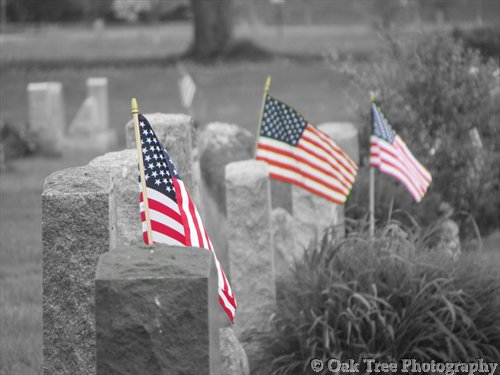
Ugly Jake has graciously volunteered their WPC 1324 - Flags of Our Fathers RESULTS entry for critique and analysis to find out what they could have done to make it better. Be nice, but be honest as this will help everyone with their craft. Thank you Ugly Jake and thank you everyone!
from WPC 1324 - Flags of Our Fathers RESULTS
from WPC 1324 - Flags of Our Fathers RESULTS
Red for the blood of patriots - blue for hearts that are true, white for the purity of the love of their families.
Jun 23, 2013 00:25:45 #

St3v3M wrote:
Ugly Jake has graciously volunteered their WPC 1324 - Flags of Our Fathers RESULTS entry for critique and analysis to find out what they could have done to make it better. Be nice, but be honest as this will help everyone with their craft. Thank you Ugly Jake and thank you everyone!
from WPC 1324 - Flags of Our Fathers RESULTS
from WPC 1324 - Flags of Our Fathers RESULTS
First, I would attempt to get all three flags in focus-- the first flag is obscured by the foreground gravestone. Since the subject is flags, they should be more prominent.
Second, I'm no fan of selective coloration-- I feel this would be a stronger image in monochrome only.
Third, I would increase the contrast.
Hope this helps.
Jun 23, 2013 08:37:25 #

LoneRangeFinder wrote:
First, I would attempt to get all three flags in focus-- the first flag is obscured by the foreground gravestone. Since the subject is flags, they should be more prominent.
Second, I'm no fan of selective coloration-- I feel this would be a stronger image in monochrome only.
Third, I would increase the contrast.
Hope this helps.
Second, I'm no fan of selective coloration-- I feel this would be a stronger image in monochrome only.
Third, I would increase the contrast.
Hope this helps.
I agree with this analysis. Also, your concept shows you gave the composition some thought before you hit the shutter. This practice will increase your artistic skill above all other techniques. Thanks for allowing us to give you some feedback.
Jun 23, 2013 17:53:33 #
I also think that it would be a great improvement for all three flags to be in sharp focus and to have them in equal contrast as well. The fact that flags 2 & 3 or quite fuzzy appears to distract from the theme. Maybe if the focal point was the headstone between flags 1 & 2 it would sharpen up the main points of focus. One further point is that the figure in white is another distraction, unless it is meant to be a ghostly figure watching over the graves.
But it certainly is a photo that makes one think about the sacrifices made by the heroes resting there, well done.
But it certainly is a photo that makes one think about the sacrifices made by the heroes resting there, well done.
Jun 23, 2013 22:55:41 #
I disagree with the above analysis. You have a particular subject and it is in perfect focus. If the other two flags were in focus then it would have taken away from the main theme of that flag. I like selective coloring especially when done well as this picture shows. The only thing I would have done differently is to move in closer and try to get rid of the tree in the background. Good job and well done. Keep shooting.
Jun 25, 2013 01:38:37 #
Subject intent is great, I would have shot all three flags from more of a front view with all three flying, and all three in focus. Thank you for posting and listing to our comments.
Jun 25, 2013 14:03:27 #

If you wanted only the front flag in sharp focus, I may have made a short depth of field more pronounced so the other flags were less focused. I also agree with the need for a bit more contrast as well as the slightly tighter cropping to remove the tree. I'm OK with the selective color, sometimes it is distracting, but in the case of the US flag, it think it works well.
Sep 26, 2013 17:32:21 #

I was surprised I liked this so much because I'm not usually a fan of selective coloration. In this case, I think it adds to the story. The largest flag is in focus. That's enough for me. I would have cloned out the fourth flag which is in b&w. It's too small to colorize well, and it's a little distracting once you notice it.
Sep 27, 2013 16:47:19 #

First let me say I like the concept, but the composition needs work.
1)The secondary subject is distracting the main subject,
(step back and get the whole headstone and flag as the main subject)
2)Ditch the left side.
(try vertical get more of the tree.)
3) Depth of field
(make it as short as possible)
4)The selective color works
(maybe tone it down a little)
5)contrast
(more would help)
My two cents. 8-)
If you want to reply, then register here. Registration is free and your account is created instantly, so you can post right away.