Abstract Macro shots
Jun 18, 2013 06:41:17 #
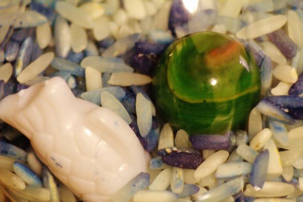
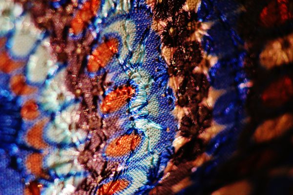
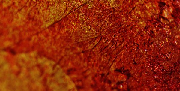
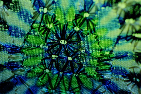
I notice there are mostly photographs of little crawly things and flowered things in this forum but last night I brought out my new extension tubes and my artistic side. Made these.
Jun 18, 2013 07:55:52 #
I really like the gradation of colors in number 2. For number one, I would burn the rice (?) a tiny bit, dodge up ever so slightly the marble and carving. and boost the saturation of the marble a bit.
I think I sound a bit picky, but I just finished up a class on photography printing and those would be the changes I would make to get a better output for printing.
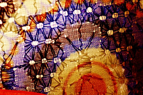
I think you did an excellent job of getting the fine detail of the fabric out.
I think I sound a bit picky, but I just finished up a class on photography printing and those would be the changes I would make to get a better output for printing.
I think you did an excellent job of getting the fine detail of the fabric out.
Jun 18, 2013 08:10:27 #
xxMeanKittyxx wrote:
Thanks for your input, I will try to put it to use.I really like the gradation of colors in number 2. For number one, I would burn the rice (?) a tiny bit, dodge up ever so slightly the marble and carving. and boost the saturation of the marble a bit.
I think I sound a bit picky, but I just finished up a class on photography printing and those would be the changes I would make to get a better output for printing.
I think you did an excellent job of getting the fine detail of the fabric out.
I think I sound a bit picky, but I just finished up a class on photography printing and those would be the changes I would make to get a better output for printing.
I think you did an excellent job of getting the fine detail of the fabric out.
Jun 19, 2013 06:30:49 #

Jun 19, 2013 07:26:26 #
sford122 wrote:
Very artistic. I like them a lot.
Thanks, that's what I was going for. I like the little critter macro but trying to expand my use of macro.
Jun 19, 2013 13:19:18 #
If you want to reply, then register here. Registration is free and your account is created instantly, so you can post right away.