WPC 1323 - Pets ANALYSIS
Jun 14, 2013 23:21:40 #

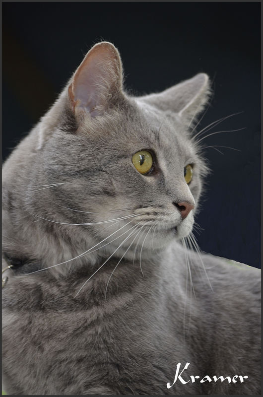
Susyseek2 has graciously volunteered their WPC 1323 - Pets entry for critique and analysis to find out what they could have done to make it better. Be nice, but be honest as this will help everyone with their craft. Thank you Susyseek2 and thank you everyone!
from WPC 1323 - Pets RESULTS http://www.uglyhedgehog.com/photo_contest_ratings.jsp?pcnum=63
from WPC 1323 - Pets RESULTS http://www.uglyhedgehog.com/photo_contest_ratings.jsp?pcnum=63
My old buddy Kramer...he used to live on my back deck until I found him a forever home. Miss him, but I know he has a loving home.
Jun 15, 2013 05:21:07 #

hi there's nothing wrong that I see in your portrait shot.I love it it reminds me of my Sweep, also grey and white , also departed.
There where just so many shots of the same type, I wanted the wow one that doesn't come up very often, and voted on the winner.
Don
There where just so many shots of the same type, I wanted the wow one that doesn't come up very often, and voted on the winner.
Don
Jun 15, 2013 07:47:10 #

This isn't a bad photo by any means, but a couple of things could help. First, the focus is soft, especially the eyes, and those ase are critical to give impact to a photo.
The position of the cat's head isn't bad either, but you're a bit too far into profile to really grab a viewer. The cat is looking too far out of the frame to be interesting. Try to get them looking at something in your hand or only slightly off-camera, if not straight into the camera.
If you use a profile view like this, a little more empty space for the cat to look into is also more pleasing to the eye. It adds a little more balance to a photo.
Jun 15, 2013 09:11:08 #

As the owner of the pet I would be thrilled to have this image. As a viewer, not so much. Stacked up against so many wonderful "story" images in this contest, I think just a nice portrait got lost. Also, I agree that more space for the subject to look into would improve this image but I do really like the expression you captured. Thanks for allowing members to comment.
Jun 15, 2013 11:34:59 #

I like it a lot. Only thing I would change is the place where the body at right meets the black background. Perhaps the photographer tried to clone out something in the background - not sure - but the transition could have been better.
However, all-in-all I think it's a good shot.
However, all-in-all I think it's a good shot.
Jun 15, 2013 12:54:00 #

DebAnn wrote:
I like it a lot. Only thing I would change is the place where the body at right meets the black background. Perhaps the photographer tried to clone out something in the background - not sure - but the transition could have been better.
However, all-in-all I think it's a good shot.
However, all-in-all I think it's a good shot.
I agree. The kitties back looks like it's been clones or cut out with an exacto knife.
I didn't look at the image that won the contest but I imagine it was chosen for many reasons beyond just being a favorite pet and good portrait. To win a contest you must look through the eyes of one of the judges.
Jun 15, 2013 13:00:55 #
Jun 15, 2013 21:43:54 #
David Popham
Loc: French Creek, British Columbia
For the responders who provided a critique: thanks so much, because I simply had no idea what to look for. You all have given me a lesson on what to look for and how to provide a remedy.
Jun 15, 2013 22:28:07 #
Thank you all for responding to the analysis and critique for this photo. I understand what you were looking at on Kramer's back. Actually I had fixed that, I used the healing brush to remove something that was on the photo, and I downloaded the wrong photo after fixing it. When I realized what I had done, it was too late to download the right one. Thank you for taking the time to respond and for your comments. It helps to know what to look for in a photo to enter in the contests.
Jun 15, 2013 22:39:05 #
it's not even my photo, but i sure learned a lot from you guys giving advice. i sure do appreciate all the gracious advice you all give.
St3v3M wrote:
Susyseek2 has graciously volunteered their WPC 1323 - Pets entry for critique and analysis to find out what they could have done to make it better. Be nice, but be honest as this will help everyone with their craft. Thank you Susyseek2 and thank you everyone!
from WPC 1323 - Pets RESULTS http://www.uglyhedgehog.com/photo_contest_ratings.jsp?pcnum=63
from WPC 1323 - Pets RESULTS http://www.uglyhedgehog.com/photo_contest_ratings.jsp?pcnum=63
Jun 16, 2013 03:03:14 #
Jun 23, 2013 01:11:11 #

St3v3M wrote:
Susyseek2 has graciously volunteered their WPC 1323 - Pets entry for critique and analysis to find out what they could have done to make it better. Be nice, but be honest as this will help everyone with their craft. Thank you Susyseek2 and thank you everyone!
from WPC 1323 - Pets RESULTS http://www.uglyhedgehog.com/photo_contest_ratings.jsp?pcnum=63
from WPC 1323 - Pets RESULTS http://www.uglyhedgehog.com/photo_contest_ratings.jsp?pcnum=63
Nice photo of a pretty cat.
Two comments:
There should be a little bit more space for the direction the cat is looking.
Love to see the other eye as well. The same rules of portraiture apply to animals. If possible, a bit less of the profile-- the nose (generally) should not break the plane of the face-- unless it's a full on profile shot emphasizing that feature.
If you want to reply, then register here. Registration is free and your account is created instantly, so you can post right away.