Check out Astronomical Photography Forum section of our forum.
Looking for advise and input
Nov 19, 2011 00:27:10 #
1gypso03
Loc: Apple Valley, Ca.
I have been taking photo's for about 2 years, and am just now finding this forum. Love the idea of learning through other's thought's.


Nov 19, 2011 00:45:42 #
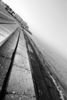
The second image is the only one worth critiquing ..i like it even though it is exposed wrong (overexposed) and pp badly. Good idea and overall composition, but nothing else. However, i still find more good than bad here. The other two have too many problems to discuss without sounding mean.
Nov 19, 2011 00:58:02 #

the first one doesn't do much for me. nice perspective, but not much exciting there. the second definitely has promise... would look better in plain b&w, i think, and perhaps a bit darker to give it a moodier feel. the last one suffers mainly from being too centered and having a blown-out sky. the 'busy' trees in the background don't help either. try to avoid having the subject dead-center in your frame. a bit off to one side or the other would help, as would shooting this on a day with either some blue sky, or at least darker, more dramatic clouds that don't blow out on you.
Check out Landscape Photography section of our forum.
Nov 19, 2011 01:00:08 #
1gypso03
Loc: Apple Valley, Ca.
Well I suppose for me" mean" is just constructive criticism. And what is "pp"? Just because I like a photo does not mean it is a "good" photo. That is why I ask, I have never shared my photo's with the public before. Love to hear what anyone has to say. Thank you for your input!
Nov 19, 2011 01:03:02 #
1gypso03
Loc: Apple Valley, Ca.
Thank you, so very helpful!! I'll try b/w with the sephia photo. I see what you mean about the sky and tree's in the cabin photo, funny the original was off to one side.

Nov 19, 2011 01:10:14 #
I'd also like to see the second one in stark black and white with a little increased contrast. It's a very cool place. And I actually really like the third one. It's a charming little building (except for the blown out sky). If I saw that, I would shoot it dead center, hope there were clouds behind it, and use a wide angle close up. Then I would shoot the heck out of it closer up in a series of "still lifes" (or would that be "lives"?) Good luck!
Nov 19, 2011 01:13:03 #
Yes! Like that! It's good that we all have different viewpoint, isn't it? That's the super fun part about photography. :)
Nov 19, 2011 01:15:08 #
1gypso03
Loc: Apple Valley, Ca.
Thank for the advice. I'll keep that in mind when I do another building. To bad it was a overcast sky instead of clouds.
Nov 19, 2011 01:16:05 #
Nov 19, 2011 01:17:40 #
Nov 19, 2011 01:24:46 #
Check out Traditional Street and Architectural Photography section of our forum.
Nov 19, 2011 01:25:06 #
loveschild33
Loc: Baton Rouge
I would advise you to be aware of your lines. The second picture looks drastically better in black and white, but it is not quite level. It needs to be rotated slightly counterclockwise. I like to use visual cues within my photograph to level the entire image (horizon lines, doorways, etc.) The first photo is a good subject, but for a perspective shot, it might look more interesting if you were closer to the train looking down its path. That looks like a fun venue to photograph!
Nov 19, 2011 01:31:51 #
1gypso03
Loc: Apple Valley, Ca.
It was a fun place to photograph. I will keep my lines in mind next time. Thank you!
Nov 19, 2011 01:37:49 #

Nov 19, 2011 01:38:38 #
1gypso03 wrote:
Like this?
still a tad tilted to the right... but you have the lighting perfect! i took the liberty of straightening it a bit more... 1.5 degrees to the left. doesn't seem like much, but it's surprising what a difference it can make... you'll get the hang of it after you've practiced a bit.

If you want to reply, then register here. Registration is free and your account is created instantly, so you can post right away.
Check out Digital Artistry section of our forum.