Check out The Pampered Pets Corner section of our forum.
Traditional Portraits
May 12, 2013 22:12:13 #

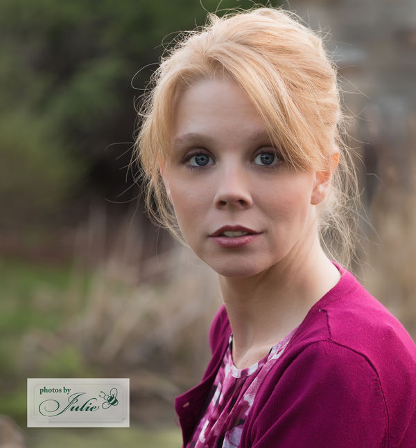
So... after the attempt at non-traditional portraits, here is my most recent work with a future model. All suggestions and comments are welcome. Thank you in advance for looking.


May 12, 2013 22:34:35 #
Julieb wrote:
So... after the attempt at non-traditional portraits, here is my most recent work with a future model. All suggestions and comments are welcome. Thank you in advance for looking.
Not a thing wrong with the subject or the pics.
:)
May 12, 2013 23:43:09 #
You made my evening better. Thank you! I appreciate your feedback.
Jblanke wrote:
Not a thing wrong with the subject or the pics.
:)
:)
May 13, 2013 02:41:10 #

May 13, 2013 11:13:08 #
JR1 wrote:
Yes, give her my name address and marriage proposal
I second that commotion!!
May 13, 2013 11:53:06 #
Julie, I've been to your website and like your work. Here are some strictly layman observations on these three.
#1 and #3: I don't favor a lot of touchup, but these would benefit from slight skin smoothing, especially her forehead.
#1: I like the pose. Whatever is behind the top of her head is a little distracting.
#2: Would have been better in shade or during golden hours, maybe with some fill flash. The bright sun on her forearm and jacket distract from a pretty face. The foot looks unnatural and the flip flop cheapens the shot. I like it better cropped above her foot.
#3: My favorite. Very pretty girl, but I've been married too many times already. ;)
May 13, 2013 19:23:31 #

Check out Drone Video and Photography Forum section of our forum.
May 13, 2013 19:31:18 #

Your photos are very nice, you did a very good job!!
Michael :D :D :thumbup: :thumbup:
Michael :D :D :thumbup: :thumbup:
May 13, 2013 20:27:42 #
Excellent suggestions thank you.
OddJobber wrote:
Julie, I've been to your website and like your wor... (show quote)
May 13, 2013 20:28:16 #
:) Thank you.
moriti wrote:
Your photos are very nice, you did a very good job!!
Michael :D :D :thumbup: :thumbup:
Michael :D :D :thumbup: :thumbup:
May 13, 2013 20:28:38 #
Check out Sports Photography section of our forum.
May 14, 2013 00:37:22 #

May 14, 2013 02:28:11 #
Sorry I am no longer watching this post, that smile, those eyes, dddrrroooooollllll, what a doll
Can't concentrate
Post deleted
Can't concentrate
Post deleted
May 14, 2013 08:21:05 #
Thank you. It is easier when the model is attractive.
sailorsmom wrote:
Good job Julie!
May 14, 2013 08:42:48 #

Ok...to start with...these are pretty good so don't think that I'm dumping on you...but here is what I see:
Image #1:
The background is SLIGHTLY distracting with the dark/light line running through her head. It would have been better to pick one single color to blur.
Her head is tilted too much for me...not sure if that's a personal thing.
Her jawline...nice and tight...very good. :)
Image #2:
Her face is less exposed than just about everything else in the shot...the background, her arm, her clothes. Better to use a reflector to get more exposure into her face.
Also, her eye sockets...same thing..they are dark.
Catchlights...there are none. Same thing...needs fill or a reflector.
Image #3:
Nice....but her eye sockets are a slight bit "racooned"...a bit of fill card or fill flash would have improved this. Also...that would have helped to create catchlights (or better ones)
The reason I'm being so critical is that these are very good and they just need a few small things...so I'm being critical and noticing everything.
If you want to reply, then register here. Registration is free and your account is created instantly, so you can post right away.
Check out Underwater Photography Forum section of our forum.