Which photo appeals more?
May 7, 2013 14:36:38 #

Hi Peeps
Please could you lovely people tell me which of these photos appeals more. I mean the actual photo, not the subject :)
Thanks in advance!
Please could you lovely people tell me which of these photos appeals more. I mean the actual photo, not the subject :)
Thanks in advance!


May 7, 2013 14:40:17 #

May 7, 2013 14:52:44 #

Nummy wrote:
Hi Peeps
Please could you lovely people tell me which of these photos appeals more. I mean the actual photo, not the subject :)
Thanks in advance!
Please could you lovely people tell me which of these photos appeals more. I mean the actual photo, not the subject :)
Thanks in advance!
No 2 and 4, plain and simple against a black blackground
May 7, 2013 14:54:59 #
May 7, 2013 14:56:40 #

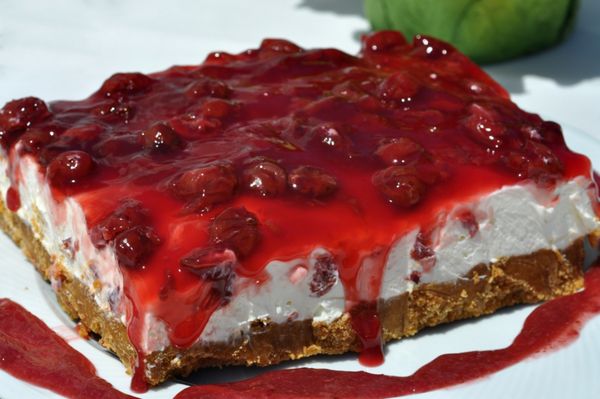
Purely on a photographic and commercial basis, No 3 has the best definition and reality factor. very well done.
Nummy wrote:
Hi Peeps
Please could you lovely people tell me which of these photos appeals more. I mean the actual photo, not the subject :)
Thanks in advance!
Please could you lovely people tell me which of these photos appeals more. I mean the actual photo, not the subject :)
Thanks in advance!
May 7, 2013 14:57:01 #
May 7, 2013 14:57:10 #

The first is OOF, don't like food floating in air, so that leaves 3 which is technically good
May 7, 2013 15:00:53 #

GWR100 wrote:
Purely on a photographic and commercial basis, No 3 has the best definition and reality factor. very well done.
For me, no. 3 is the one. Looks natural and good 3 dimension feel. Got to go. I'm hungry!
May 7, 2013 15:03:17 #
May 7, 2013 15:03:52 #
bigmac115100
Loc: Florida
#2 & 4 although technically good appeal the least to me because they seem to be floating in a sea of black.
May 7, 2013 15:04:15 #
Nummy wrote:
Hi Peeps
Please could you lovely people tell me which of these photos appeals more. I mean the actual photo, not the subject :)
Thanks in advance!
Please could you lovely people tell me which of these photos appeals more. I mean the actual photo, not the subject :)
Thanks in advance!
I like #3 the best. the one's on a black background appear to be floating, they need to have some sort of anchor ei on a table with a shadow....
May 7, 2013 15:12:29 #

Nummy wrote:
Hi Peeps
Please could you lovely people tell me which of these photos appeals more. I mean the actual photo, not the subject :)
Thanks in advance!
Please could you lovely people tell me which of these photos appeals more. I mean the actual photo, not the subject :)
Thanks in advance!
Number2 is my choice........but also a difficult choice
Brenda
May 7, 2013 15:17:24 #
Nummy wrote:
Hi Peeps
Please could you lovely people tell me which of these photos appeals more. I mean the actual photo, not the subject :)
Thanks in advance!
Please could you lovely people tell me which of these photos appeals more. I mean the actual photo, not the subject :)
Thanks in advance!
Why?
May 7, 2013 15:21:16 #

Nummy wrote:
Hi Peeps
Please could you lovely people tell me which of these photos appeals more. I mean the actual photo, not the subject :)
Thanks in advance!
Please could you lovely people tell me which of these photos appeals more. I mean the actual photo, not the subject :)
Thanks in advance!
I like number 4 the best, simple, black background makes the subject stand out.
May 7, 2013 15:29:49 #
Karl P
Loc: Leigh NW UK
Nummy wrote:
Hi Peeps
Please could you lovely people tell me which of these photos appeals more. I mean the actual photo, not the subject :)
Thanks in advance!
Please could you lovely people tell me which of these photos appeals more. I mean the actual photo, not the subject :)
Thanks in advance!
Hi Nummy
Number 3 for me - looks delicous
number 1 is too distracting with the colour of the flower pulling away from teh subject
the two with black backgrounds look like the subject is flaoting - doesnt seem to have a definition of base
that is just my personal view and not based on technical knowledge
Thanks
Karl
If you want to reply, then register here. Registration is free and your account is created instantly, so you can post right away.