Please critique black and white
Apr 30, 2013 15:08:00 #
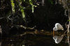
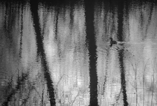
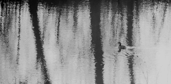
Here is a black and white I have been working on. Please let me know what I should change or do differently to improve it.
Apr 30, 2013 15:18:24 #
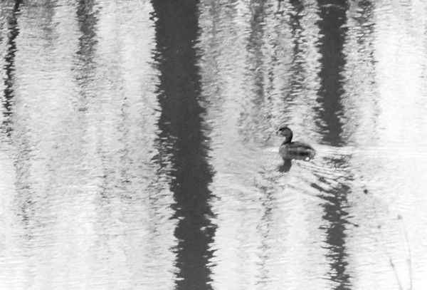
I might crop it in 16 / 9 format ( as the bottom part does not provide any more info ) and try to bring more details out of the duck.
Apr 30, 2013 15:23:35 #
tk wrote:
Here is a black and white I have been working on. Please let me know what I should change or do differently to improve it.
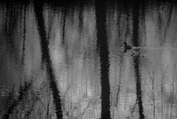
Crop and Shadow/highlight on that one

Apr 30, 2013 15:30:56 #

I like what Turbos done to it tk but to be honest i'd like to see the original,this looks a bit dark for me.Hope your not offended.
Apr 30, 2013 15:32:48 #

Apr 30, 2013 15:43:21 #
tk wrote:
Here is a black and white I have been working on. Please let me know what I should change or do differently to improve it.
The histogram shows clear signs that you have made adjustments to the tonality of the image. (I trust that these went in the right direction.)
As the image now stands, the shadow levels, although they just manage to register in the digital file, are too low to be separated by the monitor. They are showing at just tone 1 and I suggest that they should be raised to about 16.
The highlights are far too dark, registering at 196, and I would raise them to 250.
Finally an S curve, pushing up the 200 input about 5 points, and dropping the 20 input very slighly will give a small increase in contrast across the main tonality range and give the image a bit more impact.
All adjustments made using Curves.
GHK
Apr 30, 2013 15:57:25 #
Here is the original. Only thing done was cropping and changed in LR4 to B&W.
Wow, thanks for all the great responses! Really appreciate it. I'll let you folks critique this and then we'll go from there.
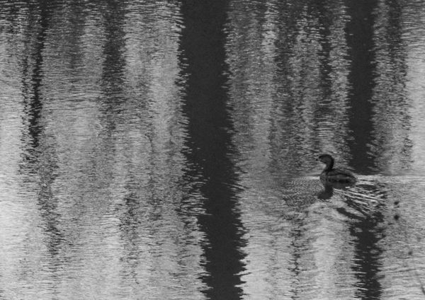
I like the suggestions. Last adjustment came out a lot better.
Wow, thanks for all the great responses! Really appreciate it. I'll let you folks critique this and then we'll go from there.
I like the suggestions. Last adjustment came out a lot better.
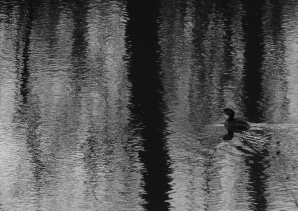
With more in the shadow/highlight critique.
Apr 30, 2013 16:03:52 #
GHK wrote:
The histogram shows clear signs that you have made... (show quote)
Really like your changes. Hope I can duplicate them.
Apr 30, 2013 16:07:37 #
Apr 30, 2013 16:07:58 #
That looks better tk,it's not as busy at the bottom of the photo, it makes me think of dusk.
Apr 30, 2013 16:09:08 #
Turbo wrote:
There you go ! curves, exposure, shadows/highlights are very useful tools
Thank you! There's the ol' UHH giving great pointers! Very much appreciate your time and trouble to help me!
Apr 30, 2013 16:09:48 #
angler wrote:
That looks better tk,it's not as busy at the bottom of the photo, it makes me think of dusk.
Thank you Angler! Always appreciate your help! Wouldn't be here without great people giving great advice!
Apr 30, 2013 16:21:45 #
tk wrote:
Here is the original. Only thing done was cropping and changed in LR4 to B&W.
Wow, thanks for all the great responses! Really appreciate it. I'll let you folks critique this and then we'll go from there.
I like the suggestions. Last adjustment came out a lot better.
Wow, thanks for all the great responses! Really appreciate it. I'll let you folks critique this and then we'll go from there.
I like the suggestions. Last adjustment came out a lot better.
I like the adjustment you did tk, the first you posted seemed dark with not enough contrast, and the duck, grebe ? seemed to be lost. Keep up the creativity.
Apr 30, 2013 16:26:35 #
gregoryd45 wrote:
I like the adjustment you did tk, the first you posted seemed dark with not enough contrast, and the duck, grebe ? seemed to be lost. Keep up the creativity.
Thank you Gregory! UHH is the best place to learn and get better. Glad to be here.
Apr 30, 2013 16:59:15 #

I took the liberty of playing with it, but I don't know if there is a lot of difference. I think the esthetic element is the reflection of the trees.
Clearer?
A clear crop
If you want to reply, then register here. Registration is free and your account is created instantly, so you can post right away.