Color or Black & White
Apr 28, 2013 13:12:06 #

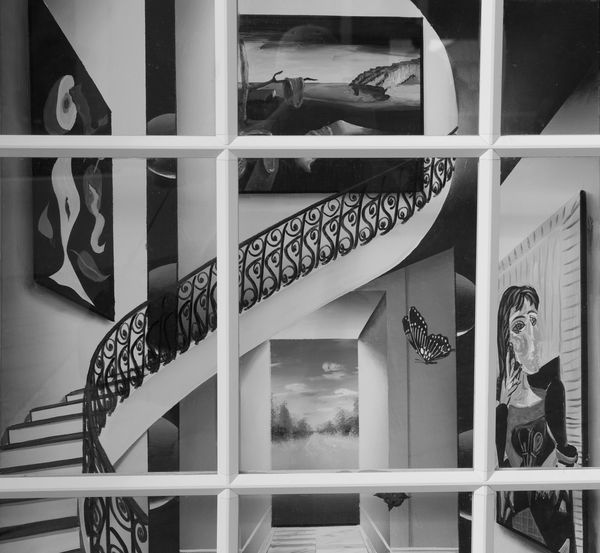
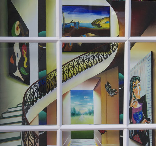
Shot this through a window of an art shop in Grand Turk Which do you prefer
Apr 28, 2013 13:27:01 #

Wow this is tough! I feel monochrome works best with a subject that has sharp lines and angles and a lot of contrast. This definitely qualifies. Then you hit me with the color and the blend of so many hues. Wow! I just don't know though I lean toward #2. Very, very well done. :thumbup: :thumbup: :thumbup: :thumbup: :thumbup:
Apr 28, 2013 13:30:19 #
Apr 28, 2013 13:37:37 #
donrent
Loc: Punta Gorda , Fl
Ahhhhhh, go fur de blackie and whiteee.... A tad more contrast wouldn't hurt either ... Nice...
Apr 28, 2013 13:41:21 #

Normally I'm not a fan of B and W, but here I LOVE it! The one with color seems to have too much going on at once IMHO>
Apr 28, 2013 14:24:02 #

After much thought, and going back between the two images, it finally hit me. The black & white makes the first strong call to me, with the angles, edges and the like. . .but there seemed to be something that was not quite right. Then, after turning it 180 degrees I saw the problem. The window panes do not work with the black & white. Without the window panes, and a touch more contrast, I would go with the back & white.
With the window panes, and a touch more vibrance, I have to go with the color.
In any event, I tip my hat to you for seeing and capturing this unique image. Well done.
With the window panes, and a touch more vibrance, I have to go with the color.
In any event, I tip my hat to you for seeing and capturing this unique image. Well done.
Apr 28, 2013 15:16:20 #

They are both quite brilliant. Being as you are using someone else's art (which is not a sin) The colour image reflect the magnificent surrealist art work in the gallery, and possible does not do your own work justice. Therefor I would go for the B & W because this is YOUR work using the gallery to portray your vision of others work. It is a very good B & W photograph Richard, Congratulations
.
.
Richard K wrote:
Shot this through a window of an art shop in Grand Turk Which do you prefer
Apr 28, 2013 15:21:13 #

I like the black and white because it highlights the stair railing,in color the other objects distract.
Apr 28, 2013 15:36:27 #

Apr 28, 2013 15:36:37 #

mooseeyes wrote:
After much thought, and going back between the two... (show quote)
Moose, I couldn't have said it better. Your critique = My critique. :thumbup:
Stunning pic and I think the spiral works well contrasting the straight lines.
Cheers
Apr 28, 2013 18:39:22 #
Honestly, the colour photo is nice, but it's just another colour photo among millions. But the black and white captures the attention, tells a story, and engages the imagination.
Apr 28, 2013 19:07:41 #
Apr 28, 2013 19:34:16 #
B&W definitely, color distracts from the lines in this image. The artistic curve in the stairway is central for me in this image, and color just doesn't do it any justice.
Apr 28, 2013 19:43:14 #
steve40 wrote:
B&W definitely, color distracts from the lines in this image. The artistic curve in the stairway is central for me in this image, and color just doesn't do it any justice.
"color distracts from the lines in this image". Yep I agree and I think thats a good thing. If the window frames were parallel and straight it would be different, for me, but as displayed I think the window needs more to be not noticed.
Just my thoughts tho. Beauty is in the eye of the photographer :)
Cheers
Apr 28, 2013 19:55:57 #
Richard K wrote:
Shot this through a window of an art shop in Grand Turk Which do you prefer
B & W for me just looks sharper :thumbup:
If you want to reply, then register here. Registration is free and your account is created instantly, so you can post right away.