WPC 1316 - Earth Day ANALYSIS
Apr 27, 2013 01:30:31 #

DP Upadhyay has graciously volunteered their WPC 1316 - Earth Day entry for critique and analysis to find out what they could have done to make it better. Be nice, but be honest as this will help everyone with their craft. Thank you DP Upadhyay and thank you everyone!
from WPC 1316 - Earth Day http://www.uglyhedgehog.com/photo_contest.jsp?pcnum=55
from WPC 1316 - Earth Day http://www.uglyhedgehog.com/photo_contest.jsp?pcnum=55
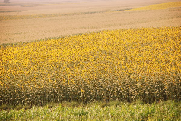
SUNFLOWERS IN WHEAT FIELDS - Travelling by train, I was standing at the open door of the running train when it passed through Bihar. I was mesmerised by the beauty and the colour of the earth. Steadying my camera with my left hand and grasping the door rail fast with my right, I shot.
Apr 27, 2013 09:32:42 #

I think it makes an interesting pattern. However, without reference to the moving train, I would wonder why it's a bit out of focus. I would also like to see some of foreground flowers sharper (again, if I knew nothing of circumstances in which it was taken). With the existing image, maybe go further the other way - towards an abstract?
Apr 28, 2013 09:14:24 #

"Color of the earth" - maybe it loses something in translation, but I would take "earth" to be the field behind the sunflowers. Since he couldn't get closer to show flower detail, maybe more of the contrasting color, and as has been suggested, add some blur to render it more abstract; make it about color and less about form?
Apr 28, 2013 09:19:54 #
I forgot to comment on relevance to the theme of the contest. I was hoping for more photos that related specifically to "Earth Day" observations and celebrations - commentary on preserving natural resources, recycling, reducing pollution etc.
Apr 28, 2013 13:06:56 #

St3v3M wrote:
DP Upadhyay has graciously volunteered their WPC 1316 - Earth Day entry for critique and analysis to find out what they could have done to make it better. Be nice, but be honest as this will help everyone with their craft. Thank you DP Upadhyay and thank you everyone!
from WPC 1316 - Earth Day http://www.uglyhedgehog.com/photo_contest.jsp?pcnum=55
from WPC 1316 - Earth Day http://www.uglyhedgehog.com/photo_contest.jsp?pcnum=55
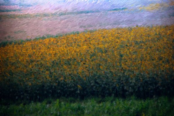
I love the subject of this photo and understand the frustration of trying to catch a true moment when traveling at a fast pace. I downloaded the original and took into Photoshop and made some minor adjustment to tone and light. I think it rescued it enough that it would be a pretty note card.
Then (because I have done this for plenty of my own shots) I took into Corel Paint Essentials and played with it. I think it makes a pretty outstanding watercolor.
Since I am a novice at photography I didn't feel I had anything to offer in terms of camera adjustment but I have played with editing enough to save some of my own photos....hope this helps.
first edit in Photoshop
watercolor from Corel Paint Essentials
Apr 28, 2013 15:20:22 #

St3v3M wrote:
DP Upadhyay has graciously volunteered their WPC 1316 - Earth Day entry for critique and analysis to find out what they could have done to make it better. Be nice, but be honest as this will help everyone with their craft. Thank you DP Upadhyay and thank you everyone!
from WPC 1316 - Earth Day http://www.uglyhedgehog.com/photo_contest.jsp?pcnum=55
from WPC 1316 - Earth Day http://www.uglyhedgehog.com/photo_contest.jsp?pcnum=55
Innsufficient range in colors, they all run together.
Apr 28, 2013 22:14:06 #

From a compositional point of view there is no focal point in this picture. What is it a picture of? Is there anything in this picture that draws you in? There are no strong leading lines to direct your focus to a particular place in the photo. I find my eye looking for a place to focus on and I don't really find one.
Your first edit in photoshop is an improvement as you've added some contrast. Try some selective darkening of the near grass foreground. Increase the saturation of the sunflowers. As it is, there is very little difference in the brightness of the various bands of foliage. If you don't believe me, make a Black and White veresion.
Your first edit in photoshop is an improvement as you've added some contrast. Try some selective darkening of the near grass foreground. Increase the saturation of the sunflowers. As it is, there is very little difference in the brightness of the various bands of foliage. If you don't believe me, make a Black and White veresion.
Apr 29, 2013 10:12:36 #
birdpix wrote:
From a compositional point of view there is no foc... (show quote)
this is not my photo, I just took the original into photoshop to help with the tone and color. Hopefully the owner of the photo will read your post and gain some ideas and knowledge from your post. Thanks for looking at the edited photos I did.
Apr 29, 2013 16:25:27 #
birdpix wrote:
From a compositional point of view there is no focal point in this picture. What is it a picture of? Is there anything in this picture that draws you in? There are no strong leading lines to direct your focus to a particular place in the photo. I find my eye looking for a place to focus on and I don't really find one...
This echoes my thoughts as well.
May 2, 2013 01:12:16 #
Lost
Loc: Oakdale,Ca
Newbie Question, if the picture had been taken from inside the doorway so the doorway showed would that be a better compostion?
If you want to reply, then register here. Registration is free and your account is created instantly, so you can post right away.