Bouquet - Please Critique
Nov 15, 2011 10:54:57 #
Nov 16, 2011 11:33:39 #
Nov 16, 2011 13:44:08 #
Nov 16, 2011 13:47:36 #
DRON wrote:
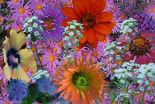
Layered flowers
Beautiful flowers but I am not excited about the phptshop stuff.
The original in my opinion was probabyy great on its own. But then again I am ot the one that has to be pleased If it does the trick fro you .. Great
Ian Could you post the original PLEASE
Nov 16, 2011 14:27:48 #

i feel like it is too busy, like to many flowers.. I would like to see the original as well
Nov 16, 2011 14:30:52 #

I find it appealing...in a collage sort of way. This is one that might look really cool if you could sort of three d it out a bit.
Nov 16, 2011 14:37:10 #

First of all, I do like this kind of stuff, and I think this has potential.
And before I go on, this suggestion: crop, and keep roughly the left third of this in a pleasing proportion, and you may have a nice image there.
I would work toward a balanced composition with either a clearer center of interest, or a better distribution of shapes and colors if you are mainly trying to generate a pleasing pattern. I would also recommend a better distribution of shapes and colors if you can manage it. The yellow flower by itself, so far to the left, is uncomfortable to me. Likewise the bright red flower, so close to the edge, feels awkward. The white flowers feel like the are in front of everything, when they should be background items...both because they are out of focus, and because they can't compete with the visual power of of the red flower, which they seem to "block"
I hope you see what I'm driving at, and that you find this helpful.
Nov 16, 2011 17:46:36 #
caitlyn13 wrote:
i feel like it is too busy, like to many flowers.. I would like to see the original as well
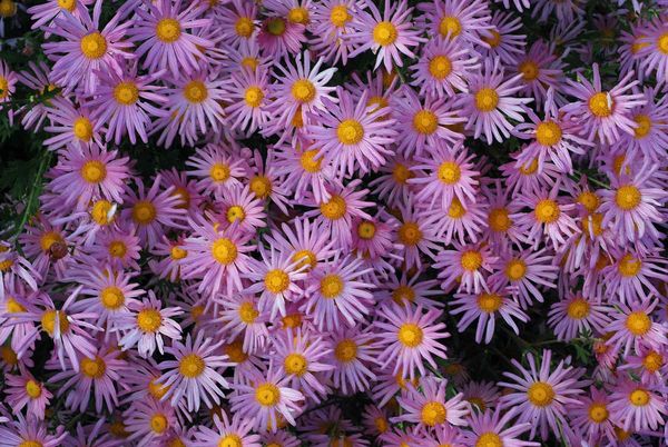
Thanks for your comments. Photoshop works are all experiments, some turn out good, and some not. Here is the original background photo.
Pink Daisies
Nov 16, 2011 18:02:31 #
JoeV wrote:
First of all, I do like this kind of stuff, and I ... (show quote)
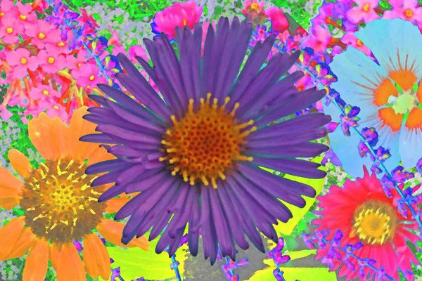
Thank you for your critique. This is a learning experience. Here is another PS layered flower that I think is better composed.
Layered flowers
Nov 16, 2011 19:14:55 #
Nov 17, 2011 00:18:17 #
If you want to reply, then register here. Registration is free and your account is created instantly, so you can post right away.