Which one would you enter?
Apr 9, 2013 17:18:59 #

I'm entering a photo contest and have four similar images. I would love to get opinions as to which image the UH folks like best and why.
Thanks
Thanks
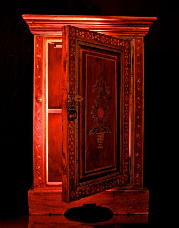
Boite Magique 1
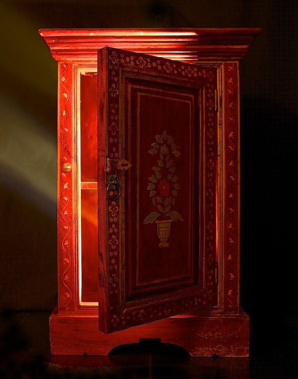
Boite Magique 2
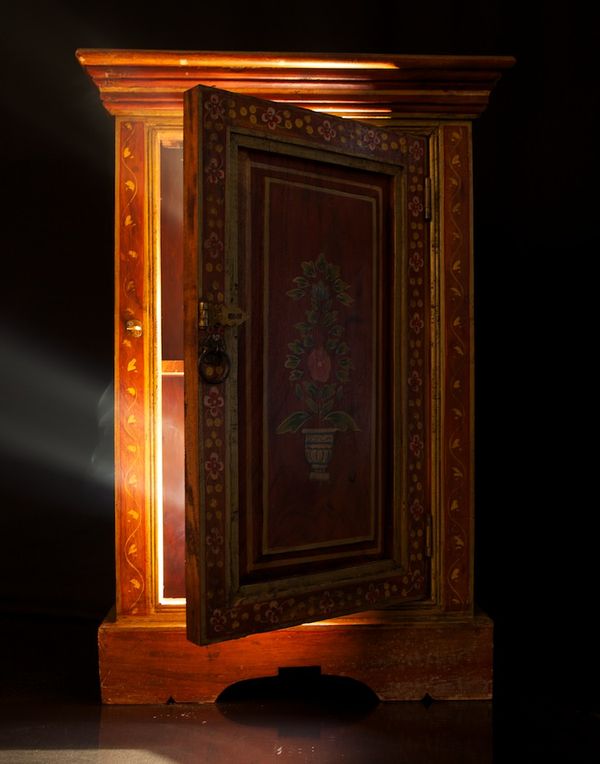
Boite Magique 3
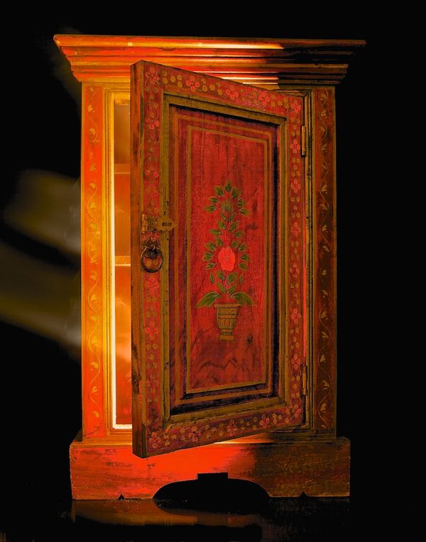
Boite Magique 4
Apr 9, 2013 17:21:44 #

bmazz wrote:
I'm entering a photo contest and have four similar images. I would love to get opinions as to which image the UH folks like best and why.
Thanks
Thanks
I would choose #2 lighting seems best
Apr 9, 2013 17:22:17 #
Apr 9, 2013 17:23:13 #

Apr 9, 2013 17:32:10 #
Apr 9, 2013 17:38:57 #
I would have to say 3. 4 is good but in three the definition is that much sharper and the light ray and the colour of the inlay is great. cheers let me know how you get on pm.
Apr 9, 2013 17:51:28 #

I like everything about #1, except U can see the light fixture at the top. Right amount of lighting, & u can see the detail on the front door. Did U do the inlay, beautiful piece of furniture. Looks like one of those pieces that would have the potty on the bottom, & the wash bowl & pitcher on the top.
Apr 9, 2013 18:05:07 #

I like #2 because the door is dark, giving a hint of mystery, yet not dark enough to hide the detail in it.
Apr 9, 2013 18:16:13 #
bmazz wrote:
I'm entering a photo contest and have four similar images. I would love to get opinions as to which image the UH folks like best and why.
Thanks
Thanks
#2. Lighting more natural and like the color.
Apr 9, 2013 18:16:37 #
#2 is my fav... to me #4 looks less natural--more manipulated; 3 has something weird going on with the light rays on the left and 1, while good, doesn't have the extra "oomph" that I think #2 has.
Apr 9, 2013 18:20:21 #
sleepy51 wrote:
I like everything about #1, except U can see the light fixture at the top. Right amount of lighting, & u can see the detail on the front door. Did U do the inlay, beautiful piece of furniture. Looks like one of those pieces that would have the potty on the bottom, & the wash bowl & pitcher on the top.
Your comment is interesting and thanks for pointing out about the light fixture, except there is no light fixture in the furniture. I used two battery operated spotlights, one on each shelf and then lit some incense so the viewer could see smoke.
Thanks for your insight, if you think it's a light fixture then someone else will too
Best,
Apr 9, 2013 18:27:15 #

bmazz wrote:
I'm entering a photo contest and have four similar images. I would love to get opinions as to which image the UH folks like best and why.
Thanks
Thanks
Hi, my vote would be for the last one in the series. The light seems to be coming from inside the wardrobe and the colors, to me, seem golden and alive! Good Luck!
Joan
Apr 9, 2013 18:30:44 #
bmazz wrote:
<snip> and then lit some incense so the viewer could see smoke.
Thanks for your insight, if you think it's a light fixture then someone else will too
Best,
Thanks for your insight, if you think it's a light fixture then someone else will too
Best,
Ah...the smoke is probably what is causing the effect that bothered me in #3.
Apr 9, 2013 18:32:52 #
I like no. one the best. This image has a very dark background. I understand that it is your intention to show the beams of light. The problem, to my eye, is that the rays upset the continuity of the background. The lighter areas of the otherwise dark background divert attention from the furniture which is the actual subject of the image. Hope I'm not being too picky, but you ask for input. I like all the images. I don't think there is a bad one in the bunch. I just like no. 1 the best.
Apr 9, 2013 18:57:02 #

I like number two..the light seems to bethe right amount , and it also seems to be coming from the right place in the photo, and that piece of furniture is absolutely beautiful
If you want to reply, then register here. Registration is free and your account is created instantly, so you can post right away.