Photo shoot with the 5d mark iii
Apr 6, 2013 22:51:18 #
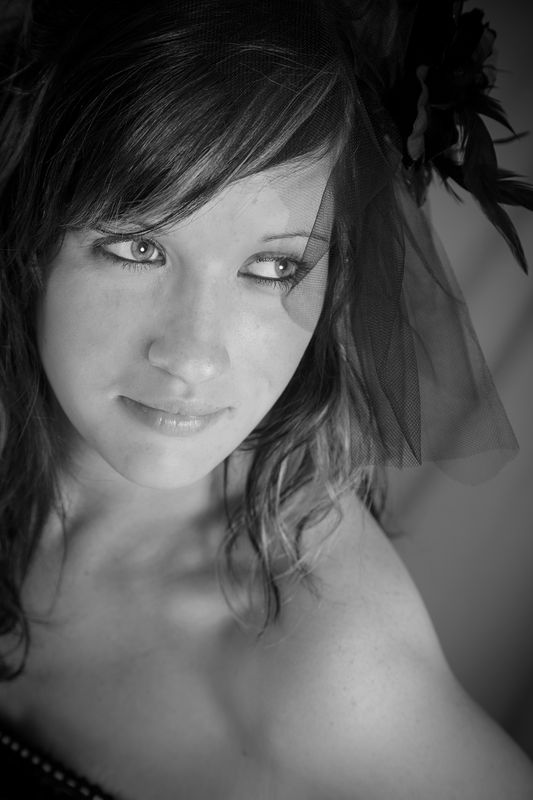
Just thought I would post one from a photo shoot. I would like to get comments of what you all think, good or bad.
Thanks
Thanks
playin
Apr 6, 2013 23:22:09 #

Apr 7, 2013 01:28:22 #

Good composition, lighting a tiny bit harsh on lower face but no shadows. I don't favor the downward angle shot but that's just my personal tastes. The black and white image does not appear to flatter her complexion.
Very nice photo, all told. Her emotion appears to be neutral; was she uncomfortable or self concious about the shoot? The fact that the photo doesn't say much leaves room for conjecture, yet it is not compelling enough to evoke mystery. I wonder if a sepia tone would give it some warmth?
Man, I must be getting sleepy. I am starting to sound like an art critic. Blah.
I like it, but don't love it. If that photo had green eyes it would have made my heart skip a beat. Thanks for posting 77firebird. Give her green eyes and frame it, then ship it to a gallery in NYC. I bet they would hang it!
Apr 7, 2013 08:43:35 #

I don't know much about portraits but I think its great and wish my shots came out this good! :thumbup:
Apr 7, 2013 11:20:54 #
Thanks for the comments,going to work on some different editing of the photo with this advice from wierdphotoguy.
Glad you liked it reddog
Glad you liked it reddog
Apr 7, 2013 17:13:04 #
Overall I like it. And I am NOT a portrait shooter. I personally love B&W (especially for portraits). I like the pose, I like your composition. The lighting appears a little harsh on her complexion, and I 'think' possibly a little more side-lighting might have enhanced her features more (more modulating of light ... does that make any sense?). I have used a moderately inexpensive piece of post-production software called: Portrait Professional. I've been pleased with the results. It smooths the skin, and sharpens the eyes while maintaining a natural appearance (it also very intuitive and user friendly ... a must for this old guy). Off subject: I own and shoot the Mk2, how are you liking your Mk3?
Apr 7, 2013 21:34:23 #

Very flat lighting, hair and (veil? ) is distracting. Nice pose and composition ! A longer focal length would have been a little nicer perspective, especially for nose.
Apr 28, 2013 07:48:13 #

I actually like the "straight on mask" lighting...but that's me.
I think you did a good job.
The two things that I can see for improvement are:
1.) Make her face the lightest thing by burning her shoulder...our eyes go to the brightest part of the image and bare skin distracting our eye is a no no.
2.) Her eyes show too much white on one side...have her shift her eyes so that they aren't so "to one extreme edge"
Other than that...nice job.
If you want to reply, then register here. Registration is free and your account is created instantly, so you can post right away.