Which is the most distracting?
Apr 5, 2013 02:13:47 #
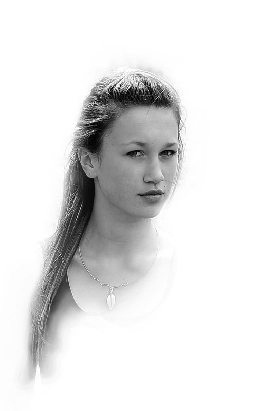
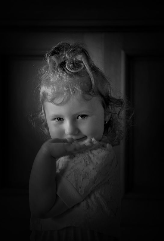
I cannot figure whether it is better to portray the light, or the shadow to present the most complimentary image of the subject. I hear some say that the white draws the eye from the subject, and think that perhaps the distraction is welcome, from the subject, obviously the subject does not command your full attention, and I have also heard said the negative space of the black is an unwelcomed distraction from the subject, but does this all depend on the subject appeal, or is it a reliable consideration. Beauty is in the eye of the beholder for sure, but as a photograher, I would like to portray the beauty I see for all others to seriously consider aswell. I would love to hear your views, opinions, and welcome your portrayals on this matter. Colour is an important part of all portrayal, and I welcome this factor, but I am mainly talking of light and shadow as the constituents
shadows
highlights
Apr 5, 2013 06:20:24 #
NZBarry wrote:
I cannot figure whether it is better to portray th... (show quote)
Here's something out of left field for you. I like both effects but I'd like to see them reversed. ie the high key effect applied to the little girl and the dark shadows effect applied to the young woman. Just my thoughts. But I like both as they are too.
Apr 5, 2013 14:18:46 #
infocus wrote:
Here's something out of left field for you. I like both effects but I'd like to see them reversed. ie the high key effect applied to the little girl and the dark shadows effect applied to the young woman. Just my thoughts. But I like both as they are too.
thanks for looking and input infocus, I will try that, but it takes me a while to do.
Apr 5, 2013 22:49:24 #

You are confusing how light and dark works. If it is a high key image ilke your first one, all that white is not a distraction and does not draw the eye away. That is true when the overall tone is dark or neutral - THEN a bright object/area will attract the eye. This is a very general statement, but In the high key, shadows define the subject. In the low key, highlights define.
Obviously, you need both and they tend to work a bit differently in different environments. But white in high key is not a distraction - it is the background.
Obviously, you need both and they tend to work a bit differently in different environments. But white in high key is not a distraction - it is the background.
Apr 5, 2013 23:42:18 #
CaptainC wrote:
You are confusing how light and dark works. If it ... (show quote)
Thank you CaptainC. I really like both high key, and low key portraits, and do get confused at some of the statements that people make with regards to the white drawing the eye away. Your statement makes sense to me.
Apr 5, 2013 23:49:44 #
NZBarry wrote:
Thank you CaptainC. I really like both high key, and low key portraits, and do get confused at some of the statements that people make with regards to the white drawing the eye away. Your statement makes sense to me.
You are welcome. The low key image seems a bit too dark. I think bumping up the highlights will improve it a lot.
I downloaded it and moved the right slider in Levels a good chunk to the left and the brighter highlights look better, IMO. It adds more dimension to her face. In any image, light areas advance and dark areas recede. Accentuating those areas is what give the 3D to the subject. Well...3D such as it is in a 2D image.
Apr 5, 2013 23:56:05 #
CaptainC wrote:
You are welcome. The low key image seems a bit too dark. I think bumping up the highlights will improve it a lot.
I downloaded it and moved the right slider in Levels a good chunk to the left and the brighter highlights look better, IMO. It adds more dimension to her face. In any image, light areas advance and dark areas recede. Accentuating those areas is what give the 3D to the subject. Well...3D such as it is in a 2D image.
I downloaded it and moved the right slider in Levels a good chunk to the left and the brighter highlights look better, IMO. It adds more dimension to her face. In any image, light areas advance and dark areas recede. Accentuating those areas is what give the 3D to the subject. Well...3D such as it is in a 2D image.
Thanks CaptainC. I've played with this photo a lot, and have to be so careful, because the lighted area of her cardigan just under her hand tends to blow out quite easily. I will play more.
Apr 9, 2013 23:36:23 #

NZBarry wrote:
Thanks CaptainC. I've played with this photo a lot, and have to be so careful, because the lighted area of her cardigan just under her hand tends to blow out quite easily. I will play more.
Mask out the cardigan before using levels.
Apr 12, 2013 23:13:22 #
ole sarg
Loc: south florida
I find in the second shot that her hand is disproportionate to her face. I think this is caused by using a big aperture ( 2.8 or 3.5) but could be wrong. It is very difficult to use hands in a portrait. Hands often become a major distraction if not carefully posed.
Apr 13, 2013 01:52:33 #
CajonPhotog wrote:
Mask out the cardigan before using levels.
Thanks for looking and commenting CajonPhotog. I will need to learn masking to a better degree for sure, and will try that.
Apr 13, 2013 01:58:48 #
ole sarg wrote:
I find in the second shot that her hand is disproportionate to her face. I think this is caused by using a big aperture ( 2.8 or 3.5) but could be wrong. It is very difficult to use hands in a portrait. Hands often become a major distraction if not carefully posed.
Thanks for looking and commenting Ole sarg. I am pleased you noticed that, and you may find that her hand is longer due to motion blur. She is only a young tot, and to get her still for any longer than a second was a feat, she was off under the table, and back behind dads legs in a flash, and all I got were her eyes, I sort of hoped that might be enough, but have had trouble with kid's hands many times. Thanks again
Apr 13, 2013 03:05:38 #
ole sarg wrote:
I find in the second shot that her hand is disproportionate to her face. I think this is caused by using a big aperture ( 2.8 or 3.5) but could be wrong. It is very difficult to use hands in a portrait. Hands often become a major distraction if not carefully posed.
Apr 13, 2013 03:18:00 #
Here is yet another way to brighten up the second shot.I hope I am correct in that is what you want to do. I made a duplicate layer by "CONT>J", and then changed the blend option to "SCREEN". I also added a brightness/Contrast layer and adjusted to my liking. The photo is still a little on the dark side but can be tweeked brighter or darker.
If you want to reply, then register here. Registration is free and your account is created instantly, so you can post right away.