Check out Close Up Photography section of our forum.
Portraits Comments Appreciated
Mar 26, 2013 01:41:06 #

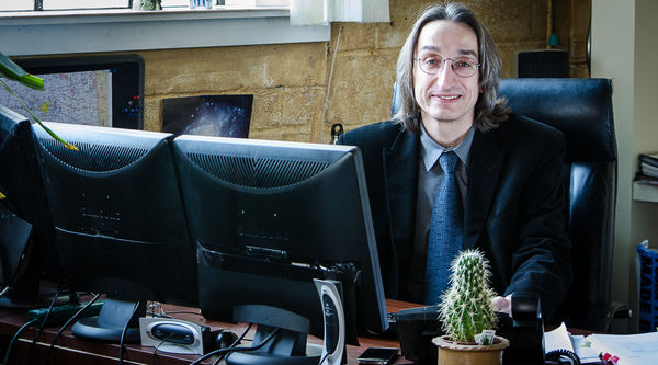
I recently shot the attached photos.
The first one was designed to show the work environment for an idependent contractor in Information Technology.
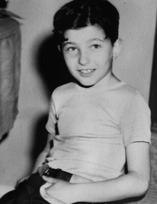
The second one was a crop to provide a portrait for the subject.
I would appreciate your thoughts on the photos.
The first one was designed to show the work environment for an idependent contractor in Information Technology.
The second one was a crop to provide a portrait for the subject.
I would appreciate your thoughts on the photos.
Environment
Crop for Portrait

Mar 26, 2013 06:00:39 #

Well you did ask. We are talking portraits here? The first photograph (Good definition)does indicate an office environment. from a portrait point of view it is a good one of the backs of three monitors and a cactus plant.
The second photograph is more like a portrait and again has good definition, but in portrait photography the subject should form the main point of interest and in this case the background should have been blurred out with use of a more selective aperture. As it stands, the background it to distracting. Just my thoughts.
The second photograph is more like a portrait and again has good definition, but in portrait photography the subject should form the main point of interest and in this case the background should have been blurred out with use of a more selective aperture. As it stands, the background it to distracting. Just my thoughts.
Mar 26, 2013 06:49:18 #
I'll mix my comments in with those of Leicaflex. I agree with most of what he said, but would add that they appear overexposed. The highlight side of his face has blown out highlights which could have been toned down.
I hope you took many photos and possibly have others to choose from. Still, a good effort and an idea which should be further pursued.
I hope you took many photos and possibly have others to choose from. Still, a good effort and an idea which should be further pursued.
Check out Close Up Photography section of our forum.
Mar 26, 2013 07:33:22 #

Photo #1:
1.) Seems crooked or distorted.
2.) Lots of clutter, seems like not a lot of forethought went into the shot; change angle, and minimize background/desk clutter.
3.) Crop too tight on his head.
Photo #2:
1.) Blurry
2.) Crop too tight on head.
3.) Joints cut in awkward place.
4.) Lighting is harsh.
1.) Seems crooked or distorted.
2.) Lots of clutter, seems like not a lot of forethought went into the shot; change angle, and minimize background/desk clutter.
3.) Crop too tight on his head.
Photo #2:
1.) Blurry
2.) Crop too tight on head.
3.) Joints cut in awkward place.
4.) Lighting is harsh.
Mar 26, 2013 11:39:23 #

rpavich wrote:
Photo #1:
1.) Seems crooked or distorted.
2.) Lots of clutter, seems like not a lot of forethought went into the shot; change angle, and minimize background/desk clutter.
3.) Crop too tight on his head.
Photo #2:
1.) Blurry
2.) Crop too tight on head.
3.) Joints cut in awkward place.
4.) Lighting is harsh.
1.) Seems crooked or distorted.
2.) Lots of clutter, seems like not a lot of forethought went into the shot; change angle, and minimize background/desk clutter.
3.) Crop too tight on his head.
Photo #2:
1.) Blurry
2.) Crop too tight on head.
3.) Joints cut in awkward place.
4.) Lighting is harsh.
Ditto
Mar 26, 2013 11:43:01 #

Mar 26, 2013 19:42:20 #
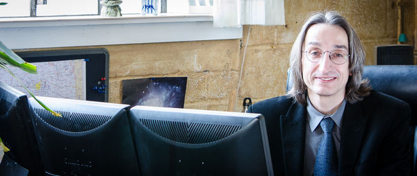
Thanks for all the feedback. The comments were not as harsh as I expected.
In the first photo, the computer monitors are essential to telling the story. The lighting was from a window with an overcast sky. It was still bright as there was a lot of snow outside reflecting the light. I did also use a silver reflector about 10 feet to the subject's left. It was a balancing act between getting the window light in the picture or cropping close to the head.
I don't really understand what the phobia on UHH is with a close crop to the head. Many of the top photographers will crop the head as a standard process.
I recropped the photo to remove the cactus and show a little more above the head. Is this more appealing to you?
I shot at a maximum aperture for my lens (f4.5) and the subject was over ten feet away from the background. I had expected the background to be a little blurred as well. Any suggestions?
Recropped
Mar 26, 2013 20:01:25 #
BigDen wrote:
Thanks for all the feedback. The comments were not as harsh as I expected.
good...that's a good sign.
Quote:
In the first photo, the computer monitors are essential to telling the story.
In the first photo, the computer monitors are essential to telling the story.
I agree...this is an environmental portrait, that's an essential part of the work (I'm assuming.)
Quote:
The lighting was from a window with an overcast sky. It was still bright as there was a lot of snow outside reflecting the light.
The lighting was from a window with an overcast sky. It was still bright as there was a lot of snow outside reflecting the light.
You might have softened it with a large sheet of plotter paper or a thin piece of white translucent cloth....just a thought.
Quote:
I did also use a silver reflector about 10 feet to the subject's left.
I did also use a silver reflector about 10 feet to the subject's left.
Silver is pretty harsh, but I applaud you for remembering to use fill...that's good. Possibly use the white side next time.
Quote:
It was a balancing act between getting the window light in the picture or cropping close to the head.
It was a balancing act between getting the window light in the picture or cropping close to the head.
Or changing angle slightly :)
Quote:
I don't really understand what the phobia on UHH is with a close crop to the head. Many of the top photographers will crop the head as a standard process.
Yes...that's true. I don't have that phobia, I like close cropped portraits with the head cut off but this is an "environmental portrait" with LOTS of room around him...and so it appears that the top crop "doesn't go" with the rest of the shot...that's all.
Quote:
I recropped the photo to remove the cactus and show a little more above the head. Is this more appealing to you?
I shot at a maximum aperture for my lens (f4.5) and the subject was over ten feet away from the background. I had expected the background to be a little blurred as well. Any suggestions?
I recropped the photo to remove the cactus and show a little more above the head. Is this more appealing to you?
I shot at a maximum aperture for my lens (f4.5) and the subject was over ten feet away from the background. I had expected the background to be a little blurred as well. Any suggestions?
He was 10 feet in front of the background?
How close were you to him and what lens focal length did you use?
When you are trying to "get it all in" and use a short focal length...you aren't going to turn the background into cream...it's not going to happen.
It's not a bad thing, after all....you are showing his environment aren't you? It's just that you CAN straighten up and remove distracting objects and things from the photo to make it more pleasing, you aren't obligated (like a photojournalist) to record the scene exactly as is.
This seems like a very valuable article that you might like to read...I found it quite informative
http://www.professionalphotography101.com/portrait_lighting/environmental_portrait.html
Mar 26, 2013 20:14:36 #
Thanks rpavich
I did move around and took shots from all angles that I could get to. The window was a problem in many cases even though I was actually shooting from slightly above him. it was again a balancing act between the window, the monitors and still making the subject look good.
The focal length was 58mm to take in the whole scene. Perhaps I should have been a little closer to the subject. I would estimate that I was about 15 feet away from him considering the desk was between us as well.
Does the second crop improve things?
Mar 26, 2013 20:18:13 #
BigDen wrote:
Thanks for all the feedback. The comments were no... (show quote)
The comments above are spot on related to the problems.
You can't crop to correct the problems. Your foreground and background are too busy. If you had planned the shot and you still wanted the monitor you should have removed everything else. i.e. cactus, stuff on the window.
As far as cutting off heads.. you know I do that. The comments about the crop is correct. It doesn't look intentional it looks just badly composed. Its one thing to cut off the top of the head on a head and shoulder shot.. It's another thing to leave only a tad above the top of the head. Definitely not good when there is so much room out front for the monitors.. You need room up top too.
If I am at 10 feet I try to shoot at f2.8 or less. The 85mm 1.8-1.4-1.2 is great at this especially for a head and shoulder shots. I shoot at 185mm at 2.8 for head shots at around 8-10 feet. The blur is just an equipment limitation.
Just giving you an honest opinion like everyone else. Sounds like that's what you were after.
Composing quality shots is not as easy as some make it sound.
It's also a lot easier to describe it and critique ones work than to create quality images.
Russ Elkins
Mar 26, 2013 21:01:45 #
PalePictures wrote:
Composing quality shots is not as easy as some make it sound.
It's also a lot easier to describe it and critique ones work than to create quality images.
Russ Elkins
Composing quality shots is not as easy as some make it sound.
It's also a lot easier to describe it and critique ones work than to create quality images.
Russ Elkins
No kidding and I hope the OP doesn't think that we don't have the same problems...we are all trying to improve...and just by hashing it out...it helps me.
Lol...edited to add...maybe (after looking at your website) I shouldn't have said "we"...but "I". :)
Check out Infrared Photography section of our forum.
Mar 26, 2013 21:05:10 #
rpavich wrote:
No kidding and I hope the OP doesn't think that we don't have the same problems...we are all trying to improve...and just by hashing it out...it helps me.
:thumbup:
Mar 27, 2013 13:20:43 #
If you want to reply, then register here. Registration is free and your account is created instantly, so you can post right away.
Check out Panorama section of our forum.