Posts for: anneglo
Jun 12, 2017 17:42:00 #
Jun 12, 2017 17:37:23 #
johnedfu wrote:
I know the whole cats on the Internet cliche...so here's another one! Closeup of Misty.
Looking at your photo of Misty, is calming and relaxing to me. Very nice.
Jun 10, 2017 08:38:03 #
firtree wrote:
So cute. I bet you are so glad that you didn't allow her age to be a factor. She is precious.
Yes, she was so scared ... all those big dogs. My husband fell in love with her. And since we are "old," it was a good match. 😊
The pictures of Cletus are precious too. Huggable!
Jun 10, 2017 08:17:58 #
R.G. wrote:
In Lightroom the Adjustments brush is a way to sel... (show quote)
Excellent and extremely helpful, thank you.
Jun 10, 2017 07:24:00 #
Sophie is a sweet, sweet little doggy. We adopted her from the animal shelter two years ago, when she was 9 years old. She is so precious.

Jun 9, 2017 15:17:52 #
R.G. wrote:
You've posted a good example of a shot that doesn'... (show quote)
Important information, I will read it several times. I appreciate it very much, and thank you for taking the time to explain. 😊
Jun 9, 2017 11:29:37 #
Lovely! A photo that I can look at over and over.
Almost like the rose is telling a story!
Almost like the rose is telling a story!
Jun 9, 2017 11:19:00 #
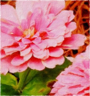
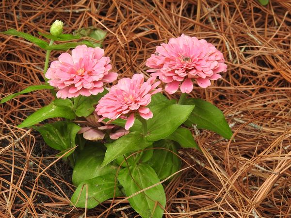
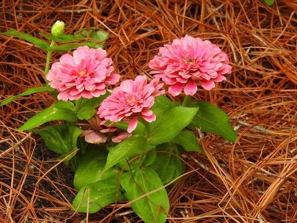
Same floral image, cropped.
Pink Zinnias
Jun 9, 2017 06:20:14 #
Jun 9, 2017 00:06:45 #
Jun 9, 2017 00:04:11 #
Bob1190 wrote:
Just getting used to new 60D camera
Awww... I love the one with the little bird. Precious, and evokes a good and serene feeling for me.
Jun 8, 2017 23:39:43 #
R.G. wrote:
Both images leave me wanting more of something I can recognise. As the editor you know what the original image looked like, but a newcomer to the edits will be looking for something to get a handle on. If there's too much obscurity you will lose the viewer - unless you were going for a surreal or impressionist look.
A different image. I'm going to go more slowly with this one, so the only thing I did was increase the saturation. Is it possible to make this a more appealing photo? Any suggestions appreciated.
Jun 8, 2017 08:31:00 #
Jun 8, 2017 08:26:59 #
SpyderJan wrote:
Sometimes the picture just presents itself. I caught this on a rainy morning. When the sun hit the web, it glistened. This little guy is an amazing engineer.
Wow! Amazing shot.
Jun 8, 2017 08:24:12 #
CLCoker wrote:
My favorite spring flower photo converted into a watercolor.
A wonderful watercolor rendition of your photo!