My latest experiments in post processing
Jun 7, 2017 12:32:35 #

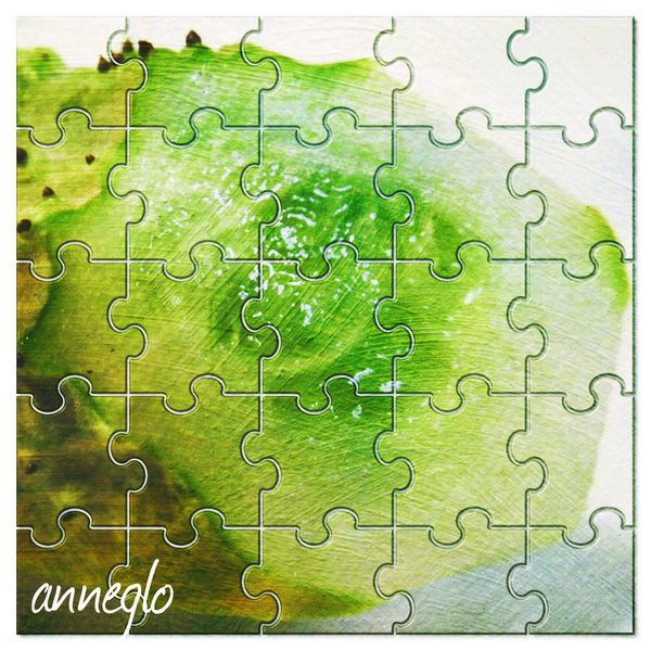
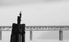
I think this is the right place to post these, if not please advise. Here is my latest experiment. Not sure if this is called post processing?

Jun 7, 2017 12:33:30 #
I was trying to add another below this image, but my "senior" brain went "wonky" and I got lost in the process. :)
Jun 7, 2017 13:03:03 #

Check out Astronomical Photography Forum section of our forum.
Jun 7, 2017 13:59:02 #
R.G. wrote:
You have up to an hour to edit any post. That includes adding images.
Thanks R.G. I'll try again.
Jun 7, 2017 14:04:06 #
Jun 7, 2017 14:10:55 #
Both images leave me wanting more of something I can recognise. As the editor you know what the original image looked like, but a newcomer to the edits will be looking for something to get a handle on. If there's too much obscurity you will lose the viewer - unless you were going for a surreal or impressionist look.
Jun 7, 2017 19:16:52 #
R.G. wrote:
Both images leave me wanting more of something I can recognise. As the editor you know what the original image looked like, but a newcomer to the edits will be looking for something to get a handle on. If there's too much obscurity you will lose the viewer - unless you were going for a surreal or impressionist look.
R.G., I really appreciate your imput. I have a lot to learn. Thanks again. I might use a different subject next time. 🙂
Check out Advice from the Pros section of our forum.
Jun 8, 2017 12:05:23 #
anneglo wrote:
R.G., I really appreciate your imput. I have a lot to learn. Thanks again. I might use a different subject next time. 🙂
You're welcome. It looks like you've learned one of the most important lessons - using a light hand.
Jun 8, 2017 23:39:43 #
R.G. wrote:
Both images leave me wanting more of something I can recognise. As the editor you know what the original image looked like, but a newcomer to the edits will be looking for something to get a handle on. If there's too much obscurity you will lose the viewer - unless you were going for a surreal or impressionist look.
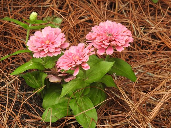
A different image. I'm going to go more slowly with this one, so the only thing I did was increase the saturation. Is it possible to make this a more appealing photo? Any suggestions appreciated.
Jun 9, 2017 11:19:00 #
Jun 9, 2017 12:23:09 #
anneglo wrote:
A different image. I'm going to go more slowly with this one, so the only thing I did was increase the saturation. Is it possible to make this a more appealing photo? Any suggestions appreciated.
You've posted a good example of a shot that doesn't need much processing. It's important to remember that there is no right and wrong in processing, and the main consideration is what you want from it. For example, where sharpening is concerned, I've seen some stunning edits of flowers that were beyond soft and the person doing the PP obviously wanted to take it in the direction of being over-soft. That person wouldn't have thanked anybody for suggesting that the shot needed more sharpening. On the other hand, if you want to accentuate the shapes and textures of blossoms, adding softness isn't the way to bring that out. So much in editing is determined by what the desired effect is.
You ask what would make this a more appealing photo, which takes things into a different arena where you have to consider what is most likely to give the shot widespread appeal. There are very few absolutes to refer to, but in very general terms there are some things that would be considered undesirable by most. Flatness, lack of colour or a poor mix of colours, a composition that just doesn't look right for whatever reason, these could all be seen as negatives - but only in very general terms.
To that we could add anything that looks like a mistake or an oversight or a shortcoming. For example, soft focus can be used to good effect, but if it doesn't produce the desired effect it will look like a mistake. Other examples of things that usually look like mistakes are over-saturation, excess contrast and sharpening that leaves a gritty, over-textured look. Those last three can all be avoided by exercising restraint.
When you see an image come to life when you apply an adjustment like Saturation it's easy to get carried away and take it beyond what's actually needed. You very often see people say that they apply their adjustments up to the point where they think it looks good, then they back off a bit. That's actually quite a good way to avoid the usual mistakes of excessive processing, especially when you're in the early stages of learning. Eventually you'll be able to rely on your eye to tell you when enough is enough, but I think you'd probably find that most people who worked their way up the editing learning curve went through a phase of self-imposed restraint similar to what I've just described.
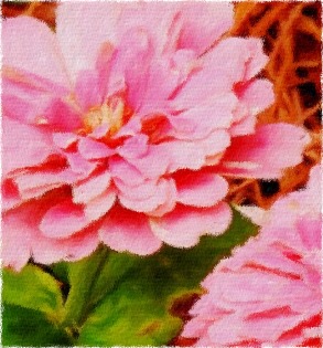
Here's my edit of your shot. My main concern was that the brights were just a bit too bright, which can make it difficult to make out details and textures, so I concentrated on lowering the Whites and Highlights. Then I cranked up the Contrast to bring out the shapes of the petals and to give the shot some overall pop. One of the things to watch when using Contrast is having the brightness extremes becoming too extreme. In this case, taming the highlights first helped me to gauge how much contrast was needed (and it wasn't a lot). Lifting the shadows and lowering the highlights both take away contrast and it's usually necessary to replace it using the Contrast slider.
I finished off the edit with a custom vignette which I got using a large, well-feathered Adjustments brush. That enabled me to shape the vignette to loosely follow the shape of the flowers and leaves. The edge of the feathering never overlapped the blossoms or leaves, and I could choose which parts of the edges of the shot got the vignette and which didn't. For example the parts where the flower is close to the edge of the shot didn't get any vignette whereas the bottom corners got the full application of the brush. As well as darkening for the vignette I also used the same brush to add denoise to soften the outer parts of the image, and I reduced the contrast as well. Those steps all help the background to not become too eye catching or distracting, which helps the flowers to hold centre stage.
One thing I didn't do for this edit was add saturation. I'm not saying that saturation is wrong - I'm just making a point that it's not essential to produce an image with more pop. And saturation is also a matter of taste.
-

Check out Underwater Photography Forum section of our forum.
Jun 9, 2017 15:17:52 #
R.G. wrote:
You've posted a good example of a shot that doesn'... (show quote)
Important information, I will read it several times. I appreciate it very much, and thank you for taking the time to explain. 😊
Jun 10, 2017 05:41:49 #
R.G. wrote:
(. . .)
I finished off the edit with a custom vignette which I got using a large, well-feathered Adjustments brush. That enabled me to shape the vignette to loosely follow the shape of the flowers and leaves. (. . .)
I finished off the edit with a custom vignette which I got using a large, well-feathered Adjustments brush. That enabled me to shape the vignette to loosely follow the shape of the flowers and leaves. (. . .)
Your lengthy description of your PP is very interesting. But could you add some detail to your statement I quoted above? -- I do not know what a "well-feathered Adjustments brush" means.
My guess is that you darkened the layer, applied a mask, filled it with black. Then, with the mask selected, brushed the outside of the image with a feathered white brush. At least, that's what I might have done. Is that what you meant?
Jun 10, 2017 07:11:54 #
ygelman wrote:
....could you add some detail to your statement I quoted above? -- I do not know what a "well-feathered Adjustments brush" means....
In Lightroom the Adjustments brush is a way to select a specific area or areas where you want to make localised (as opposed to global) adjustments. For the screenshot below I pressed the letter O to show the selected area in red (you only have that on when you want to see the selected area. Pressing O again gets rid of the red highlight).
Because I used maximum feathering for the brush, the selected area is not hard-edged, and as a consequence the applied adjustments are diffuse (graduated) at the edges of the selection. If I hadn't used any feathering the selected area would be hard-edged and the adjustments would stop abruptly at the edge of the selected area.
As you can see from the slider section at the edge of the workspace there is a variety of adjustments that can be applied using the Adjustments brush. The section underneath on the right is where you make alterations to the brush itself (size, feathering, density etc).
The size of the image as you see it in the screenshot is the size that I reduced it to in the workspace (in this case a zoom ratio of 2:1). Having a bit of space round the outside of the image means that you have room to manoeuvre when making the selection. For some parts of the selection the selected area is mostly feathering, not the whole brush. That, together with the size/feathering settings (the larger the brush the larger the feathering) allow a subtle, diffuse vignette to be applied.
-

Jun 10, 2017 08:17:58 #
R.G. wrote:
In Lightroom the Adjustments brush is a way to sel... (show quote)
Excellent and extremely helpful, thank you.
If you want to reply, then register here. Registration is free and your account is created instantly, so you can post right away.
Check out Commercial and Industrial Photography section of our forum.