Posts for: TheeGambler
Sep 6, 2017 19:49:44 #
Hi Don. Since you asked....When i looked, i thought head one and head two were coming out of the same collar opening,???? i am sure that is not what you meant... Great idea. M.
May 26, 2017 10:29:51 #
Mar 21, 2017 17:45:09 #
Lots of nice action in your photo. I like it. When I do these kinds of events, I get on ground level and shoot through the fence. So, I couldn't have gotten this shot. That bull is just too close. It would be great if you could remove the fence, it might just be worth the time. You can process this as digital art, an advertisement, or photo book, etc. Or, you can just put it in your collection. I usually have some idea about how I will use a photo, and that dictates how it will be processed. As for the background, again, that depends on the purpose or use of the photo. I like the new background you used. It makes a big difference as I see it. Maybe just tweak it a little so that the figures stand out more. Maybe use something simple on the background like a change in tone, a little texture, or a little blur. 
Nov 6, 2016 17:54:42 #
St3v3M wrote:
When you present an image here you're encouraged to reply in an honest, and respectful way, and whether we agree with the assessment or not the amazing thing is that we're all trying to help. The key is to listen, evaluate, and think about what's been said, then use it to improve our work in every way we can! S-
Well, Steve, Chuck was less than respectful. I expect an apology from him about the last paragraph in his post, where he said that my photo didn't qualify as much of anything, in his "judgment."
Nov 6, 2016 17:26:07 #
Linda From Maine wrote:
I'll do another critter and the one shot I've take... (show quote)
Well, Linda, Chuck would not like your photo because the donkey is not looking at you, and neither is the cook. That is why Chuck said he didn't like my "Pooch Photo," as he called it, the pooch wasn't looking at me. Isn't that the craziest thing...

Nov 6, 2016 14:31:22 #
rlaugh wrote:
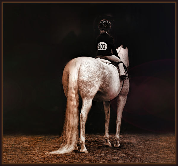
TheeGambler..fine job on this portrait...a horse lover would love to hang this shot! The cute little tot on that big ol horse is a complete story!! The number and shiny helmet complete the story of a little competitor!!...reminds me of a Rockwell painting where we saw just backs of heads, or backs of heads with faces in mirror! If that was my little one out there in that arena, on that big guy, sitting there so tall on her own, would bring a tear to my eye!!...love it!
I see that you have got the REAL story! This little tot is not in school yet, and already competing with all the older kids. Her parents let her go it alone and did not accompany her in the arena. The powerful horse was extremely schooled and knew his job...but, his most important job was to take good care of his little rider. Her parents were extremely proud and I get that so much. She definitely is a competitor, hence the title!!
Thanks for your nice comment!!
Nov 6, 2016 12:48:03 #
St3v3M wrote:
This deserves its own post! S-
- https://www.google.com/#q=The+Faceless+Portrait
- https://www.google.com/#q=The+Faceless+Portrait
Thank you, Steve!! This is a very interesting Genre of photography which I was attempting to try. This might be well-worth exploring on UHH.
Nov 6, 2016 12:37:34 #
minniev wrote:
The tail is beautiful, elegant, and we can't help but see it first. It delivers us to the rest of the image. It is the first thing the eye goes to, and in all images, that first "hook" has a dominance that isn't undone even though we come to appreciate the other elements after we complete our journey through the frame.
My reason for asking was because you said, "the STORY was about the tail." The STORY is NOT about the horse's tail. I just couldn't understand that comment.
Nov 6, 2016 12:10:19 #
minniev wrote:
Thanks for sharing an unusual take on a portrait! ... (show quote)
You wrote, ".....the TAIL is the story here......." Minnie, I am not sure that I understand you right! Are you saying that the photo is "about a HORSE'S TAIL?"
Nov 6, 2016 12:02:15 #
Chuck_893 wrote:
Late to the party again as usual. The thing has go... (show quote)


I think you are kind of behind the times, there, Chuck! Or you were never aware of, "The Faceless Portrait."
There is an entire Genre of faceless portrait photogs. It is more of a sophisticated concept of photography and many are unable to grasp it.
Faceless portraits have been around for almost as long as there have been, drawings and paintings. And, as someone that previously stated that he is NOT qualified to "judge," you have certainly taken on each photo. It is almost like you are reinforcing someone else's comment, when it comes to the Portrait I submitted, but I am sure you wouldn't do that. You stated that your "judging" depends on whether a photo, "makes you laugh" no matter what rules it breaks, it gets a 5/5. I guess that is a real measure of your judging. {Sorry Dixie, to use your photo as an example) Below is a
preview of a National Geographic, February, 2015, article on Faceless Portraits. This is the first quick example I saw when goggled. yourshot.national geographic.com/assignments/faceless-portraits.
Nov 6, 2016 10:34:57 #
Linda From Maine wrote:
Fascinating and unique, definitely dramatic!
I must confess to wishing I could see a bit of the horse's head, but I respect your artistry very much.
I must confess to wishing I could see a bit of the horse's head, but I respect your artistry very much.
Hi Linda, I see that you came back and added the part, that you wanted to see more of the horse head. I guess you missed the idea of what this photo is about. It is not about the horse head. Even so, you can see an ear and a little part of the jaw and we know the head is really there. Ha!!
Nov 6, 2016 10:00:07 #
I think this should qualify as a Portrait. At least that is what I intended it to be, something a little different than the usual thing done. I am not sure exactly what makes the difference between a Portrait and a candid shot of someone at a restaurant, horse show, or on the street. Is it the processing, the cropping, the perspective? Processing dictates how we see a photo and what we see in it. It is all important to how we "feel" (there is that word again) and what the photog is trying to convey to the viewer.
In this Portrait, I used an inside shot taken as the little girl rode up to the judge to receive her ribbon. The background in arena shots are never really useable for this kind of thing. So, that was the first thing I had to change. Since I was going for something more elegant, (like to hang over the fireplace) and different, everything pretty much had to go. I just cloned out the background. That is just as easy or easier that using the selection tool, for me. I always have to go back around after the selection tool, anyway, so why do it twice. I did salvaged the mulch in the arena to reinforce the idea that this was an event, along with the competitor number on her back. I thought about removing that number but then the authenticity would be gone. Everyone knows that competitors wear their numbers when in the arena. The idea was...this is a competitive event...in an arena, and I wanted to keep it real. So, the first thing I used was to clone out the background. I then used a slight cruise through Textures. The amount of texture was as minimal as I could get. Then, I went to Glow. There again, it was used as little as possible to get the desired effect. I mulled over the idea of the lights reflected in her helmet, to keep them as they were or to minimize them. When I take a photo, I like to keep the original look as much as possible while creating the effect that I desire. (Though sometimes I do go overboard being caught-up in processing.) When I was satisfied, I finished up with Adjust for the frame. I ended with a trip to NIK. This processing was pretty straight forward. I thought this was something to show that was easily done, while still creating a dramatic mood. I needed no layer masks for this one, but I do use them frequently.
I think, after all that being said, the most important thing, and what gives you your "brand," is the "work by hand." I don't think that it is just running a photo through the programs. I am not talking about "touchups" after the fact. I am talking about significant work to build upon what the programs can do. Purchased programs are fine and they help a lot in creations, but I never stop there. Hope you guys and gals enjoy this one.
The Competitor
Nov 4, 2016 17:12:40 #
minniev wrote:
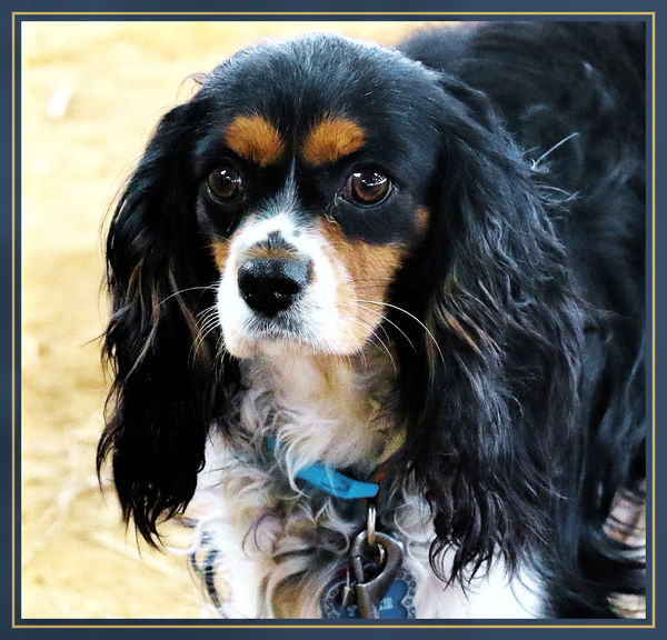
This is beautiful. Yes, the eyes have it and you got them sharp and glistening before you created the artwork of fur. I hope you're gonna tell us a little more about your processing. Thank you so much for sharing!
"....before you created the artwork of fur."
Sorry, no processing but a little hand work, mostly on the ear. The black in his coat was so black, it had little highlights, in some places, and looked flat. And, this was taken under "arena lights," which at best is a problem. Other than the spots that lacked highlights, I really liked the imagine. As mentioned above, the eyes are priority..and first consideration for me in a portrait.. At least I didn't have to process the entire photo. I would have lost all the good things about it, most likely.
Nov 4, 2016 15:16:36 #
So, it looks like a pretty high bar has been set, already!
I took this at a show this Spring and thought this guy had some soulful eyes.
I took this at a show this Spring and thought this guy had some soulful eyes.
Nov 4, 2016 09:36:40 #
Great shot!! Plus, the fly-guy didn't have to leave a "tip!" TG