Posts for: advocate1982
Jun 11, 2017 11:19:55 #
Short answer - unless you have the screen and the printer to take advantage of 16 bit, you won't see the difference because most screens and most printers will not take advantage of the 16 bit. There are some monitors that give you the full Adobe RGB spectrum, but not many, and not cheap. There are printers that will print a 16 bit image directly from Photoshop, but again not many, and not cheap.
But you do not know what tomorrow brings, so why throw away information that you could use down the road. It's like the JPG vs RAW debate. There are pros and cons on both sides, but as technology and my skills have improved I have been able to go back and re-edit RAW files to create new versions much better than the original. I wouldn't have been able to do that if I had just saved the JPG.
But you do not know what tomorrow brings, so why throw away information that you could use down the road. It's like the JPG vs RAW debate. There are pros and cons on both sides, but as technology and my skills have improved I have been able to go back and re-edit RAW files to create new versions much better than the original. I wouldn't have been able to do that if I had just saved the JPG.
Jun 11, 2017 09:43:31 #
tomcat wrote:
Nope, I did not use "move". The "... (show quote)
Because that is what it does when it cannot find where you want to put things. I use import presets to move my files to where I want them, but I have over 20 drives and sometimes when for whatever reason it cannot read or find the drive that is in the preset, it defaults to the pictures folder. No, I didn't find that out by reading the manual. I found it out by going I just imported those files, where in the world did they go.
Jun 10, 2017 16:27:31 #
Gene51 wrote:
"It doesn't matter if they are viewing a phot... (show quote)
No I sound like a guy that has real world practical experience rather than parroting back something that somebody else told them.
Jun 10, 2017 10:54:35 #
Martys wrote:
LSMFT,.....On bottom of Lucky Strikes packs, br b... (show quote)
I remember the Abomb tests, we would be warned about fall out and would have to stay indoors until we were told it was clear. That was in Canada.
Too soon old, too late smart - one of my Grandfathers favorite sayings. He was 8 when he came over from Germany back in the early 1900's or late 1800's.
Jun 10, 2017 10:26:51 #
LOL, most but not all. We spent an untold amount of hours looking for a game of Jacks for my 8 year old for last Christmas, got a lot of you are crazy looks from store clerks.
How many here got their arm caught in the wash machine ringer while putting cloths through.
The one I'm not sure about is the brass plate with the four buttons next to Dagwood.
I predate the rotary dial telephone, we didn't have a telephone, and at Grandma's it was the big wood box on the wall with the crank, and the speaker coming out of the front, and the ear piece being a on a cord that you put up to your ear.
And that green table - that was the same table that Grandma had in her house, and we would spend hours playing Canasta with Grandpa and Grandma, or watching them play with my Great aunt and Uncle
On the farm we used the outhouse right up until we got running water in 1969.
Jun 10, 2017 09:34:32 #
Did you use Add or move on the import. I am guessing that you used move, and the files were moved from your folder to whatever your import moves them to. If you haven't changed that, it will be under your pictures folder. When you went to export to original folder - they went back to the picture folder. Not to the folder that you imported them from.
You can go to your original photo in lightroom, right click, and then click on open file location in explorer (or something similar to that, don't have lightroom open right now) and that will open the actual file location in explorer for you.
You can go to your original photo in lightroom, right click, and then click on open file location in explorer (or something similar to that, don't have lightroom open right now) and that will open the actual file location in explorer for you.
Jun 10, 2017 08:43:36 #
Believe63 wrote:
My question does not exclusively talk about color nor does if reference printing, it's about forum users judging or making suggestions concerning the technical aspects of a particular post/photograph using a monitor that may or not be properly calibrated. I would assume that very few if any of the users on this forum are going to print a photo first and then comment to the author.
It doesn't matter if they are viewing a photo that you created on a calibrated monitor, and they are viewing it on a calibrated monitor because calibration is a closed loop system designed for printing. That means you calibrate your system to your use and the calibration changes with room light, with color of walls, with type of paper, with printer. So I have my system calibrated, fine - but that doesn't mean that a photo from your calibrated system will look correct on my system.
You then have to factor in - what do you like for color, vs what I like for color. I used to run a professional photo lab. For every client we had a master target that would be used for color balancing their orders. Some would like their prints on the cool side, some liked them on the warm side, some liked them with a red tinge, some liked them with a green tinge.
Even where you hang the final print makes a difference on color balance. That's why in my top end portraits for clients, I actually go to the house, with a full sized proof print, hang it on the wall where it is going to be displayed, and then adjust my color balance from there. A print displayed under tungsten light will look different than the same print displayed under florescent light, or sunlight.
It is because of all of these variables, that I don't even attempt to correct a file in house if it is going to an outside lab. I let them do the color balancing on their end because even with their print profile, it's a hit and miss game.
At the lab we used to have a set of 4x6 prints of a Kodak Shirley Neg - google it for more detail. But on the print was a big grey spot, that you used to calibrate your system too. Nice big expensive densitometer so that we could nail that grey card perfectly. But in this deck of 4x6 prints of the standard Shirley neg, we only had one that was correct according to the machines. Then we printed it out in 5 point increments in all different directions all the way out to 50 points out in all directions, including density. When a client a new client would come into the lab we would take that deck of prints and lay them out in front of the client and ask them to pick the best color by their eye. On the back of each print we had recorded the actual settings of that print, so we would flip it over, right down that number, and then shuffle them all up and do it again. We would do that five or six times. We never had a single photographer that would pick the same color twice.
And that was dealing in a closed loop system where everything was calibrated, and final images were all viewed under very expensive calibrated daylight bulbs.
So back to calibration of a monitor - just because it's good on your calibrated monitor doesn't mean it will look the same on my calibrated monitor. And me looking at it on my monitor and telling you that it is out in any amount in any direction is nothing short of impossible. And a waste of time. The only way you can ensure that your color is accurate and consistent is to have a new grey card that is being lit by the same light as the subject included in the image. Why a new grey card - because even the color of a grey card changes over time.
Now I know that flys against what everybody thinks is correct. But very few have actually got the real experience to understand what they are talking about. Most is just parroting back either what they have read somewhere, or what they have been told by somebody else that really doesn't understand.
Jun 9, 2017 14:40:22 #
Jer wrote:
Actually, yes you do own the photos in all cases, unless you specifically give away the copyright to the photos. If you do that then you should probably take some lessons on photographer's rights.Post wedding pictures can be a problem since you don't technically own those photos in most cases. If you are going to use the photos from self-promotion, then it should be in the contract. If you are going to use them for anything you want, it should be in the contract. But, then again, just because you can do it....should you?
Jun 9, 2017 11:28:49 #
Madman wrote:
You worked for a bad company - I'm sorry about that.
I've worked for three different photography retailers - large and small. And in each one, the sales person earned at the very least a percentage of the sale. And the vast majority of the cameras had spiffs.
I've worked for three different photography retailers - large and small. And in each one, the sales person earned at the very least a percentage of the sale. And the vast majority of the cameras had spiffs.
I would have to agree with that point. They have grown over the years, and there is one of their stores in the city about an hour from me, but after 30 years, I still will not spend any money there. But in their main store location (where I had worked) most of the people that I worked with are still there. Probably because they never made enough money to afford to retire
Jun 9, 2017 11:22:51 #
Mostly you will not see a difference between the two lens untll sometime down the road. For example I have two 80-200 2.8 Nikkors, one the orginal push pull and then the AF-D (I believe) and both of them are over 20 years old and still going strong. Most of my work is photo journalism, so they are my main walk around lenses so they see heavy use. A buddy of mine bought the Tamron 8-200 2.8, took excellent photos, but it fell apart and had to be replaced after several years of heavy use as a photo journalist.
The moral of the story is - if you are not using the lens all day, every day, the Tamron will probably last you a life time. But if you expect to put it to lots of use and abuse then the Nikkor will probably last you better. But as for image quality - the Tamron makes good products. Until I dropped it and sent it to the lens graveyard, I had a Tamron 90mm macro that was one of the sharpest lenses that I owned. I've replaced it with the Nikkor 105 2.8, but that was because the store that was around when I needed to replace the lens, carried Nikon, but not Tamron.
The moral of the story is - if you are not using the lens all day, every day, the Tamron will probably last you a life time. But if you expect to put it to lots of use and abuse then the Nikkor will probably last you better. But as for image quality - the Tamron makes good products. Until I dropped it and sent it to the lens graveyard, I had a Tamron 90mm macro that was one of the sharpest lenses that I owned. I've replaced it with the Nikkor 105 2.8, but that was because the store that was around when I needed to replace the lens, carried Nikon, but not Tamron.
Jun 9, 2017 11:09:14 #
BHC wrote:
I did too, but never kept the pictures. I just handed the unprocessed rolls to a relative and left. I wish
I could have a couple prints of the shotgun wedding, particularly one of the the fathers (dressed like Jed Clampet) poking the groom with his shotgun while the six to seven month pregnant bride stood by crying!
I could have a couple prints of the shotgun wedding, particularly one of the the fathers (dressed like Jed Clampet) poking the groom with his shotgun while the six to seven month pregnant bride stood by crying!
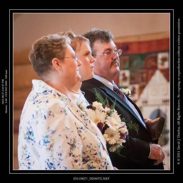
You mean like this: That's a double barrel shotgun tucked into the Dad's arm. The bride didn't notice the shotgun until after the end of the ceremony.
Jun 9, 2017 10:48:33 #
Szalajj wrote:
Did you miss the fact that he visited Unique, then... (show quote)
Are you sure that they get any commission? When I worked at a professional camera store years ago, you got a small (very small) commission on mostly the accessories. The bodies and lens all had a set dollar spiff of either $5 or $10. If it wasn't on the spiff list, you got nothing. I quit when I had a client come in and order a 500 F4 Nikkor lens, we had to call Nikon to get a price, and he came back with a certified check for the total before we ordered the lens. There was a mistake on the quote and we had an extra $1000 in profit in the sale, but the boss (owner's son, who spent most of his time in the office redoing the commission schedules so that you never made any money) not only didn't give me a bonus on the sale of the lens, but wouldn't even fork over a $5 spiff on the sale because it wasn't on the spiff list.
Jun 9, 2017 10:41:12 #
hotshot1 wrote:
Some of the Best Buys do have some very knowledgeable people. This was the case when I was looking for first real camera.
Quality of people does seem to vary some from store to store.
Walmart: All that is hired is plain store clerks.
The pay is too low for quality people.
Don't want discussion, this is just my personal opinion !
Quality of people does seem to vary some from store to store.
Walmart: All that is hired is plain store clerks.
The pay is too low for quality people.
Don't want discussion, this is just my personal opinion !
In Alberta, the Walmart staff that deal with electronics - cameras, computers, cell phones, etc are actually not Walmart staff. They are like the Walmart Portrait Studios, a separate company that has an agreement with Walmart for providing the service. Their wages are about 50% above the going rate for Walmart staff. They are knowledgeable on the limited amount of gear that they carry. I would imagine that it is the same setup throughout Canada, but that part is just a guess.
Jun 7, 2017 17:07:00 #
Been there done that - it is not worth repairing. There are no simple or cheap repairs. So throw it out, take it apart to see how it works, give it to the kids, but you can buy a new one for less than the cost of repair. You can buy a used one for less than a good steak dinner.
Jun 7, 2017 12:00:04 #
Been there done that - it is not worth repairing. There are no simple or cheap repairs. So throw it out, take it apart to see how it works, give it to the kids, but you can buy a new one for less than the cost of repair. You can buy a used one for less than a good steak dinner.