Posts for: ptcanon3ti
Feb 14, 2017 20:21:28 #
ebrunner wrote:
A good addition to an already good photo.
Thanks Erich. On a side note....Is it true that they had to euthanize a percentage of the foxes, on the island, because of disease?
Feb 14, 2017 20:10:51 #
Frank2013 wrote:
See there, nothing to it......sorry to be the trouble maker this time. Well done.
No trouble Frank. It's all just a learning curve. If the fence had not been in the original landscape it would have been easier to make the shadow for it. In this situation I found the best way to accomplish the task was to select the fence, in sections, copy as layers and then morph the heck out of them. Blend mode was "multiply" btw.
Feb 14, 2017 20:02:12 #
ptcanon3ti wrote:
This is good info too. I'm still learning that the blend modes keep in, or leave out tonal ranges. Lot's to learn.
Ok...Here is my attempt at putting in the fence shadows. Not perfect but as good as I'm willing to do...and not get paid. lol
Feb 14, 2017 17:51:40 #
magnetoman wrote:
Good advice Min. If you can get the background white, blend in Multiply mode and the white will disappear, then reduce opacity to suit. I've used the technique quite a bit for complex structures against the sky.
This is good info too. I'm still learning that the blend modes keep in, or leave out tonal ranges. Lot's to learn.
Feb 14, 2017 17:34:37 #
minniev wrote:
I once had luck with a defined and complex item like your fence by making a new layer, pushing it hard in levels to make it just black and white, reversing it and masking it in where I wanted it, then pushing/pulling with some of the distort tools in PS, and finding the best opacity and blending mode.
Well Minnie...if I have any luck I'll post it and let you know what I did.

Feb 14, 2017 17:03:38 #
magnetoman wrote:
Looking again at the complexity of the fence, I'd ... (show quote)
Thanks for the tips. I'm going to try a couple things tonight. Maybe I'll have success. *fingers crossed.
Feb 14, 2017 16:59:59 #
ebrunner wrote:
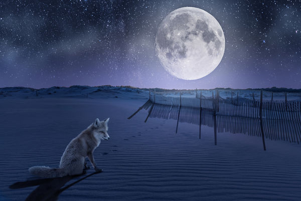
The tedious work of removing the stars work out for the better. It is much more convincing that way. Right here we have foxes that live on a State Park that is part of the Atlantic shoreline. It is a mostly natural area and there are fences like the one you have in this shot. For me, it looks like it could have been shot in my neighborhood and really works well. I think I also prefer the bluer cast.
Erich
Erich
Thanks Erich. I shot the fox and the fence scene in your neighborhood 1 year apart. Island Beach State Park.

Feb 14, 2017 09:41:22 #
magnetoman wrote:
Fantasy doesn't mean you can get away with anythin... (show quote)
How would you suggest making the fence shadow?
Feb 14, 2017 09:40:24 #
trc wrote:
Hi Paul, br br I really like your fantasy image. ... (show quote)
Thank you for the thoughtful comments Tom!
The funny thing is, this was originally a sunset image on the sandy dune with the fence and fox prints already there. When I placed the fox, I put his left front paw in a print that was there and tried to position him to make it look like he just sat down.
Feb 14, 2017 09:36:12 #
trc wrote:
Hi Paul, br br I really like your fantasy image. ... (show quote)
Feb 14, 2017 09:35:41 #
NJFrank wrote:
Terrific way to spend a rainy day. Nice going
Thank you Frank!
Feb 14, 2017 09:35:12 #
donrosshill wrote:
Nice work. I like it. Shows some inner sole feelings.
Thank you kindly!
Feb 13, 2017 16:25:22 #
Linda From Maine wrote:
Fantastic work, Paul. I enjoyed this tremendously.... (show quote)
Thanks Linda!

The only thing that i'm not completely happy with is the shadow of the fence. The fence was part of the original foreground image - not something added to the scene - so I couldn't figure out how to put a shadow in for it. Maybe as I learn more I'll figure it out. I am enjoying getting new use of images that I have in "storage". hahaha
Feb 13, 2017 16:20:55 #
minniev wrote:
I like the bluer version (of course! and thank you for that!) and surely the stars did need to be gathered up and tucked away. Figuring out which textures, overlays, blending modes, selection methods, and brushes to use - what a world of choices! And I'm still exploring all of that.
I like it better with the bluer hue and the stars off the moon too. The choices are endless in PS and so is the learning curve!
Feb 13, 2017 13:13:38 #
OddJobber wrote:
Just noticed this is in FYC so it should have some... (show quote)
Thank you Sir! I'm most appreciative of the fact that you are understanding the intent.
