Posts for: R.G.
Apr 14, 2024 02:04:18 #
ricardo00 wrote:
Would you expect Sandisk to report on the failures of their SSL drives? Don't think this would happen. Instead Sandisk put them on sale. Personally, I respect hearing individuals experiences. I heard about the Sandisk SSL failures first by an individual photographer a couple years ago. Since then, there have been many reports as well as lawsuits filed:
https://arstechnica.com/gadgets/2023/08/lawsuit-takes-western-digital-to-task-over-sandisk-ssds-allegedly-erasing-data/
https://arstechnica.com/gadgets/2023/08/lawsuit-takes-western-digital-to-task-over-sandisk-ssds-allegedly-erasing-data/
This is a quote from the link you provided:-
... "this company has been downplaying the issue for months, all while it continues to sell these drives at a steep discount" ...
Is that the American way?
Apr 13, 2024 13:39:47 #
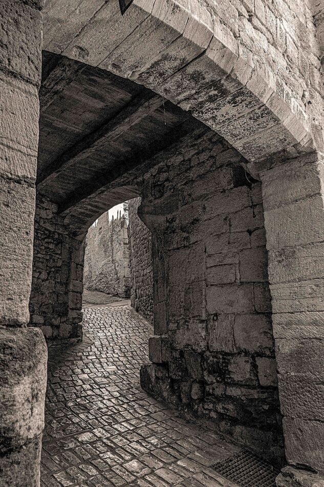
The single face version works better than the two-face version you posted earlier.
Apr 13, 2024 13:35:42 #
Schoee wrote:
... Anecdotes do not equal data
Anecdotal evidence may be on the same level as circumstantial evidence but if it keeps coming it becomes more and more compelling. There's either an issue with the SSDs or the multiple reports of failure are due to bad luck. Which do you think is more likely to be the case?
Apr 13, 2024 13:32:37 #
It might be worth contacting SanDisk. Since it was a failure of their product they might offer to salvage the data for free.
Apr 13, 2024 13:21:17 #
Rongnongno wrote:
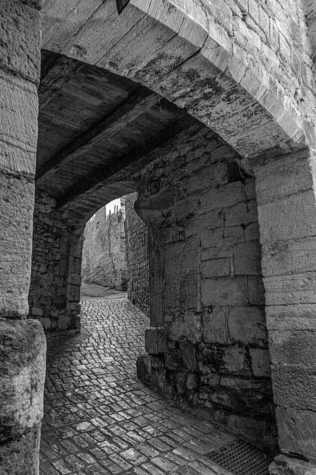
... the input I need is more about the B&W post-processing effectiveness. Too much contrast? Not enough? Area that need dodging and burning?
The contrast in the first three is just about right. You wouldn't want the tunnel part to be much darker and you wouldn't want the bright stonework to be harshly bright. The shine on the cobblestones is a nice touch and you wouldn't want to lose that by suppressing the whites or highlights too much. Having the detail in the tunnel just visible is just about right.
For some reason my exported jpeg has noticeably less contrast than the edited image I had in Lightroom. I don't know how to avoid that so I'll leave it as is. But even with weakened tonal contrast the split toning gives added colour contrast between the darks and the brights, so the loss of tonal contrast isn't as detrimental as it could have been. Even if the tonal contrast was at its limits, split toning is a way to add even more contrast to the image while avoiding unwanted effects with the brightness levels. That works with low levels of tint even to the point where it's close to being subliminal. And with higher levels of tint it can look like a monochrome where sepia or some such is the main tint.
Apr 13, 2024 06:55:55 #
Split toning? Yellow-orange for the highlights and blue-green for the darks. #1 is subtle and meant to be barely noticeable (i.e. still B&W - but still effective?) whereas #2 is less subtle and recognisable as a mixture of tints.
.
.
Apr 12, 2024 13:09:31 #
Are you asking about recreating the softening effect of a shallow DOF on the background? Or getting rid of motion blur or removing softness due to missing focus?
Apr 12, 2024 11:29:36 #
#4.
Apr 10, 2024 01:35:11 #
Using a teleconverter reduces the effectiveness of the aperture. With a 1.4 teleconverter, f/2.8 becomes the equivalent of f/4 and a 2X teleconverter loses another stop on top of that. Plus there's a loss of image quality.
Apr 9, 2024 12:28:06 #
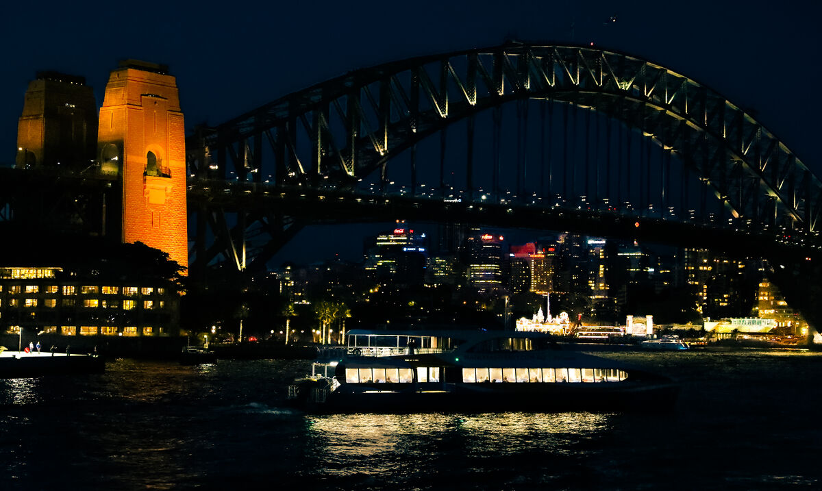
Tried to make good use of the available darkness  .
.
.
..
Apr 8, 2024 12:31:52 #
A thought-provoking discussion. I'd just like to mention one point that hasn't been raised so far. There can be a contrast between ordinary and different. Usually if something (or somebody) is different, it (or they) will stand out and be noticed. I haven't any examples of that because I don't do street photography or even people photography but I can think of many examples I've seen in the past where it was the different thing or person that became the obvious main subject of a photo. Our attention is automatically drawn to what's different and it can be the starting point of any storytelling that's being told by an image.
Apr 8, 2024 12:25:08 #
Strodav wrote:
... The human visual system perceives higher contrast as sharper...
As Linda said, that's an interesting statement, but I have my own take on it. Yes, increasing contrast does increase the perceived sharpness, but I believe that sharpness isn't the determining factor. I believe that vividness is what determines how we perceive a scene and sharpness is just one aspect of vividness. Increased sharpness leads to increased vividness (and the inverse is also true - increased vividness can create an impression of increased sharpness). Contrast is also an aspect of vividness where increasing contrast increases vividness.
The point I'm making is that if you make sharpness an end in itself you're missing the point. Sharpness is relevant only insofar as it enhances vividness. And vividness is something that we may or may not want more of. In fact ofttimes we want less. But in either case vividness is the determining factor and sharpness is just one aspect of vividness. So is tonal contrast. And colour contrast. And textural contrast etc etc.
Apr 8, 2024 01:35:10 #
Good job on the exposure. The petals all stand out.
Apr 7, 2024 05:51:33 #
Apr 6, 2024 01:42:51 #
JZA B1 wrote:
How do you approach composition in your photography?
First I approach it head on, then I try some sideways movements to see how that works out.