Check out True Macro-Photography Forum section of our forum.
Posts for: trc
Mar 15, 2017 08:00:39 #
Ultra-Man wrote:
Just trying out a studio setup with a new reflecting umbrella soft box and a reflector.
Hi Ultra-Man,
I agree that the crop is NOT a problem. I like the good separation of her head, hair, and shoulders from the background. I also think you did a great job with focus and being sharp, and maintaining the texture of her skin - not overdone and real looking. The catch lights appear to be placed well, perhaps raised up just a tad and pointed down to result in the main light more at a 2 O'Clock position?
The large earring could be a bit distracting, but her eyes are very nice. I have not quite decided, fully, if her hair on her chest is too distracting and needs removed or not - Hmmm? Possibly, it might be better if the hair off her camera left shoulder was not there - another question mark for me, but most portraits usually do clean up the stray, fly away type hairs, and women's hair is usually well groomed. Lastly, the one thing I notice right away when i blow up the download on my 27" screen is the very circular, black dot shaped 'spot' looking like it is just above an extended eyelash (like on the tip) on her camera right eye. Is that a beauty mark/dark freckle or a piece of eyeliner or mascara or what? My eyes just go right to it when the download is enlarged, but is not nearly as noticeable in normal viewing mode. Thanks Ultra-Man.
Best Regards,
Tom
Mar 15, 2017 07:36:33 #
I saw on UHH not too long ago - maybe a week or two, I am thinking, where someone posted a shot of a picture of flame on a maroon colored looking liquid in a clear wine type glass, and then I think there was a link that told how to do it - what & how was used to make the flame, etc. It may have had some title involving a a candle, but maybe not!
The flame in the picture/image was actually split - showing like two flames coming from the surface of the liquid in the glass. I have looked and searched, but cannot find the link. I am grasping at straws, but was hoping someone could remember what I am talking about and the post link. My seraching has been unsuccessful, so I have come down to asking everyone if you know what I am talking about. I belong to a local photography club and that is what they said our 'assignment' was for tonight's meeting. Thanks very much.
Best Regards,
Tom Carlson - Tom
trc on UHH
tomcarlson1039@roadrunner.com
Mar 14, 2017 12:56:13 #
Dave Chinn wrote:
Thanks Tom !!! All is well with me, and wish you a... (show quote)
Dave - Thanks for the reply!


I will be anxiously awaiting your next post/rendition/rework.
My Best To You & Yours,
Tom
Check out Commercial and Industrial Photography section of our forum.
Mar 13, 2017 10:09:00 #
Dave Chinn wrote:
While I have had this particular composite concept in mind for a couple of years now, I have not followed through with it until now, and since the proper elements for the concept came into play the other day I decided now was a good time for display. As always, I'm looking and seeking new ideas for various concepts to work with. I chose some slight color for this one, but there will be a B&W version in the works I'm sure. Thoughts and comments are welcomed. FYC
Hi Dave,
Another one of your impressive ideas and imagination. Hope all has been well with you. I love the color, the tones, the textures, and the composition. I am having some difficulty with the difference in sizes of the camera left and camera right boots. I understand that one is closer and the other further away from the viewer, but the size discrepancy just doesn't seem to quite work in my mind - just too much of a difference, perhaps? I have the download brought up on my 27" screen in one tab and going back and forth while writing this. Maybe it is because the camera left boot is broadside and the camera right boot is positioned more directly to the viewer's point of view - more elongated, more inline, or perhaps because it is partially 'under water' in the river? I hope you can see or understand what I am trying to explain.
This is a far cry from our portraiture in Vegas a few years ago? I really love your composition and think you did a wondrous job in PP'ing. I like the cigarette in his mouth and the other trowel in his camera left hand. What do you think about cloning out the white 'object' behind his camera right boot heal? I just find it a little distracting - it may just be me and looking at detail. Also, there is no shadow cast from his camera right boot? I also am wondering about the different directions of the shadows, especially the one that is in the water behind his hand/arm/trowel running toward or from his camera left boot? The lighting seems to be coming from the southeast to the nnw for the theme of the image. These are merely details to think about for the image.
Dave, keep up with those visualizations in your mind, collection of images to develop these composite images, and your progressive skills in post processing and bringing them to life! Truly a nice piece of work, Dave.
Best Regards,
Tom
Mar 11, 2017 18:59:17 #
Mar 7, 2017 19:48:49 #
R.G. wrote:
Thank you Tom. I think you accomplished all that you set out to do. It's totally believable and looks like a well taken shot (something my photography's crying out for ).
PS - Best sky so far IMO.
).PS - Best sky so far IMO.
Ron,
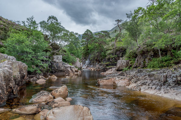
Thank you. Having been to Scotland, I know that it is cloudy a lot with some pretty nifty looking grey skies. I also know that over saturation is usually not necessarily a real image on a cloudy day in Scotland. I have seen some pretty nice looking landscapes with plenty of color, but the color has to meet and match the weather conditions as well, as far as I am concerned.
This just seems to be a well balanced image with the grey overcast sky, some greenery in the foliage, and the bit of coloration in the water in the river/stream. Your eye for a well composed shot, and it's potential, is very experienced and quite accurate. Thanks again, Ron.
Best Regards,
Tom
Mar 7, 2017 14:55:00 #
R.G. wrote:
This is one of my favourite river shots, and I think it could be taken in different directions. It's a merge of bracketed shots, so it should take a bit of pushing and pulling.
The exposure compensation was set to +0.3 so don't feel obliged to go with the brightness levels as posted. And the sky looks blown but there's detail there waiting to be extracted.
I believe we have until Thursday night to post our edits, then voting begins.
-
The exposure compensation was set to +0.3 so don't feel obliged to go with the brightness levels as posted. And the sky looks blown but there's detail there waiting to be extracted.
I believe we have until Thursday night to post our edits, then voting begins.
-
Greetings Ron,
Another one of your beauties, for sure. I just can't seem to pass up the opportunity you present once again. I did it all in PS starting with ACR, using your .dng file, and then progressed from there into PS. I made changes selectively, did not over saturate or make any too drastic a change, for I want to try to maintain the reality of your original image and keep it's beauty as when the image was shot. Thanks again for providing a wonderful opportunity once again!
Best Regards,
Tom
Check out Sports Photography section of our forum.
Mar 7, 2017 07:34:04 #
JohnTxNC wrote:
This photo was captured during the same session as... (show quote)
John,
Yep, first thing I saw was her foot between her legs. Quite distracting. You might have something if you can pose her to get rid of her foot in the shot. Nice try, but 'Take 2' should/will be much better. To be perfectly honest, I didn't even bother looking at the lighting, etc., once I saw the foot.
Best Regards,
Tom
Mar 6, 2017 17:14:29 #
treadwl wrote:
The Milky Way over Big Cypress Preserve.
'Twas a beautiful morning in the Big Cypress Preserve. At 4:30 this morning, no wind, and while a tad chilly, there were NO, absolutely NO mosquitoes.
The Milky Way, blended with the rising sun to create a scene well worth staying up to see.
Please view the download.
Thanks for looking.
Nikon D810, 24-70mm lens at 24mm. 4000 ISO, f2.8, 20 seconds
This is a 10 shot merger. All shots taken in the vertical position.
Larry,
Simply Marvelous in every respect . . . Marvelous!
Best Regards,
Tom
Mar 5, 2017 14:56:31 #
Jim-Pops wrote:
All good questions and I had to go back and look a... (show quote)
Hey Jim,
Thanks for the reply. Possibly a thought . . . to get light to the front of your car, would it be possible to bounce light off a reflector, white foam board easily bought at Walmart or Hobby Lobby, possibly the ceiling with a snoot or grid on a light source or some directional piece of cardboard or such on your light source, or simply bouncing light off a piece of white cardboard (somehow/some way made directional) would most likely work? There are basically several different ways just limited by your imagination and resources. Just food for thought.
Sounds like you may have come upon a small business opportunity to shoot cars for the club members. Just get your setup(s) figured out and tested, and then I would think it would be fairly easy and quick without too much challenging thinking once you get a few under your belt. Maybe?
Best Regards,
Tom
Mar 5, 2017 10:59:14 #
Frank2013 wrote:
Anything here to get more than a quick glance?
Hi Frank,
I will admit, when I first looked at this image, I thought there wasn't much to it and passed on by. Then, I went back to it and started looking at the download. Actually, there is a lot going on in this image. I initially did not like the camera right side with the wall and shadows, but then I realized that it is actually balancing out the bright white of the camera left front facing wall and the walls of the corridor as well as the porches/overhangs of the apartment building in the background. You captured the somewhat tunnel vision of the corridor to the man walking away with the darker walkway and objects in the corridor.
If one further inspects the image, you have captured the detail of the limbs of the background trees as well as the detail of the vertical 'metal tower' camera left foreground, as well as the shadows/lines on the wall and the sign hanging on the wall, camera left, which I really didn't pay any attention to when initially looking at your image.
Hence, Frank, there is a lot to look at in this photograph, once the viewer opens up his/her eyes, and it actually 'says' a lot! Thanks Frank.
Best Regards,
Tom
Check out Bridge Camera Show Case section of our forum.
Mar 5, 2017 10:38:13 #
Jim-Pops wrote:
Shot a red car the other day and posted it. Yester... (show quote)
Hi Jim,
I like your shot and think you did a superb job for such a small space/garage and large object (car). That isn't even mentioning the composite image of all your individual shots!
One of my questions that seems to jump out at me is: How do you account for the off black (red?) parallel 'zones' running on the hood from the windshield about 2/3 down to camera left toward the front of the car? Did you just decide to leave them 'reddish' and not black as the rest of the car, or did you not have lighting properly located or too bright? I honestly don't know and just curious, not criticizing you at all.
My second question is the following: Is the very front of the car/bumper (camera left) grey with a lack of sheen (flat looking paint and not glossy) or simply another phenomenon or result of your lighting scheme, likes, dislikes, and/or objective of your vision of what the final shot was to look like? Once again, not a criticism whatsoever, but merely curiosity looking for your explanation. Thanks very much, Jim.
Best Regards,
Tom
Mar 3, 2017 11:00:49 #
winterrose wrote:
I refer to nightski's thread:- http://www.uglyhedgehog.com/t-444916-1.html#7487006
With nightski's enthusiastic approval member rehess threw out a challenge to me that in order to maintain credibility to my critique I should post a photo that is better than the one she put up in her above thread.
With nightski's enthusiastic approval member rehess threw out a challenge to me that in order to maintain credibility to my critique I should post a photo that is better than the one she put up in her above thread.
Winterrose,
A definite improvement. Very Nicely Done.
Best Regards,
Tom
Feb 18, 2017 09:47:03 #
Haydon wrote:
Big change for me from landscapes, closeup and macro work. Sorry she's not real but cooperative. Real people coming soon. Clam shell lighting with a 43" umbrella. Canon 5DIII 1/160 second 85mm 1.8 @ F5.6 ISO 100. Comments welcome.
Haydon,
I think this is done fairly well. To me it looks like a combination of Clamshell and Broad lighting to a degree with her camera right cheek/face being directed to the camera a tad more than her camera left cheek/face. Possibly rotate the model a little to camera right to cut down on the Broad lighting aspect?
I also noticed that you had used a background light to a degree for separation and I think you did a pretty good job separating her from the background. The only questionable area is her camera left breast down a hair or two - what do your think? I may be nit picking just a tad? Also, I like the shadow you achieved underneath her bottom lip, but turning her a little camera right may even out that shadow for just a little more clamshell lighting. I learned portraiture, initially, using the same mannequin type practice models as well. You are well on your way using two lights and foam core. Is her black top just a little too light coming down the slope of her 'camera right' breast? Just curious - can be fixed in PP'ing as well as easily take care of fly way hair.
Best Regards,
Tom
Feb 14, 2017 09:05:12 #
Hal81 wrote:
On the back roads near my place.
Hal,
I love this old house, the stone walls and foundation, most likely. It goes to show people what could be done with minimal tools and without modern day knowledge. I would say I may have been in Bucks County through the years. My parents were born and raised in Kane (McKean County) which I feel is not all that terribly far away. I also had a grandmother that once lived in Curwensville (Clearfield County) which may even be closer to Bucks County? You wouldn't happen to have a shot of this that isn't quite so tight and shows more of the full frame of the house, stone walls, surroundings, etc.?
Best Regards,
Tom
Check out Advice from the Pros section of our forum.