Posts for: dave sproul
Dec 14, 2013 11:45:31 #
Shakey wrote:
Thank you for the tutorial, Fstop12. I use GIMP but the instructions are easily transferred. Thank you for your patience.
.wrong reference
Dec 14, 2013 11:34:50 #
Graham Smith wrote:
Cambridge.
I like this composition.
Normally I think the white of the signs would detract form the face of the man looking at the camera -- which seems to me to be the point-of-interest.
I came to this conclusion because the pipe on the wall and the sign posts tend to point to the man's face. There also seems to be a funneling effect from the larger (closer) subjects in the to the point-of-interest, and the point-of-interest 'white face" on top of the darker background tends to make it stand out. Additionally the apparent DOF helps the eye to "see" the man's face and ignore the more out of focus areas.
If I were to attempt to do anything to this photo it would be to maybe just slightly darken a little more the faces around the point-of-interest.
Great phot to learn from.
Another 2 cents
Dec 14, 2013 11:12:44 #
Fstop12 wrote:
I didn't spend much time on this but if it were mind I would probably try something like this. It would be a painstakingly time consuming process for me.
Nice. But, what did you do to get this result ??
Opps -- Missed the above response. Thank you .
Dec 9, 2013 12:59:04 #
I seem to learn something from both the verbal and processing analysis / critique postings that are provided by some.
To me it is obviouse when comments get "off-track" and I just tend to sift for the nuggets in the thread.
Thank you again for your time and effort.
To me it is obviouse when comments get "off-track" and I just tend to sift for the nuggets in the thread.
Thank you again for your time and effort.
Dec 9, 2013 12:42:26 #
Dec 5, 2013 08:48:26 #
trc wrote:
Hi Folks, br br I'm thinking this will be OK to p... (show quote)
First, I must state I am slightly color blind of some shades of some colors.
Having said that, I like the red one.
I do think there are a couple of pictures to be found within this one also.
Dec 5, 2013 08:44:15 #
minniev wrote:
Remember those dead water lilies I posted last wee... (show quote)
I like it the way you have presented it. The longer I look at it the more it provides me the feelings of quit, calm, and peace.
Thank you.
Dec 5, 2013 08:36:31 #
Bob Yankle wrote:
Well done! The HDR treatment was subtle and not overblown which is my distinct preference. The color tonations here are excellent.
Well said :thumbup:
Nov 29, 2013 09:41:28 #
I believe:
1. Diversity is needed and required for survival, and
2. The world population excels in the DunningKruger effect, i.e., a cognitive bias in which unskilled people make poor decisions and reach erroneous conclusions, but their incompetence denies them the meta-cognitive ability to appreciate their mistakes.
This seems to be supported by this post, republican & democrat politicians, and a good percentage of the populace in the US and world wide.
Nov 26, 2013 10:48:32 #
chaser48 wrote:
WE should all be worried.......................
I REPEAT
I am a retired (combined Navy & Army) vet.
The president is the CMC (the boss).
I hear your comments, but you provide neither data nor criteria to support your comments. It seems like the typical, rambling discontent dialog I associate with "barracks grumbling" -- a lot of emotion but no substance.
It therefor is difficult to agree or disagree with your comments.
Please help me understand your position.
What are you talking about specifically??
Nov 25, 2013 09:44:36 #
Background:
I am a retired (combined Navy & Army) vet.
The president is the CMC (the boss).
Discussion:
I hear your comments, but you provide neither data nor criteria to support your comments. It seems like the typical, rambling discontent dialog I associate with "barracks grumbling" -- a lot of emotion but no substance.
It therefor is difficult to agree or disagree with your comments.
Request:
Please help me understand your position.
Nov 22, 2013 09:31:43 #
Thank you everyone for your comments. It has helped.
I tend to get in a "rut" or get "brain cramps" sometimes and cannot move on to see the additional possibilities .
This is a great site and topic area for learning & seeing the possibilities.
Thank you again everyone.
I tend to get in a "rut" or get "brain cramps" sometimes and cannot move on to see the additional possibilities .
This is a great site and topic area for learning & seeing the possibilities.
Thank you again everyone.
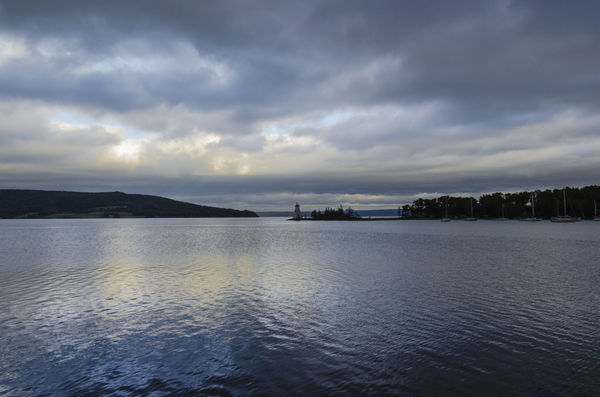
Nov 21, 2013 10:05:10 #
I have been working this for awhile.
I would like some suggestions on how to improve this photo
I think I am to close to it
Thank you for your time and effort
PS -- It is obvious I still do not know what I am doing in this site. Sorry for the mess up.
I would like some suggestions on how to improve this photo
I think I am to close to it
Thank you for your time and effort
PS -- It is obvious I still do not know what I am doing in this site. Sorry for the mess up.
Nov 14, 2013 20:57:26 #
Nov 14, 2013 09:41:25 #
sourdough58 wrote:
Coming home from work last night this was my view in front of my house. Any ideas on how to frame ?
I like the photo 1 better, mostly because of the tree silhouette on the right.
I would then try to bring out some subtile and vague details in the bottom black area -- not a lot, just a little.
Just my opinion