Fall composition
Nov 5, 2018 09:39:57 #

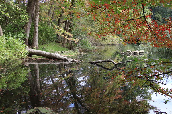
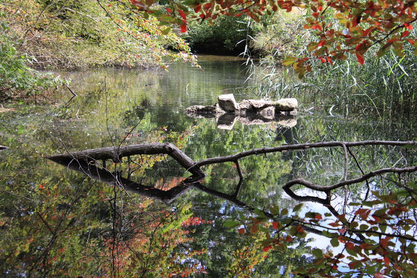
On a beautiful day, I went to Caumsett State Park and found this hidden water feature with the leaves already turning. I can't decide which one has the best composition. Comments on the best and why, would be greatly appreciated or, "none of the above", and why. Thanks.
Nov 5, 2018 09:44:49 #

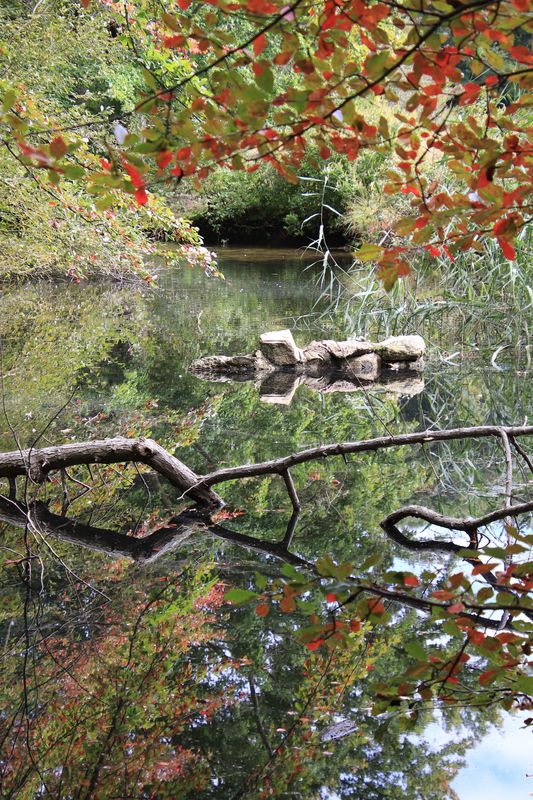
My personal choice is #3. Love the reflections. It has a interesting foreground, middle ground and background. I also like the framing of a portion of the background. My eye finds it very appealing.
Nov 5, 2018 09:58:21 #

I have a personal bias against large portions of the frame being out of focus when in foreground, except perhaps when it's a peek-a-boo kind of thing (bird through forest) and uniformly distributed. All these are quite busy, but probably the last is my favorite. I see the rock first, and then can enjoy looking around at the colors and reflections and also feel the sense of place.
Nov 5, 2018 10:00:04 #
Thank you for your comments. I'm a big reflections fan. Being aware of foreground, middle and back will be helpful when composing.
Nov 5, 2018 10:02:32 #
Nov 5, 2018 10:57:10 #
kenievans
Loc: Dallas
For me, I prefer the first one and the last one. In the others you appear to have multiple subjects fighting for attention. #1 captures the beauty of the reflection and the last one captures the cool rock formation in a colorful setting. Ultimately though it is what makes you happy.
Nov 5, 2018 11:26:32 #
GeorgeK
Loc: NNJ
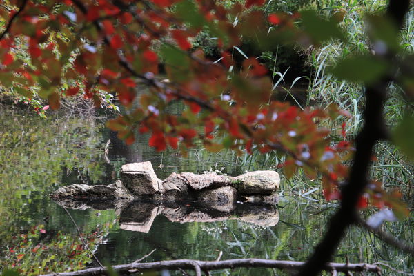
It looks like a lovely park. I look at your photos and, apart from #2, I cannot tell where you want to direct my attention. There are some nice reflections and color but my eyes wander without direction.
Nov 5, 2018 11:26:47 #

taj334 wrote:
On a beautiful day, I went to Caumsett State Park and found this hidden water feature with the leaves already turning. I can't decide which one has the best composition. Comments on the best and why, would be greatly appreciated or, "none of the above", and why. Thanks.
Hi, tam,
## 2 and 4: too much out-of-focus foreground “framing stuff”...too distracting.
#3 things of interest are “stacked up” vertically (bottom to top) reflections, branch, rocks, dark point of disappearance of stream.
##1 and5 are the most pleasing compositions (IMO) in that they provide the naturally appearing depth recessions.
Dave
Nov 5, 2018 12:39:13 #

Number three is the best shot for me. Personally, I’d crop off the bottom just at the top edge of the fallen limb because the photo is too busy for me--it keeps my eye moving around, trying to find the point of interest. the crop would eliminate that problem. In short, it’s just too busy.
Nov 5, 2018 15:00:55 #
Thanks for your input. It is very helpful. I will try to keep in mind "what is the subject" and work from there.
Nov 5, 2018 15:09:59 #
Thanks GeorgeK. You're right. My eyes go all over the place. Thanks for pointing that out.
Thanks Dave. Your critique is spot on. Appreciate your input. I'll try harder to make my "framing" not distracting. A lot to think about. Thanks for helping me out with it.
Thanks Jaymatt. I tried your crop and I agree with you. Looks like I was trying to put everything (but the kitchen sink) in it. Next time I'll try to pick and choose more.
Thanks for all the feedback. It's was very helpful.
And Kennievans. My reply to you went wrong. It went somewhere. I agree, in the end it's my choice, but it's good to have others opinions to help figure out how we see things. Thank you for your input.
Nov 5, 2018 22:16:52 #
taj334, That is a weird looking rock and for that reason I like the second photo best! 

Nov 5, 2018 23:59:30 #
Looks like a scene that needed quiet contemplation prior to taking any shots to determine exactly what you wanted to show.
Nov 6, 2018 06:09:29 #

Only 1 in for me and that's no.1! A good overall pleasing scene. Not that the others are bad (apart from no. 2, the O.O.F. area steals the frame), but no.1 would look good on a calendar and I think that's an easy way to look at it.
Nov 6, 2018 10:49:40 #

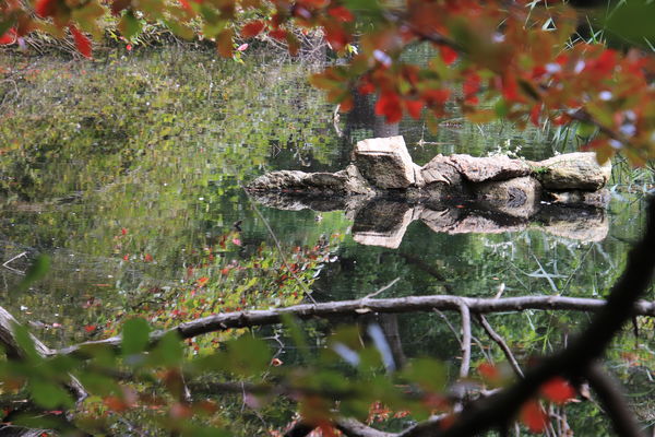
I also like the last one for the composition. The dark area bothers me. I was able to dodge some of the low branches back, but the top of the rocks are blown white.
If you want to reply, then register here. Registration is free and your account is created instantly, so you can post right away.