Need help narrowing my State Fair Entry choices
Jul 27, 2016 06:28:38 #
Jul 27, 2016 07:34:14 #

Jul 27, 2016 07:37:46 #
timspix wrote:
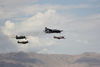
Dear All, br I plan to enter our State Fair Fine A... (show quote)
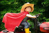
These are all exceptional. I vote for 4 and 3, in that order. Excellent work and as I am fond of saying, I likes dat!
Jul 27, 2016 07:40:33 #
timspix wrote:
Dear All, br I plan to enter our State Fair Fine A... (show quote)
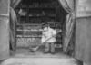
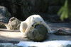
My selection is no. 4. No 3 is good, but only half the flower shows and that begs the question why. No 1 needs more depth of field and no. 2 isn't so interesting as the others. That's my take. I would take another few photos and sort them for your second entry.
Jul 27, 2016 07:50:00 #

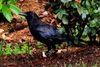
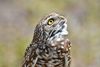
#1 best for impact - in a creepy, shivering way, lol - and for composition. This would get my vote, for sure.
#2 is too common
#3 best for technical. Gorgeous!
#4 is fun, but mostly just right-time/right-place, so no points for creativity.
#2 is too common
#3 best for technical. Gorgeous!
#4 is fun, but mostly just right-time/right-place, so no points for creativity.
Jul 27, 2016 08:02:20 #
Herbie1924
Loc: Woodbury, MN
#4 for sure, but crop 1" from left side to improve the composition. #3 would have been OK if more of the subject was in sharp focus, so you may want to go thru your files
& pick another subject.
Herb
& pick another subject.
Herb
Jul 27, 2016 08:07:07 #
Jul 27, 2016 08:07:50 #

Jul 27, 2016 08:10:50 #
I go with 3 & 4. At 1st glance, I liked #1, but a second look made me decide it looks "incomplete" for lack of a better term. Just sems as though more of the snail should be visible in the frame. Just my own opinion. Good luck!
Jul 27, 2016 08:40:25 #
Jul 27, 2016 08:43:07 #
Jul 27, 2016 08:49:57 #
Jul 27, 2016 08:50:31 #
Jul 27, 2016 09:00:07 #
Jul 27, 2016 09:07:40 #
If you want to reply, then register here. Registration is free and your account is created instantly, so you can post right away.