Stumped
Mar 25, 2012 01:24:41 #
Mar 25, 2012 01:52:35 #

When I first looked I immediately said the color one. Because the stump drew my focus better and seemed to make me want to look longer. Then I started to read the comments and the first one (I think) said something about the green moss drawing away from it. I thought, "What green moss?" scrolled back up and sure enough there it was. So it didn't distract my VERY untrained eye lol
Mar 25, 2012 02:13:08 #

Thanks for all the comments. I am going to play some more with the B/W. The color version can be enhanced a bit, but not easily. The B/W can be tweaked in a number of ways which can mess up the underlying colors, but which don't show at all with the B/W. Like Mike, I like 'em both, too, though with the full images, I found the B/W more dramatic. On a related note, dynamic range, I know that the dark interior of the stump showed more than I can draw out from this one shot. The human eye has a wider range, and adjusts to what you focus on without your being consciously aware of it. Maybe it would be worth lugging a tripod back there and bracketing some shots.
Mar 25, 2012 06:53:48 #

Mar 25, 2012 08:05:23 #

Mar 25, 2012 08:20:52 #

Mar 25, 2012 10:07:10 #

renomike wrote:
I think they are both good, no reason you can't like'em both....;0)
Mike
Mike
Ditto
Mar 25, 2012 12:02:14 #
RMM:
I agree completely with Photogrl57's comment. The color is the better of the two as they are. But, if the black and white had greater contrast(easily done on Photoshop), it might surpass the color pic!
This is a great subject for discussion. Thank you for posting it. It is wonderful to see how people view things differently.
All the best,
Susie Q
RMM wrote:
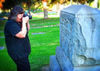
I took this photo of a fallen tree in the woods behind us. I'm loading color and black-and-white versions. Which do you think works better? Or does it make any difference?
Mar 25, 2012 12:31:44 #
senad55verizon.net
Loc: Milford, NJ
I see an issue with this pic that has nothing to do with coloration. It has a problem with dimensionality.
I'm talking about how the distribution of light and shade in a flat image can clearly depict 3 dimensional form and shape. That's what doesn't happen in this image. Actually, the opposite is true.
My mind keeps trying to figure out where everything is. The fibrous tangle at the top of the stump is really confuses the image. It's disorienting.
Anybody else have this problem?
Mar 25, 2012 12:42:33 #
myts10
Loc: SE Ohio
I agree with mooseeys, B&W seems flat to me to. I have to say the shot in color looks better.
Mar 25, 2012 13:58:17 #

Mar 25, 2012 14:18:51 #
friedeye
Loc: Los Angeles
Color. Really nice composition. This is what I consider a true photograph, as opposed to a picture of a stump.
Mar 25, 2012 14:25:17 #

RMM wrote:
I took this photo of a fallen tree in the woods behind us. I'm loading color and black-and-white versions. Which do you think works better? Or does it make any difference?
I'm going to vote for color. Personally I would use the shadows/highlights button in Photoshop and decrease the shadow slightly. It doesn't affect the main part of the picture, but it opens the tunnel that has rotted out in the center of the log far enough that your eyes are drawn to the center of the picture wondering what could be hiding in the hole. It gives the center of the log a third dimension feel!
Swede
Mar 25, 2012 16:00:41 #

RMM wrote:
the large black hole in the center is a distraction in both compositions {for me} the eye is drawn to the center nothingness - - how about a slave flash down low to light up the inside of the tree trunk ??I took this photo of a fallen tree in the woods behind us.
Mar 25, 2012 18:37:51 #

RMM wrote:
I took this photo of a fallen tree in the woods behind us. I'm loading color and black-and-white versions. Which do you think works better? Or does it make any difference?
This is one of those pics where I like both, just different reasons. The little color in the color version captures my attention due to the difference between the B&W and color portions. Nice composition. The B&W captures my attention because color does not get in the way of the textures, lines and starkness of the composition.
Very nicely done.
If you want to reply, then register here. Registration is free and your account is created instantly, so you can post right away.