Mist and Fog in the Morning
Nov 2, 2023 07:31:19 #

Nov 2, 2023 08:23:14 #
Nov 2, 2023 08:45:24 #

Curmudgeon wrote:
Thanks very much, Jack.Beautiful work Linda. It reminds me of many mornings when I was young, sitting in a duck blind waiting for those birds to fly toward me. Ah, better more innocent times
Nov 2, 2023 08:45:46 #
photophile wrote:
Thanks Karin. Glad you enjoyed!Very nice indeed.
Nov 2, 2023 08:45:57 #
Nov 2, 2023 08:52:42 #
magnetoman wrote:
Thank you very much for your detailed assessment, Dave. I often change my mind about images after editing, and of course often have two or more versions I like nearly equally I’m not going to be popular - but I just don’t lik... (show quote)

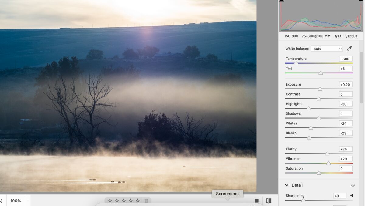
Here is what the original looks like after a few tweaks in the raw editor. I'll put this one in my folder of "reconsider what you did" for the upcoming cold and gray winter days.
I greatly appreciate your time and interest.
Nov 2, 2023 08:54:06 #
Nov 2, 2023 08:54:31 #
dpullum wrote:
Much appreciated, Don. It was below 30 degrees, so I kept the car running Indeed a beautiful mystic morning mood setter for warm coffee from the thermos as one waits for a good shot of the sunrise and hill in the background. Great photo 
Nov 2, 2023 08:56:14 #
NJFrank wrote:
Thanks Frank. I do enjoy the light shows!Wonderful capture. Good time to be out with your camera.
Nov 2, 2023 09:46:06 #

This is lovely. The colours are wonderful. I really like how the lightness of the fog makes the silhouette of the trees stand out. For me, it makes them the focal point of the image. I probably wouldn't have noticed the ducks if you hadn't mentioned them. But they do add interest to the water portion of the image.
Nov 2, 2023 10:59:43 #
AzPicLady wrote:
Thank you, Kathy. I'm very pleased it appeals to you!This is lovely. The colours are wonderful. I really like how the lightness of the fog makes the silhouette of the trees stand out. For me, it makes them the focal point of the image. I probably wouldn't have noticed the ducks if you hadn't mentioned them. But they do add interest to the water portion of the image.
Nov 2, 2023 12:55:42 #

Now, there's an artistic shot! Great subject matter and layers that complement each other well.
Enjoyed, Linda, enjoyed!
Enjoyed, Linda, enjoyed!
Nov 2, 2023 12:57:13 #
jaymatt wrote:
I'm delighted by your enthusiastic response, John. Thank you!Now, there's an artistic shot! Great subject matter and layers that complement each other well.
Enjoyed, Linda, enjoyed!
Enjoyed, Linda, enjoyed!
Nov 2, 2023 13:08:50 #

magnetoman wrote:
I’m not going to be popular - but I just don’t lik... (show quote)
I agree that the brightness in the water is a little overwhelming, but why not just bring that down a bit ... or two or four, and maybe add a bit of red? Why delete such a lovely layer?
Nov 2, 2023 13:13:53 #
Linda From Maine wrote:
The backlighting was yummy. Primary edit is Topaz Studio 2 filter, "Swirly strokes" at 30 percent opacity. Feedback welcomed!
btw, those durned ducks wouldn't lift their heads; they were too busy skimming the water for breakfast
btw, those durned ducks wouldn't lift their heads; they were too busy skimming the water for breakfast
Love it. Very nice moody and dramatic image.
If you want to reply, then register here. Registration is free and your account is created instantly, so you can post right away.