Critique Please
Oct 25, 2011 01:02:46 #

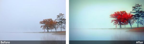
I think this is a great photo. I would bring more of the color into it though, and crop it just a bit....
Oct 25, 2011 01:49:51 #

SladeCalhoun wrote:
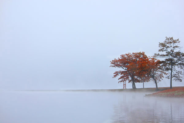
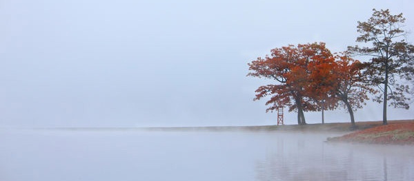
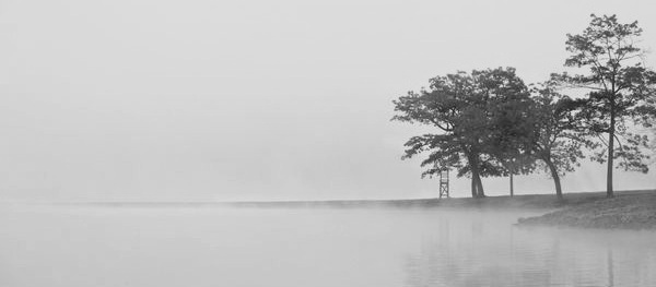
I took this shot on a very foggy morning over the weekend. Since catching leaf reflections on the mist covered water was out of the question I had to shift gears and try something different. I considered removing the lifeguard chair, but that's a little more invasive than I prefer. I'd love to get some feedback on this one as I am just not sure how I feel about it.
Very nice! I really like the peacefulness it brings!
I cropped it a bit though. I also took out the chair everyone wanted gone but was quick to put it back! It just took way to much away from the photograph. Thanks for sharing and happy shooting!
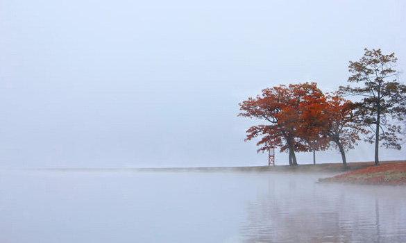
original
Cropped
Oct 25, 2011 08:28:08 #
nikondaddy
Loc: Mayfield,Kentucky
The composition with the tree leaves too much empy space for the eye to wander this looksl like a pan shot stoppin in mid pan. The fog is interesting.
Oct 25, 2011 10:42:06 #
I love the shot as is, the Life guard chair gives the photo a feeling of FINALITY, the Summers over. Leaving cropped tree at right also gives feeling of ABRUPT ending, VRS continuing the flow.
Oct 25, 2011 11:24:58 #
I'd turn it into a long panoramic; crop out much of the sky and keep the entire center and land spit!
Oct 25, 2011 11:40:07 #
Oct 25, 2011 11:43:04 #
I agree. The subject is not the tree. It's the fog encroaching on the tree!
The cool thing about this pic is it's interesting. That why you get so many opinions. It's all in the subject. I agree with removing the tower as
well. I bet this shot would look
great blown up and framed. I still would like to
see it in b&w
Russ
The cool thing about this pic is it's interesting. That why you get so many opinions. It's all in the subject. I agree with removing the tower as
well. I bet this shot would look
great blown up and framed. I still would like to
see it in b&w
Russ
Oct 25, 2011 11:45:53 #
Shot has an other worldly feeling that I would enhance by cropping down to eliminate some sky but keep the full width as I like the way the line of land trails out into the fog.
Chair is fine.
I might underexpose 1/2 to 1 stop to see if the slightly darker effect works to bring out the spooky feel.
Chair is fine.
I might underexpose 1/2 to 1 stop to see if the slightly darker effect works to bring out the spooky feel.
Oct 25, 2011 11:49:16 #
Jaded Edge wrote:
I think this is a great photo. I would bring more of the color into it though, and crop it just a bit....
Sorry, jade Edge, but I do not prefer your treatment especially the vignetting. Popping the color is sometimes a great approach but for me, the mood here is more subdued and I would stick to the original colors with a tad under exposure to darken a bit.
:-P :-P :-P
Oct 25, 2011 13:00:17 #

Slade,
This has been a difficult one for me. I keep coming back, checking out the other people's changes. . .and after all is said and done - your original it the winner! To crop anything off of the left spoils the effect of the "spit" going away cleanly into the mist. Also, I would not crop anything off of the right, nor the bottom. While there were a couple of suggested adjustment that brought out more of the color, these also lost the original tone and temp. mood of your image.
If you do not already have any business cards for your photography. . .you certainly do now. A slight crop off of the top to get into the correct aspect ratio for a business card, and then add your text in the wonderful open area on the left. Keep it clean and subtle, and you will have killer business card that will work for you. I would suggest a font that is easy to read when small, and the font could be a color that picks up and enhances the image color.
Your original is plum perfect to me.
Oct 25, 2011 13:32:58 #
mooseeyes wrote:
If you do not already have any business cards for your photography. . .you certainly do now. A slight crop off of the top to get into the correct aspect ratio for a business card, and then add your text in the wonderful open area on the left. Keep it clean and subtle, and you will have killer business card that will work for you. I would suggest a font that is easy to read when small, and the font could be a color that picks up and enhances the image color.
Mooseeyes.... Great idea... That's one thing I like about this forum, everyone is helpful and very friendly with advice. A lot of us would have never thought of doing that.
Even if your not in business, it would make a great personal card to give out with just your name and phone number on it.
Oct 25, 2011 13:48:25 #
it would be interesting if the lifegaurd stand were more out on the point, i like it in jsut the same
Oct 25, 2011 14:25:51 #
Oct 25, 2011 14:38:45 #

I like the panoramic approach.....the original is great....For me the more I look at it ,the better I like it
Oct 25, 2011 14:52:04 #
By the way, I love the photo; such great mood to it! I also played with B&W but color looks loveliest!
B&W
If you want to reply, then register here. Registration is free and your account is created instantly, so you can post right away.