Check out Commercial and Industrial Photography section of our forum.
Portrait or landscape?
Jan 7, 2023 12:46:05 #
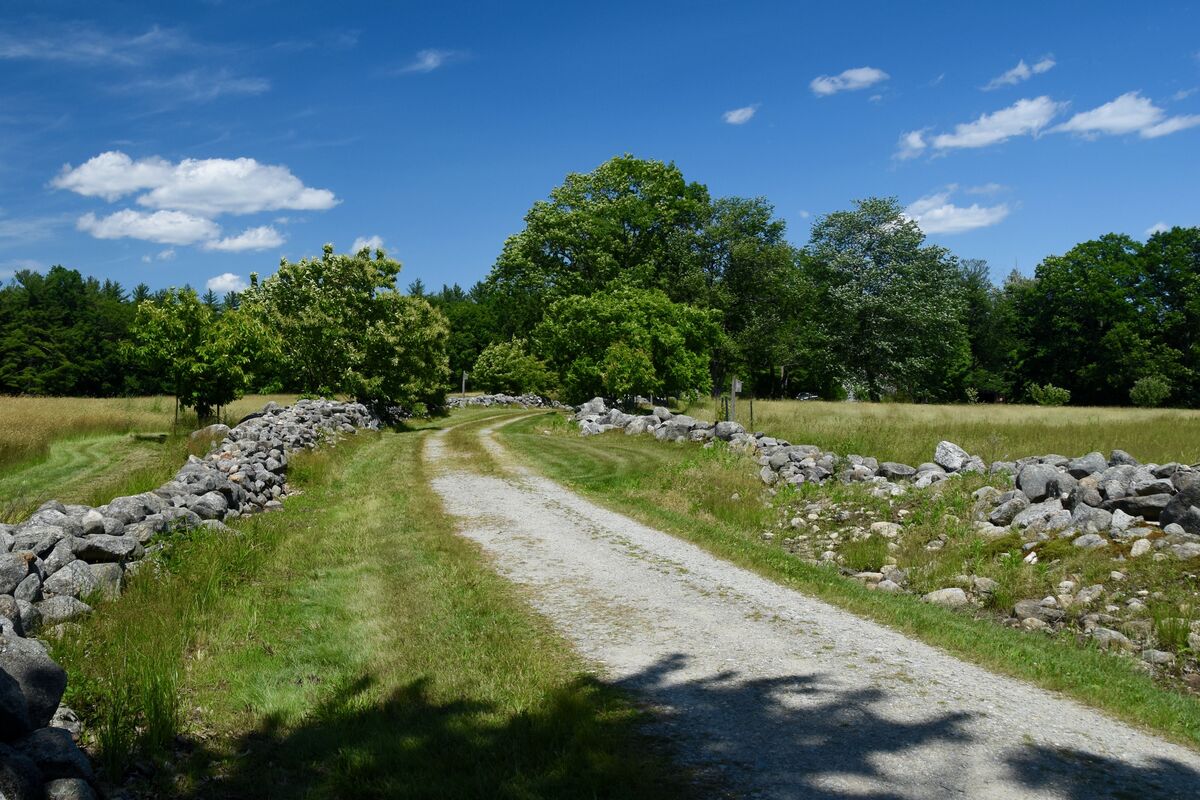
revised..For portrate, it needed to be shot differently. This is the best I could do with your original photo. I would have moved the road edge to the right corner of the frame. Included more rock fence on the left and not cut off the tree tops. But not had so much sky. Maybe lowered my perspective so that the road foreground was leading more. But That's just me. Going from Landscape to Portrait is more than just turning the camera vertical.

Jan 7, 2023 14:33:58 #
Jan 7, 2023 14:41:53 #

Wanderer2 wrote:
I prefer the landscape version. Cropping out the shadow in the extreme foreground might make it better to my eye.
I agree with this comment, and for me I'd level the the "horizon."
Check out Bridge Camera Show Case section of our forum.
Jan 7, 2023 14:47:05 #
I prefer the portrait although the composition is meh. What would really set it off if there were a person walking in the distance so the the road and rock walls lead to the person. Just a thought
Jan 7, 2023 14:50:58 #
TheShoe
Loc: Lacey, WA
jimvanells wrote:
IMHO, the landscape has more of sense of place. The portrait shows just a gravel road into the woods.
 Agree
AgreeJan 7, 2023 15:32:19 #
petrochemist
Loc: UK
If there was a person on a bike in the foreground the portrait version might be better, but otherwise the landscape wins hands down
Jan 7, 2023 15:38:13 #

ORpilot wrote:
revised..For portrate, it needed to be shot differently. This is the best I could do with your original photo. I would have moved the road edge to the right corner of the frame. Included more rock fence on the left and not cut off the tree tops. But not had so much sky. Maybe lowered my perspective so that the road foreground was leading more. But That's just me. Going from Landscape to Portrait is more than just turning the camera vertical.
I love it the way it sits here 💚💙💚💙💚
Check out Travel Photography - Tips and More section of our forum.
Jan 7, 2023 15:56:43 #
OldSchool-WI
Loc: Brandon, Wisconsin 53919
camerapapi wrote:
Landscapes look better in the square format. At ti... (show quote)
____________________________________(reply)
Composition should not be a set of rules, although rules might help to get to the starting point. But the composition should maximize interest and complexity, but still provide thematic focus. Color is part of composition as anything which moves the eye focus is composition. Whether in graphics or fiction writing or sound music---it is all with the same goals, that of heightening the artistic experience. Therefore we come back to common sense an a type of eye or ear and then mental mechanics.-----------ew
Jan 7, 2023 17:09:20 #

camerapapi wrote:
Landscapes look better in the square format. At ti... (show quote)
Yes - and I also use 4/3 format for landscapes.

Jan 7, 2023 17:11:22 #
Jan 7, 2023 18:39:14 #
OldSchool-WI
Loc: Brandon, Wisconsin 53919
______________________(reply to aspect and crop questions)
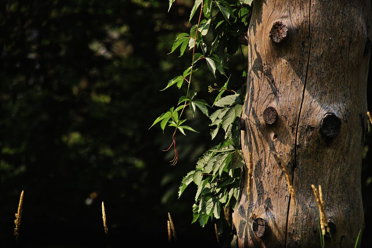
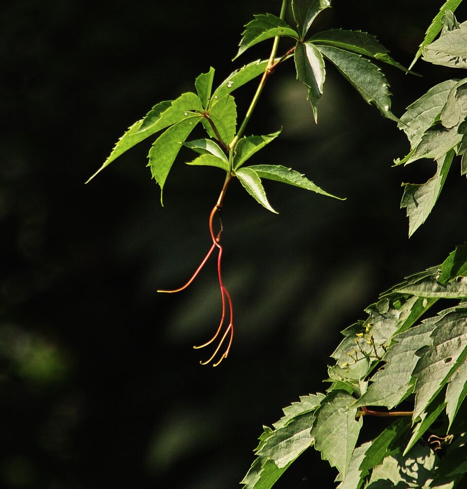
Here is an example of what cropping and an eye to composition can do to a photo.l I have posted the full image of nothing more than a dead spruce tree and some vine leaves. The overall photo has a number of focal points but no continuity of thought or composition.
Now hit your enlargement plus (+) button and keep enlarging until you have only the leaves and the flower part in the photo and see what composition does. (attached photo)
Check out Infrared Photography section of our forum.
Jan 7, 2023 19:06:23 #
OldSchool-WI
Loc: Brandon, Wisconsin 53919
OldSchool-WI wrote:
______________________(reply to aspect and crop qu... (show quote)
_____________________________(P.S. Reply)
My cropped and the original photos shows that you can make an interesting photo practically anywhere and about practically anything. The original here was taken out a window while testing equipment new to me. I was just testing focus on the knots in the dead tree.-----------------ew
Jan 7, 2023 20:53:47 #

Jan 7, 2023 21:28:18 #
zug55
Loc: Naivasha, Kenya, and Austin, Texas
Yesterday, I sent this from my cell phone during a long layover at Amsterdam airport:
"Landscape. First, level the image. Crop it on the left--this will put the focus on the curvature of the road. Also crop it on top--you know, the two-thirds thing--and maybe the bottom a little too."
I am attaching a version of what I had in mind.
"Landscape. First, level the image. Crop it on the left--this will put the focus on the curvature of the road. Also crop it on top--you know, the two-thirds thing--and maybe the bottom a little too."
I am attaching a version of what I had in mind.
Jan 8, 2023 03:23:28 #
If you want to reply, then register here. Registration is free and your account is created instantly, so you can post right away.