Dealing with similar tones in a black and white conversion
Aug 30, 2022 07:59:05 #

camerapapi wrote:
Good to hear from you, William. Many thanks!I like your original image Linda. It has great tonalities and the subject is a very good one for the b&w treatment. I usually convert with Affinity Photo or Topaz B&W Effects 2.
In regard to using contrast, in my humble opinion, many images require it. Some people do not like contrast with their b&w images. I tend to add contrast as needed per my taste.
It is a very nice image.
In regard to using contrast, in my humble opinion, many images require it. Some people do not like contrast with their b&w images. I tend to add contrast as needed per my taste.
It is a very nice image.
Aug 30, 2022 08:01:10 #
selmslie wrote:
Thank you very much, Scotty. I believe your solution is similar to Rongnongno's?There is no reason to get rid of anything in the image.
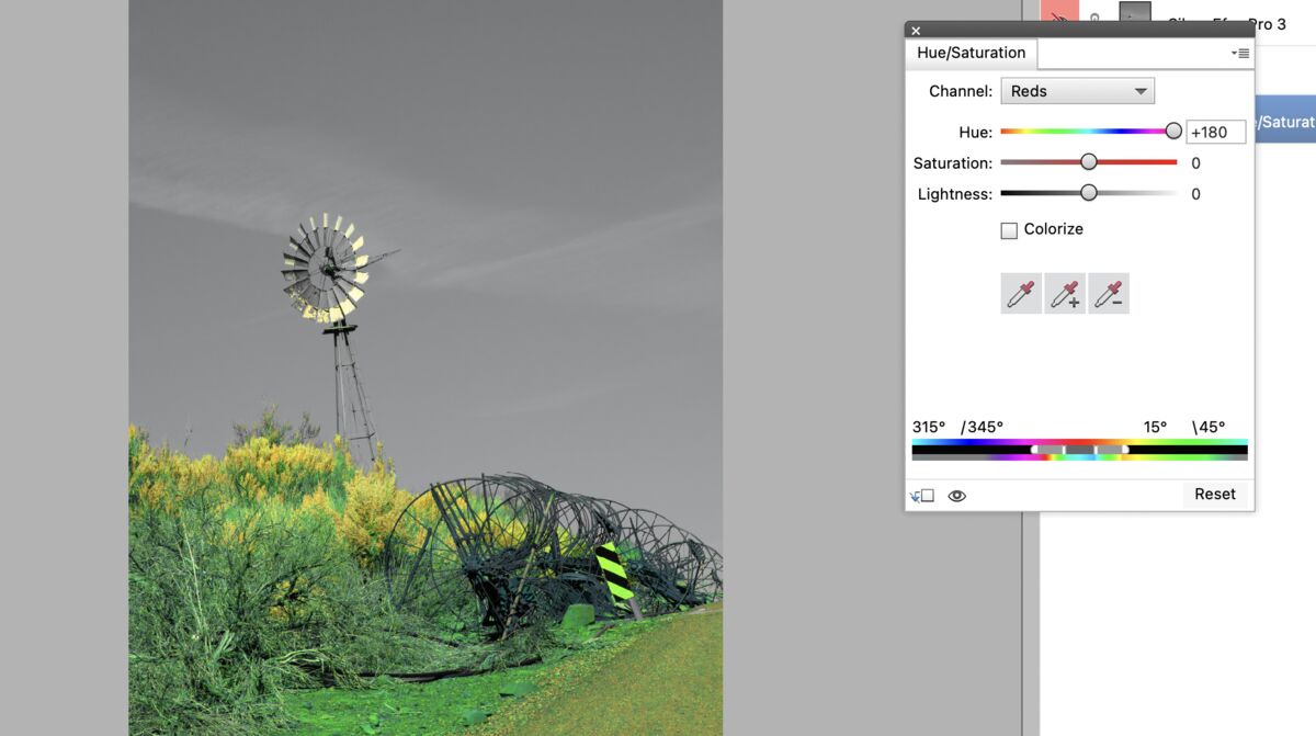
A simple conversion in Capture One (boosting red and yellow, darkening blue and cyan) keeps everything in place. Bringing the highlights up on the blades also helps.
Leveling to make the windmill vertical is optional but it removes some irrelevant rubble.
A simple conversion in Capture One (boosting red and yellow, darkening blue and cyan) keeps everything in place. Bringing the highlights up on the blades also helps.
Leveling to make the windmill vertical is optional but it removes some irrelevant rubble.
Lots of detail, less drama - I truly love how many ways one can pp for black and white!
Aug 30, 2022 08:16:57 #

Aug 30, 2022 08:18:55 #
dpullum wrote:
Thanks Don. I've been using Nik Silver Efex off and on since around 2014, and bought DxO's newest version a couple of months ago. It has a daunting number of presets and sliders; I just have to learn how to use them better Keep life simple and use Topaz B&W-2 many presets many sliders.

Aug 30, 2022 11:02:01 #

It all depends on what sort of B&W look you're after. The presets seem to lean towards quite a stark look but I prefer my B&W to have its strength in the mid tones and shadows. My edit is mostly the Tones sliders plus Contrast and Clarity, and where that didn't do what I was hoping for I made various selections to add more contrast, lift the shadows or whatever.
I'm not sure which similar tones you're referring to in the title, but the usual way to deal with that is to use the sliders that determine how each colour is converted. Using them I was able to darken the sky without having to select it and could add contrast to the vegetation on the left. Aqua affects the sky but large shifts in its luminance caused a grainy look that I didn't care for so I moderated that adjustment. The stark look of the presets could be easily achieved by lifting the Highlights (if that's what was preferred).
.

Aug 30, 2022 11:10:35 #
R.G. wrote:
Thanks very much, R.G. I believe that you, Rongnongno and selmsie are speaking of the same tip re individual color sliders?It all depends on what sort of B&W look you're... (show quote)
I used what was available in PS Elements for color channels and found it to be simple and satisfying when combined with the neutral b&w preset in Nik Silver Efex. Then I used Topaz Studio 2 for tweaks such as clarity, contrast, dehaze etc. Here is the result from those edits, along with a slight crop of sky.
As you and others have mentioned, the final result is personal taste and in my case can be multiple "likes"

Thanks again.

Aug 30, 2022 11:21:46 #
To my eye that last one is the most likeable of the brighter versions.
Slightly off topic, another trick with B&W is to use split toning to add some contrast without suffering the consequences of over-pushing the Contrast slider. With the right choice of colours it's possible to give it an overall tint such as sepia or cyan. If contrast is the main objective you can use complementary colours for the highlights and shadows, but a very subtle effect can be achieved by using a smaller difference between the two colours - for example yellow-orange for the highlights and red-orange for the shadows. With some colours it gives the image a metallic look.
Slightly off topic, another trick with B&W is to use split toning to add some contrast without suffering the consequences of over-pushing the Contrast slider. With the right choice of colours it's possible to give it an overall tint such as sepia or cyan. If contrast is the main objective you can use complementary colours for the highlights and shadows, but a very subtle effect can be achieved by using a smaller difference between the two colours - for example yellow-orange for the highlights and red-orange for the shadows. With some colours it gives the image a metallic look.
Aug 30, 2022 11:50:34 #

Linda From Maine wrote:
Thank you very much, Scotty. I believe your solution is similar to Rongnongno's?
Lots of detail, less drama - I truly love how many ways one can pp for black and white!
Lots of detail, less drama - I truly love how many ways one can pp for black and white!
Similar but more direct.
Other than leveling, the only adjustments were in the B&W conversion step and in the Levels tool setting the upper and lower range of brightness. It took less than two minutes.

The image is good enough to start with that I see no point in torturing it with complicated post processing.
I would not dream of replacing the sky because it would take our attention away from the windmill and simple clouds.
Aug 30, 2022 12:44:15 #
Aug 30, 2022 12:46:52 #
Thank you Scotty. I prefer the blacker wheels of mine, though probably not quite so black I also like my two-toned sagebrush, but both these choices are probably more about what I see in reality than any other reason.
I also like my two-toned sagebrush, but both these choices are probably more about what I see in reality than any other reason. selmslie wrote:
Similar but more direct. br br Other than level... (show quote)
Aug 30, 2022 15:42:42 #
After seeing all the different versions I like the first one you did Linda. I prefer the tips of the plants NOT to be blown out. I would prefer the sky to be just a bit brighter.
I did this edit using Nix's Silver Efex Pro 2. Next brought it into photoshop, could be Lightroom, lowered the highlights a little, increased brightness, increased contrast a bit. All small moves. On my computer lights are a bit whiter and black a bit blacker. 🤔
I don't mine is better than yours Linda just what I came up with to see how I would respond to your original post.
Good Job Linda,
Jim

Aug 30, 2022 17:59:27 #
Jim-Pops wrote:
Thanks for your time, Jim! Did you use the "neutral" preset in Nik? And, if yes, did you adjust any sliders while in that plug-in?After seeing all the different versions I like the... (show quote)
Aug 30, 2022 18:28:18 #
Linda From Maine wrote:
Thanks for your time, Jim! Did you use the "neutral" preset in Nik? And, if yes, did you adjust any sliders while in that plug-in?
I used the Preset "Modern" - *016 Full Dynamic
Moved Midtone slider to about -11
Set Shadows to about -24
Aug 31, 2022 07:31:57 #
Jim-Pops wrote:
OK, great to know, thank you!I used the Preset "Modern" - *016 Full Dynamic
Moved Midtone slider to about -11
Set Shadows to about -24
Moved Midtone slider to about -11
Set Shadows to about -24
Aug 31, 2022 10:38:08 #

The lighting on the windmill catches my attention so much that I really didn't notice the sign until it was mentioned. I really like the composition. Great work.
If you want to reply, then register here. Registration is free and your account is created instantly, so you can post right away.