Dealing with similar tones in a black and white conversion
Aug 29, 2022 16:49:01 #

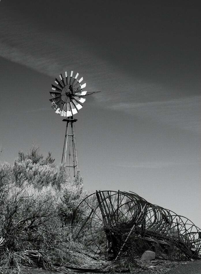
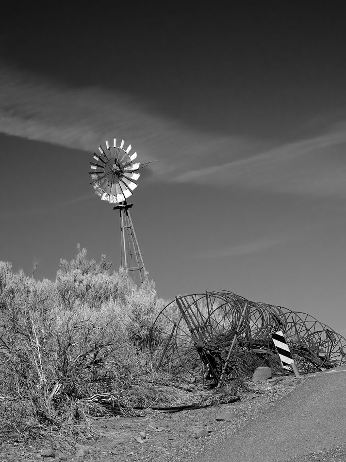
#1 is what I came up with. #2 is the raw file for you to work on. I use PS Elements, and also worked some in Topaz Studio 2 for this. I hadn't noticed until today that PSE 2022 (I purchased last month) has Adobe presets for black and white in the raw editor. I started with that, and also did some dodging + a Nik Color Efex "graduated ND lighten" filter.
Thanks for any advice, tips or your own vision for this shot.
Thanks for any advice, tips or your own vision for this shot.
Aug 29, 2022 17:11:04 #
Thanks for the tip about the Adobe presets including B & W Linda.
I like the way you've treated this, but after looking at the original colour version, I wonder if a smidgen more contrast in the B&W version might give it a little more... 'pop'.
I guess its just a matter of personal preference.
But as I say, its still a 'yes' from me as is.
Regards
I like the way you've treated this, but after looking at the original colour version, I wonder if a smidgen more contrast in the B&W version might give it a little more... 'pop'.
I guess its just a matter of personal preference.
But as I say, its still a 'yes' from me as is.
Regards
Aug 29, 2022 17:22:50 #
TonyP wrote:
Thank you Tony. I have now discovered there's more than one preset to choose from Thanks for the tip about the Adobe presets including B & W Linda.
I like the way you've treated this, but after looking at the original colour version, I wonder if a smidgen more contrast in the B&W version might give it a little more... 'pop'.
I guess its just a matter of personal preference.
But as I say, its still a 'yes' from me as is.
Regards
I like the way you've treated this, but after looking at the original colour version, I wonder if a smidgen more contrast in the B&W version might give it a little more... 'pop'.
I guess its just a matter of personal preference.
But as I say, its still a 'yes' from me as is.
Regards
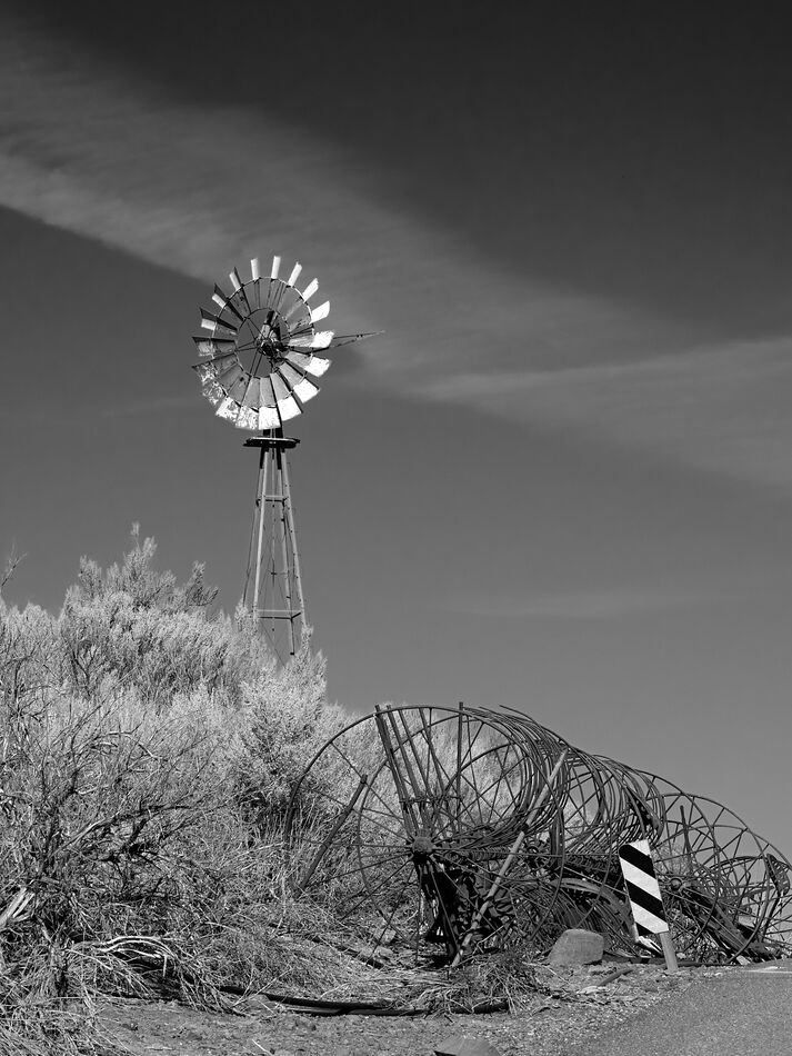
 Here's a new version that, after preset 04, I made brightness/contrast adjustments, as well as levels. But no tweaks to clarity or additional sharpening.
You'll note I didn't deal with the warning sign yet. For the effort it takes to clone out, I may grow to love it - or I'll add a really big jackrabbit

Aug 29, 2022 18:25:14 #
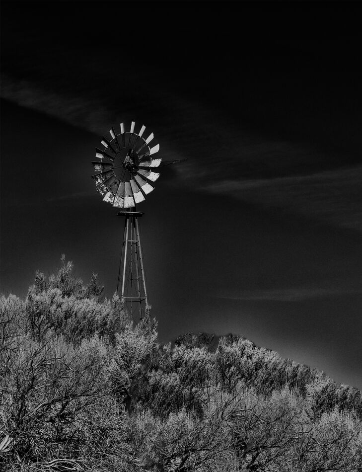
When I opened the picture the first object I saw was the windmill. "Ah ha" I said, a cool picture of a windmill. My next thought was what's all that clutter on the bottom right and that road sign, ugh, that's got to go. Then, as you know I tend toward darker pictures, and I thought "I can do something about all the unnecessary brightness." So I did.
I look forward to what I did to your picture Linda
I look forward to what I did to your picture Linda
Aug 29, 2022 18:39:45 #
Linda From Maine wrote:
Thank you Tony. I have now discovered there's more... (show quote)
For me, perfect Linda. And id leave the signage etc and the wire etc. Adds context or something imo.

Aug 29, 2022 19:10:27 #

Linda From Maine wrote:
#1 is what I came up with. #2 is the raw file for you to work on. I use PS Elements, and also worked some in Topaz Studio 2 for this. I hadn't noticed until today that PSE 2022 (I purchased last month) has Adobe presets for black and white in the raw editor. I started with that, and also did some dodging + a Nik Color Efex "graduated ND lighten" filter.
Thanks for any advice, tips or your own vision for this shot.
Thanks for any advice, tips or your own vision for this shot.
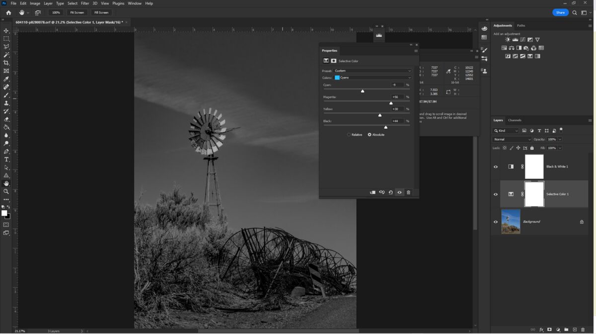
The key here is to understand that RGB color have a grey value that can be identical to each other, which creates the 'similar tones'.
You can use ACR or adobe B&W conversion, but they fall short of the task in my opinion.
The best bet is to get the raw set correctly in color as close as possible.
Then import it into your program, add two layers, first the selective color then the B&W color. I hope PSP has the color adjustment layer (I use PS CC).
From the color adjustment layer you can pick any color and R, G, B, C, M, Y and Global luminosity.
In whatever color you select you can adjust the C, M, Y, K and luminosity for that specific color. Then and only then, adjust the B&W layer, if needed.
If you used a colored filter as I try to make folks aware of, when using raw, do not adjust the color, that is an error. Do the rest though, Optical, details (sharpness and color noise reduction), exposure and yes, dehaze too. The one should proceed as above.
(Comment: This is a great picture to add a new sky for drama)
Aug 29, 2022 21:53:34 #

Nice photo, Linda!! I like your pp work and I really like the composition!!
Dodie
Dodie
Aug 30, 2022 01:12:31 #
Linda From Maine wrote:
#1 is what I came up with. #2 is the raw file for you to work on. I use PS Elements, and also worked some in Topaz Studio 2 for this. I hadn't noticed until today that PSE 2022 (I purchased last month) has Adobe presets for black and white in the raw editor. I started with that, and also did some dodging + a Nik Color Efex "graduated ND lighten" filter.
Thanks for any advice, tips or your own vision for this shot.
Thanks for any advice, tips or your own vision for this shot.
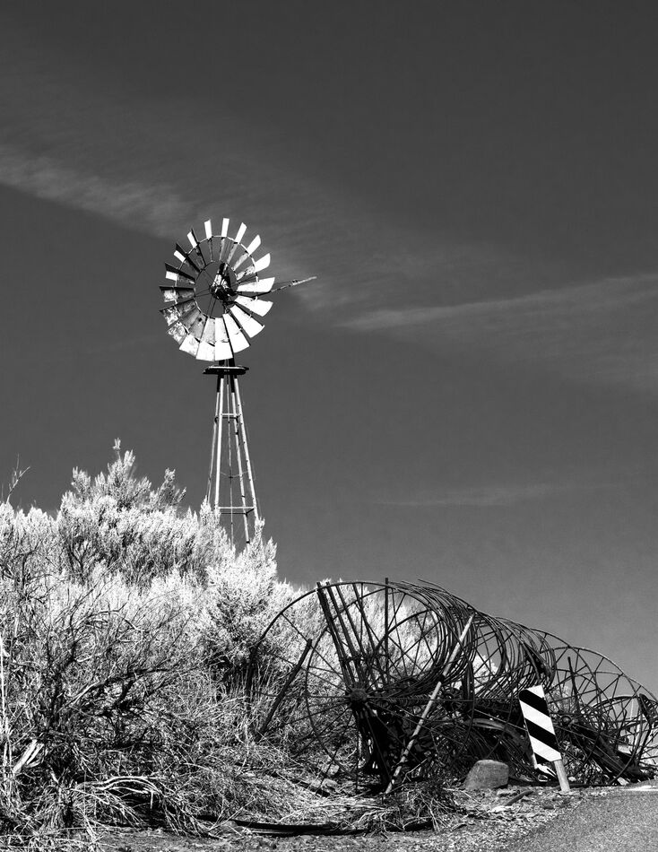
Crop the image above the cloud band, the negative space adds nothing to the image. On the farm implement, put a radial filter and open up shadows to reveal the hidden detail.
Aug 30, 2022 06:43:46 #

I like your original image Linda. It has great tonalities and the subject is a very good one for the b&w treatment. I usually convert with Affinity Photo or Topaz B&W Effects 2.
In regard to using contrast, in my humble opinion, many images require it. Some people do not like contrast with their b&w images. I tend to add contrast as needed per my taste.
It is a very nice image.
In regard to using contrast, in my humble opinion, many images require it. Some people do not like contrast with their b&w images. I tend to add contrast as needed per my taste.
It is a very nice image.
Aug 30, 2022 07:03:12 #

Linda From Maine wrote:
#1 is what I came up with. #2 is the raw file for you to work on. I use PS Elements, and also worked some in Topaz Studio 2 for this. I hadn't noticed until today that PSE 2022 (I purchased last month) has Adobe presets for black and white in the raw editor. I started with that, and also did some dodging + a Nik Color Efex "graduated ND lighten" filter.
Thanks for any advice, tips or your own vision for this shot.
Thanks for any advice, tips or your own vision for this shot.
There is no reason to get rid of anything in the image.
A simple conversion in Capture One (boosting red and yellow, darkening blue and cyan) keeps everything in place. Bringing the highlights up on the blades also helps.
Leveling to make the windmill vertical is optional but it removes some irrelevant rubble.
Aug 30, 2022 07:47:12 #
Curmudgeon wrote:
That's a fun and dramatic rendition, Jack. I don't miss the metal wheels as much as I would have expected When I opened the picture the first object I saw was the windmill. "Ah ha" I said, a cool picture of a windmill. My next thought was what's all that clutter on the bottom right and that road sign, ugh, that's got to go. Then, as you know I tend toward darker pictures, and I thought "I can do something about all the unnecessary brightness." So I did.
I look forward to what I did to your picture Linda
I look forward to what I did to your picture Linda
 I appreciate your time and interest!
Aug 30, 2022 07:48:23 #
TonyP wrote:
Thanks so much, Tony!For me, perfect Linda. And id leave the signage etc and the wire etc. Adds context or something imo.
Aug 30, 2022 07:53:37 #
Rongnongno wrote:
Excellent information, Jacques, thank you! I don't think I have exactly the right tools, but let me double check and I'll get back to you. I would be interested in someone else trying a sky replacement; the lines and gaps of the windmill + the edges of the sagebrush look a bit daunting The key here is to understand that RGB color have ... (show quote)
Aug 30, 2022 07:54:07 #
luvmypets wrote:
Many thanks, Dodie!Nice photo, Linda!! I like your pp work and I really like the composition!!
Dodie
Dodie
Aug 30, 2022 07:58:32 #
rgrenaderphoto wrote:
Thank you kindly, R. The second one I posted may be heading in the right direction re details in the dark. I'll have to look at a crop. I do love my big skies Crop the image above the cloud band, the negative space adds nothing to the image. On the farm implement, put a radial filter and open up shadows to reveal the hidden detail.
If you want to reply, then register here. Registration is free and your account is created instantly, so you can post right away.