Does it make a difference?
Mar 21, 2022 13:40:34 #

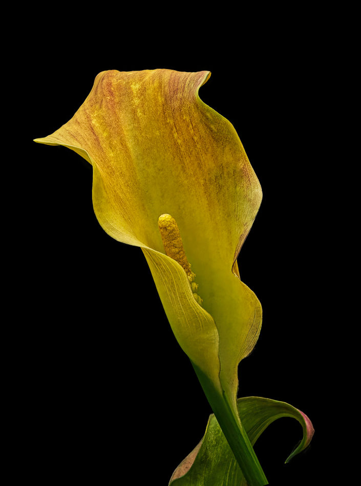
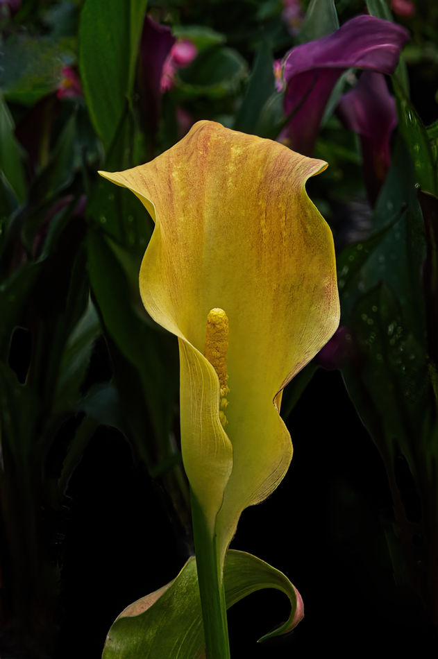
The second shot is my original post in the gallery today. I wasn't satisfied with it so I re-edited. I eliminated the colorful background, changed the positioning of the flower and used a Topaz Studion 2 selection called Hummingbird Wings. Do you agree that the changes are for the good?
Mar 21, 2022 13:53:12 #

Mar 21, 2022 14:00:37 #
I think the major positive change is the orientation of the flower. The slight tilt makes all the difference. On my monitor I can't see any real difference with the filter applied.
Mar 21, 2022 14:40:01 #
It is beautiful either way, but I do like your edited version.
Pardon my ignorance, but what is Studio II?
Pardon my ignorance, but what is Studio II?
Mar 21, 2022 15:21:31 #
Blenheim Orange wrote:
It is beautiful either way, but I do like your edited version.
Pardon my ignorance, but what is Studio II?
Pardon my ignorance, but what is Studio II?
Thank you! I was referring to Topaz Studio II.
Mar 21, 2022 15:21:49 #
chuckrem wrote:
Yes. I prefer the edited version of the original.
Thank you, Chuck!
Mar 21, 2022 15:22:52 #
Curmudgeon wrote:
I think the major positive change is the orientation of the flower. The slight tilt makes all the difference. On my monitor I can't see any real difference with the filter applied.
Jack, you are absolutely correct. I'm not sure whether I ever applied the filter. I can't see any difference either.

Mar 21, 2022 15:26:27 #

Both are beautiful, Carol! The first shows it in its environment, the second shows it as art.
Mar 21, 2022 15:28:21 #

Mar 21, 2022 15:37:02 #

I like the 2nd a little better but the background in the first image is not distracting to me.
Mar 21, 2022 16:11:41 #

I like your re-edited version. It's much more striking to me with no background interference and places the emphasis directly on the color and interesting shapes of the flower. I also like your repositioning to the angle, I think it adds more drama. Nicely done. Bev
Mar 21, 2022 17:17:56 #

Carol, there is a tremendous difference, and it all depends on what you want the viewer to see. If you are going for a natural look, then the original tells its story better. If an artistic look, then the edit. Only you can decide. By the way, nice work on both.
Mar 21, 2022 18:28:00 #
Cwilson341 wrote:
Thank you! I was referring to Topaz Studio II.
Ah, thanks.
Mar 21, 2022 21:48:02 #
UTMike wrote:
Both are beautiful, Carol! The first shows it in its environment, the second shows it as art.
Thank you, Mike! I agree with your assessment. I find the second one much more comfortable to look at but there is something to be said for showing it in it’s element.
Mar 21, 2022 21:48:53 #
DWU2 wrote:
I like the dark, uncluttered background.
Thank you, Dan. That is my preference, too.
If you want to reply, then register here. Registration is free and your account is created instantly, so you can post right away.