Question on cropping
Aug 28, 2021 12:50:08 #

Aug 28, 2021 14:17:51 #

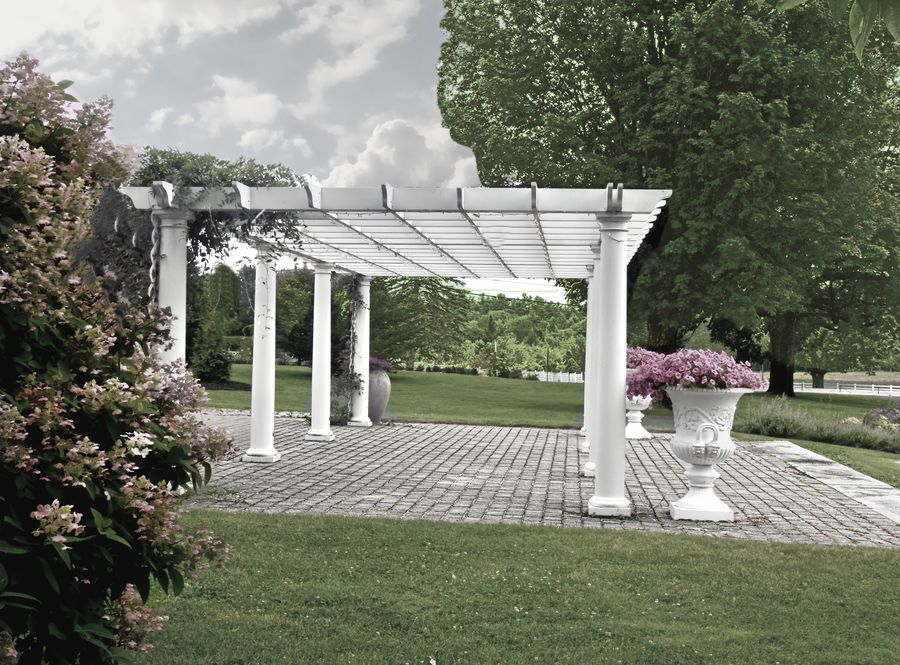
Cropping is not always the only cure. I a case like this, I like to show the original landscape designers' concept and work. If you crop too tight you lose the feeling of space and scale. You want to allow enough space to create depth and tonal or colour mass so the viewer gets the illusion that they can walk in and around the main structure in the scene. Rather than crop into the sky, I just added detail. Your original file had more information in the shadows than was apparent in the original post. Reducing the shadow density revealed the foliage.
Nothing wrong with lush grass and rich tones in the flowers.
Attached is a quick edit.
Nothing wrong with lush grass and rich tones in the flowers.
Attached is a quick edit.

Aug 28, 2021 15:51:34 #

E.L.. Shapiro wrote:
Cropping is not always the only cure. I a case li... (show quote)
Great thinking and result 💚💙🏆💙💚
Aug 29, 2021 03:54:44 #

E.L.. Shapiro wrote:
Cropping is not always the only cure. I a case li... (show quote)
To me the green color of the trees in the background doesn't look at all natural, and seems to suffer from overkill.
Of course, MHO.
Aug 29, 2021 06:02:59 #

Delderby wrote:
So far as cropping - do whatever pleases. The most important thing to do is straighten the horizontal line of he pergola. IMHO.
Disagree, I think the most important thing is to keep the verticals perpendicular. The horizontal line of the pergola slips away because the OP is shooting down the line of the columns. I like it, but perhaps it might have been a tad better if the OP was in line with columns.
Aug 29, 2021 06:36:07 #

Delderby wrote:
So far as cropping - do whatever pleases. The most important thing to do is straighten the horizontal line of he pergola. IMHO.
Looks to me the post on the left is straight up and down.
Tom
Aug 29, 2021 07:45:22 #
John N wrote:
Disagree, I think the most important thing is to keep the verticals perpendicular. The horizontal line of the pergola slips away because the OP is shooting down the line of the columns. I like it, but perhaps it might have been a tad better if the OP was in line with columns.
Yes - I do agree, the verticle is of greatest importance. However, in this instance I levelled the horizontal without affecting the verticle of the columns either to right or left. The ground does slope down towards the right, evidenced by the different size of the bases on which the columns stand. The photographer can only shoot straight down one line of columns, and achieves this to the right side.
On another subject, I'd love to see more pics of the kites.

Aug 29, 2021 08:25:28 #

I am a fan of the first photo because it better shows the scene the object is tied to rather than just showing an object--sense of place, if you will, versus just place.
Aug 29, 2021 08:50:57 #

Aug 29, 2021 10:18:19 #
jbk224
Loc: Long Island, NY
I like the 1st as well as it shows the context of the area. I have only cropped out the people.

Aug 29, 2021 10:24:34 #
Delderby wrote:
On another subject, I'd love to see more pics of the kites.
On another subject, I'd love to see more pics of the kites.
The Kites are noticeable by thier absence at the moment, both over my garden and the Nature Reserve.
Aug 29, 2021 11:00:12 #
Delderby wrote:
To me the green colour of the trees in the background doesn't look at all-natural, and seems to suffer from overkill.
Of course, MHO.
Of course, MHO.
Yeah, I tend to think in "Koadchrome" and old picture postcards. Actually, I should not edit other's work and I will refrain from doing so in the future. There are too many unknowns. I did not SEE the actual scene. Perhaps the use of a CPL filter would have yielded more saturation? As for perspective, verticles are easy to correct but as for the horizon- who knows if the is not a natural incline of the land if they weren't there. These elements are best corrected at the time of photography. Sometimes just doing a quick edit is an easier way to make a point as opposed to writing paragraphs of explinations.
Attached is- desaturated version.
Aug 29, 2021 11:20:59 #

Aug 29, 2021 11:39:18 #

Definitely the second image, the cropped one is more appealing. Nothing on the right side added to the image, and cropping a little of the white sky off the top helped it too.
Aug 29, 2021 13:42:55 #

After looking up the definition of the pergola, I think the first one is more appropriate, as it shows the environment in which the pergola is located.
--Bob
--Bob
fourlocks wrote:
Last week, we visited Pineland Farms in Maine and my sister asked me to take some photos for her. I rather liked this one of a pergola but it somehow seemed off balance so I cropped it, moving the pergola to the center of the frame. Just wondering which looks best? I once asked the same for a photo of Monticello and a couple of Hoggers cropped it for me, vastly improving the look.
If you want to reply, then register here. Registration is free and your account is created instantly, so you can post right away.