Your advice required please
Aug 27, 2021 07:05:25 #
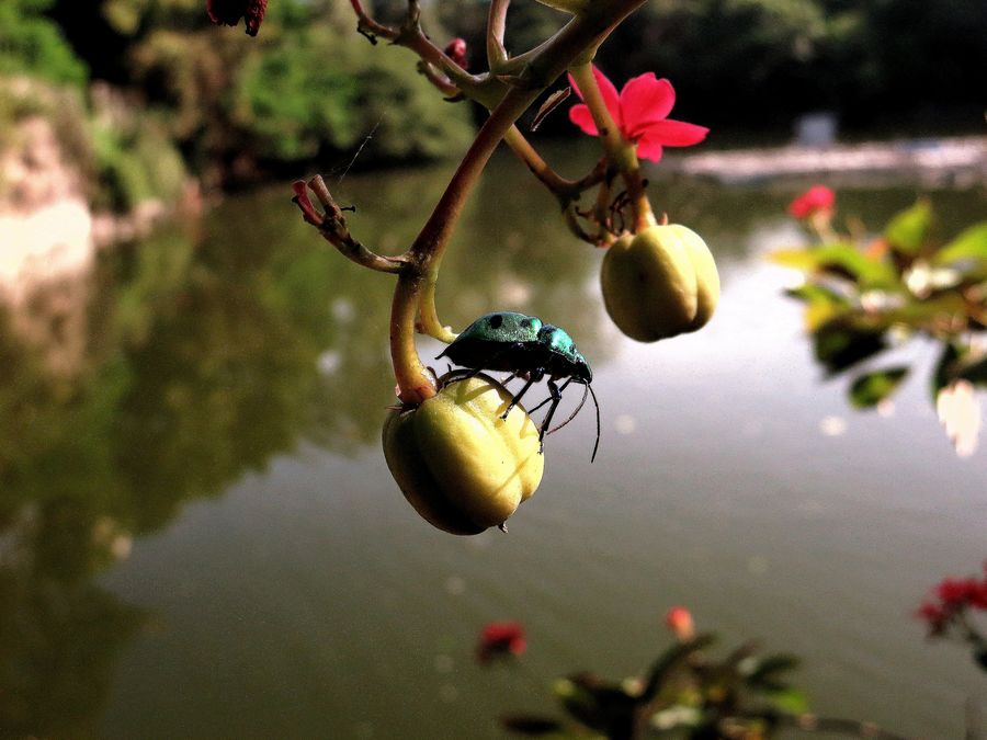
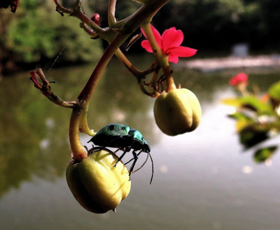
I took a photo of this beetle with a water background. One is more close-up. Which one is a better composition. Please comment,thanks
Aug 27, 2021 07:17:39 #
Aug 27, 2021 07:18:44 #
I feel the second one highlights your main subject best. Interesting beetle.
Aug 27, 2021 07:26:25 #

Aug 27, 2021 07:26:44 #

Aug 27, 2021 07:32:39 #
leftj
Loc: Texas
peterjoseph wrote:
I took a photo of this beetle with a water background. One is more close-up. Which one is a better composition. Please comment,thanks
Without a doubt the second is the better composition.
Aug 27, 2021 07:37:41 #

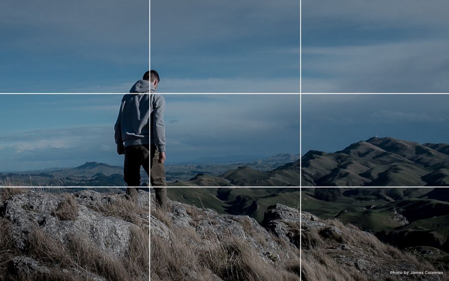
Using the rule of thirds would be good. The beetle is too centered in the frame. Here is a photo that shows the rule of thirds. Try cropping some off the left side of the first photo and a little off the bottom.
Aug 27, 2021 07:58:06 #
CO wrote:
Using the rule of thirds would be good. The beetle is too centered in the frame. Here is a photo that shows the rule of thirds. Try cropping some off the left side of the first photo and a little off the bottom.
...His is close enough for me. It doesn't have to be PRECISELY at the thirds intersection point....
Then, in your example, do you put the guy's head at the intersection point or his body.....
Aug 27, 2021 08:03:22 #

I'd like the top cropped a bit further, but the second is oddly positioned. If just kept dead center, look at the top of the original and find a dead leaf / flower entering the frame on the upper left. If you bring in the top margin that far into the frame to remove that distraction, see if that amount (or similar amount) can be applied to the other edges to achieve a standard size image, either 1x1 or 3x4. Or, even going back to 3x5 or wider like 16x10, as the red background flowers on the bottom will be hard to remove via cropping. Instead, those bright distractions in the background should by cloned-away to remove, to leave space at the bottom of the frame. You don't have to put the yellow bud / beetle exactly at 1/3 intersection, you also can place 'major elements' along the 1/3 guides, leaving space below the yellow bud as needed to get the yellow bud somehow touching or passing through the bottom 1/3 horizontal guide.
Aug 27, 2021 08:03:32 #
Aug 27, 2021 08:59:54 #
Longshadow wrote:
...His is close enough for me. It doesn't have to be PRECISELY at the thirds intersection point....
Then, in your example, do you put the guy's head at the intersection point or his body.....
Then, in your example, do you put the guy's head at the intersection point or his body.....
It doesn't have to be perfect. With the rule of thirds you can place the main subject at an intersection or at a line that is one-third of the way in from the edge. When using the rule of thirds on horizons, one would place the horizon one-third of the way from the top of the frame or one-third of the way from the bottom of the frame.
Aug 27, 2021 09:11:13 #
CO wrote:
It doesn't have to be perfect. With the rule of thirds you can place the main subject at an intersection or at a line that is one-third of the way in from the edge. When using the rule of thirds on horizons, one would place the horizon one-third of the way from the top of the frame or one-third of the way from the bottom of the frame.
ABOUT one third... I simply start there and move as desired.
It depends on the subject and the surrounding elements that are in the image.
And it's not a steadfast rule.
I place my horizons about one third, mostly. What pleases me the most, aesthetically.
Sometimes they do cut about the middle. Sometimes way at the top or bottom.

Aug 27, 2021 09:33:37 #
The first rule of Photography is know all the rules and don't talk about them.
Aug 27, 2021 09:38:29 #
CHG_CANON wrote:
The first rule of Photography is know all the rules and don't talk about them.

Aug 27, 2021 10:18:01 #

I think you did a nice job on them. Color is good snd you were mindful of the background and framing. Good job hiding the specular highlight. It would be very distracting. One of those two focuses attention on the subject more than the other. It is more pleasing to look at and has fewer distractions.
Which one do you like better? And why?
Which one do you like better? And why?
If you want to reply, then register here. Registration is free and your account is created instantly, so you can post right away.