Make a change!
Mar 15, 2021 06:22:03 #

I wish that the administration folks would consider making a change to the screen so that you could better see a different color showing when an article had been opened. It's hard to differentiate, at least for me.
Mar 15, 2021 07:07:21 #
I started this topic a while ago. Sent a p.m. to admin and they say that if I can suggest a more suitable blue, they will consider it... https://www.uglyhedgehog.com/t-688617-1.html
I am currently looking for a different blue that would be sufficiently contrasty to make things easier for us all. Not trivial, they don't want to use another part of the colour spectrum...
I am currently looking for a different blue that would be sufficiently contrasty to make things easier for us all. Not trivial, they don't want to use another part of the colour spectrum...
Mar 15, 2021 08:23:47 #
Mar 15, 2021 09:15:02 #

Mar 15, 2021 09:36:39 #
It really doesn't matter what color as long as you can see the difference.
Mar 15, 2021 09:40:40 #

Longshadow wrote:
Purple?
Orange?
Orange?
Purple is good!
The Orange - not as good as the Purple.
Just my opinion.
Mar 15, 2021 09:58:00 #
Ourspolair wrote:
I started this topic a while ago. Sent a p.m. to admin and they say that if I can suggest a more suitable blue, they will consider it... https://www.uglyhedgehog.com/t-688617-1.html
I am currently looking for a different blue that would be sufficiently contrasty to make things easier for us all. Not trivial, they don't want to use another part of the colour spectrum...
I am currently looking for a different blue that would be sufficiently contrasty to make things easier for us all. Not trivial, they don't want to use another part of the colour spectrum...
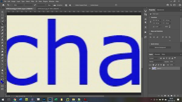
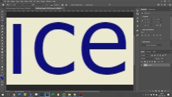
First step: Determine the colors being used.
Took a screenshot of the UHH page and blew up the images, selecting one read topic and one unread topic. Loaded the images into Photoshop and used the eyedropper to select a pixel inside a character.
Probably due to my laptop, but looking at several points gave different results. So I took several points and found the mean. Uncertainties were about 1 for red and blue channels and about 3 for the blue channel.
I came up with (RGB) of (0,1,203) for the read topic and (1,1,118) for the unread topic. I'm assuming that they were really meant to be blue so I generated sample colors at (0,0,100) and (0,0,240). That gives a (very slightly) darker blue for unread and a noticeably lighter blue for the read topic. Also tried (0,0,100) and (0,0,255) to give the brightest blue available. I left a little blue in the unread topic to avoid just pure black.
Read topic

Unread topic

Read topic in Photoshop
Unread topic in Photoshop
Current colors

Colors with slightly more contrast

Brightest blue available for read topic

Mar 15, 2021 14:38:01 #

DAN Phillips wrote:
I wish that the administration folks would consider making a change to the screen so that you could better see a different color showing when an article had been opened. It's hard to differentiate, at least for me.
The > works just fine for me.
If you want to reply, then register here. Registration is free and your account is created instantly, so you can post right away.