Using PhotoShop filters
Jun 9, 2020 11:33:51 #
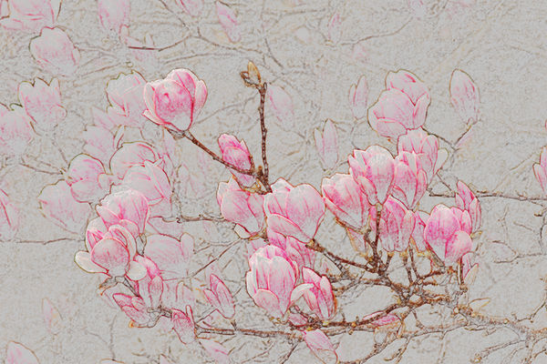
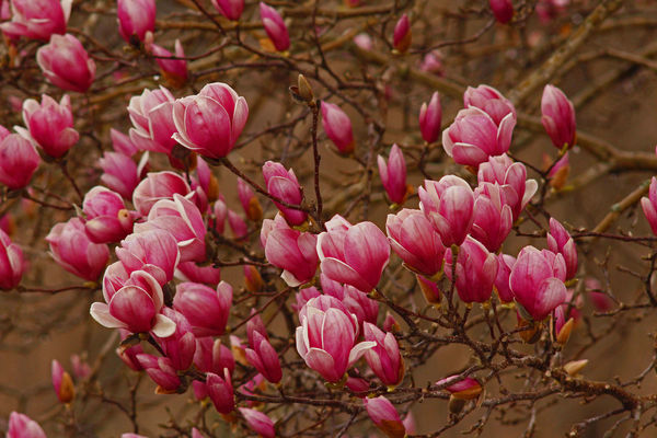
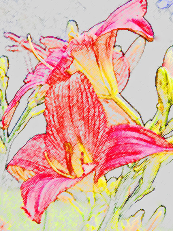
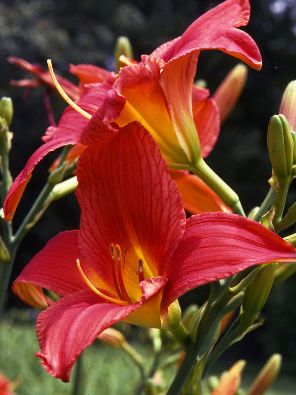
I have never been much for making graphic art out of photos, but I tried using a simple PS filter on these two ordinary shots (along with tweaking contrast, color, brightness, sharpness--no major construction) and I actually liked the result better than the original... What do you think? One is delicate, the other bold. The daylily is an old Kodachrome slide, needs a bit of spotting.
Jun 9, 2020 11:42:34 #

Playful pp is enjoyed by some and ridiculed by others. I'm one who loves to explore and create.
I like your first for the same reason you mention. The delicate colors and lines seem very appropriate and appealing for the subject. For me, the second is harsh and not easy to look at.
There are some fun ideas included in this list of Tutorials, created by UHH members:
https://www.uglyhedgehog.com/t-645056-1.html
Enjoy your playtime!
If you want to reply, then register here. Registration is free and your account is created instantly, so you can post right away.