Color to B&W... A different image, another try at it.
Jan 5, 2020 23:46:31 #
Steve DeMott
Loc: St. Louis, Missouri (Oakville area)
Thanks Cany & Linda for the comments.
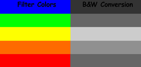
When converting color to B&W, one must understand how a particular color will look when converted. Red & Green are very close to the same shade of gray. Yellow & Orange are lighter and Blue the darkest.
Filters come in 5 basic colors with each having a variety of shades, Red, Yellow, Green, Blue, Orange. A colored filter will absorb a certain portion of it's complementary color allowing the rest to pass through.
Why did I use a green filter? This allows the green (prime) color to pass and lightens or be slightly over exposed while blocking some of the red/orange (complementary) color causing it to be under exposed.
hope this helps
-- Steve
P.S. The image was created in Photoshop then part converted to B&W. I hope Photoshop converted correctly
Jan 6, 2020 00:38:51 #
Jan 6, 2020 00:39:43 #
Hamltnblue wrote:
Another thing you could try is taking the shot vertically
Yes a vertical might have been a better composition. Thanks.
Jan 6, 2020 00:47:27 #
Cany143 wrote:
No clue (well, maybe that's not an I entirely /I ... (show quote)
I realize what you are saying, "do this first then do that second" is not going to work the same for every image, or for pretty much any two images. That is kind of the approach I took with this image after reading a couple of the suggestions in my first post. Each image will require a somewhat different approach. No two images will be, or probably can be adjusted exactly the same and come out looking right.
Jan 6, 2020 07:31:34 #
Cany143 wrote:
No clue (well, maybe that's not an I entirely /I ... (show quote)
I am in a disagreement with a smidge of the above comment.
When you are a tyro, the "cookbook" is a good way to go. To me, this is learning about your new car before venturing out into the world. If you don't have an idea as to what on your car does what, using a light pole as a brake is no fun.

It does give you a starting point with which to understand what someone like Cany offers you in pointers.
Speaking of "pointers", too many newcomers think that they have to be "perfect" from the get-go once joining UHH. Even we oldsters learn something out of the discussions in here. We all had to start with something in order to move forward. And many (all) still have do this when we venture out of our comfort zone(s).
(On reread, light poles are only good for holding up lights. Even if you are someone like Batman!)
Keep up the work. You are doing well.

Jan 6, 2020 07:37:42 #

steve DeMott wrote:
When converting color to B&W, one must understand how a particular color will look when converted. Red & Green are very close to the same shade of gray. Yellow & Orange are lighter and Blue the darkest.
Good information. There are videos and many articles online; the ones directed to film will still help those understand digital editing. Nik Silver Efex has virtual colored filters in their toolbox.When converting color to B&W, one must understand how a particular color will look when converted. Red & Green are very close to the same shade of gray. Yellow & Orange are lighter and Blue the darkest.
Jan 6, 2020 10:50:58 #
foggypreacher
Loc: Dickinson, Texas
Vince68 wrote:
Okay so yesterday I posted a color image and a B&a... (show quote)
Vince68, both are very nice. I have become more interested in B&W and really like the mood yours brings to me. The change in mood, especially the 'clouds' inside the top left of the arch make the shot IMHO. Thank you for sharing.
Jan 7, 2020 00:04:33 #
foggypreacher wrote:
Vince68, both are very nice. I have become more interested in B&W and really like the mood yours brings to me. The change in mood, especially the 'clouds' inside the top left of the arch make the shot IMHO. Thank you for sharing.
Thanks for looking and your comment foggypreacher.
Mar 23, 2020 14:02:45 #

If you want to reply, then register here. Registration is free and your account is created instantly, so you can post right away.