Creating B/W photos
Jan 1, 2020 12:44:05 #
Kozan
Loc: Trenton Tennessee
MW wrote:
I think for most people they will get better results by taking the photo in color and converting later. However, starting with the camera set to b&w, although tougher to get good results, may teach you to “see in b&w” better.

Jan 1, 2020 12:54:23 #
One of my cameras has an option in
its <DISPLAY> menu to set only the
display to monochrome, even when
shooting color. Never tried using it.
Just checked the only camera that I
happen to have with me [traveling]
and this one does indeed have that
[Lumix G9] so I tested it. Display is
in monochrome but it still recorded
a full color jpeg.
Got no clue whether this is rare or
common industry-wide. Browse a
few menus to see if you've got it !
Jan 1, 2020 13:10:02 #
I realized one day that I tend to to select subject matter for shape and pattern without much thought colors.
Even with no conscious intent I would often pick subjects that were inherently monochromatic even if was some actual color apparent. Seeing them later on a PC monitor I couldn’t understand why they had seemed interesting before pushing the shutter release but blah on the screen. Someone who new me fairly well told it was no surprise after observing my choices in furniture, decor, clothing and so on - I didn’t really “get” color but spatial relationships and shapes were another matter.
Even with no conscious intent I would often pick subjects that were inherently monochromatic even if was some actual color apparent. Seeing them later on a PC monitor I couldn’t understand why they had seemed interesting before pushing the shutter release but blah on the screen. Someone who new me fairly well told it was no surprise after observing my choices in furniture, decor, clothing and so on - I didn’t really “get” color but spatial relationships and shapes were another matter.
Jan 1, 2020 13:23:42 #
larryepage wrote:
Because of how I learned "serious" photo... (show quote)
I too have the same feelings generally.
I have one camera that I use to shoot B&W images with. That is my Pentax Q. Even though it has a small sensor it is the best camera I have for getting B&W images the way I have it set up.
If I want color images of the same subject, I will have one of my other cameras with me for that.
As the Q is so small (world's smallest interchangeable lens camera) it doesn't add much weight to my camera bag.
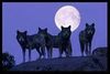
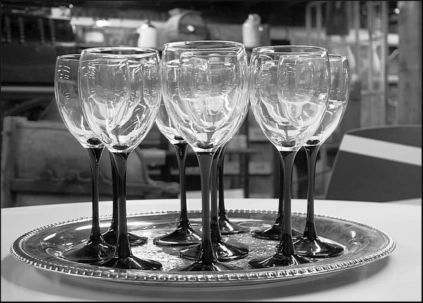
Below are a couple of examples at what it can capture. They need very little PP work done, other than some sharpening and cropping.
will

Jan 1, 2020 13:26:44 #

Blair Shaw Jr wrote:
OH GOOD POINT.....sorry and hope Santa was kind to you.Happy New Year !
While I love my Sony H-1, my other camera does save RAW, which I do shoot.
Maybe SOME year I might get another bridge camera with more Mp that saves RAW,
but I do not require one at this time.

My point was that not all of the cameras people own save RAW.

Jan 1, 2020 13:33:12 #

Linda From Maine wrote:
Generally you have more control if you convert in pp, but it will depend on the software. Nik Collection's Silver Efex is awesome.
What Linda said.
Jan 1, 2020 13:53:13 #
JFCoupe
Loc: Kent, Washington
As noted above, shooting RAW will give you the most data to work with later. RAW is always color and you can convert in post processing to B & W
An easy test would be to set you camera to both RAW and jpeg, set camera to B & W or Monochrome and shoot some images. Download both to you computer. You will have the jpeg that the camera edits internally in B & W. You can do your own editing of the RAW image and then compare the jpeg version to your edits.
An easy test would be to set you camera to both RAW and jpeg, set camera to B & W or Monochrome and shoot some images. Download both to you computer. You will have the jpeg that the camera edits internally in B & W. You can do your own editing of the RAW image and then compare the jpeg version to your edits.
Jan 1, 2020 14:00:04 #
Jan 1, 2020 14:04:26 #
JFCoupe wrote:
As noted above, shooting RAW will give you the most data to work with later. RAW is always color and you can convert in post processing to B & W
An easy test would be to set you camera to both RAW and jpeg, set camera to B & W or Monochrome and shoot some images. Download both to you computer. You will have the jpeg that the camera edits internally in B & W. You can do your own editing of the RAW image and then compare the jpeg version to your edits.
An easy test would be to set you camera to both RAW and jpeg, set camera to B & W or Monochrome and shoot some images. Download both to you computer. You will have the jpeg that the camera edits internally in B & W. You can do your own editing of the RAW image and then compare the jpeg version to your edits.
Wouldn't it be funny if the camera making a B&W image and the editor provided by the camera manufacturer used the same algorithm and yielded the same B&W result?
Not sure why it would be different.
Now a different developer's editor may yield different results.
Jan 1, 2020 14:40:11 #

tfgone wrote:
When making a Black and White photo, is it better to set Camera to B/W or shoot in color and convert in pp
80% of my photos end up being B&W but I always shoot in colour - then I have more options.
Jan 1, 2020 14:52:43 #
tfgone wrote:
When making a Black and White photo, is it better to set Camera to B/W or shoot in color and convert in pp
Color and preferably Raw.
Not to get into the whole Raw vs Jpg thing but the tonal graduations will be greater and smoother.
In color every color is its own built in mask.
Raw conversion plus Capture One's auto Luma Range Tool masking is a zone system photographer's wet dream.
Jan 1, 2020 14:54:06 #

Longshadow wrote:
"Developer" being the photographer or the software manufacturer?...Now a different developer's editor may yield different results.
Silver Efex has quite a few pre-sets, each with the ability to fine tune and do all kinds of things to tones, tint, contrast and more. You can also start from zero, so to speak (color simply removed).
I think people who are just getting into b&w conversions should make a point to look at the options of their software. Even PS Elements has a few choices, some of which are based on the colored filters of film days as someone mentioned here. Many b&w posted to UHH seem to be just a one-click, with no understanding of whites, blacks, tonal range, shadows and light, and all that jazz.
.
Jan 1, 2020 15:02:29 #

larryepage wrote:
Because of how I learned "serious" photo... (show quote)
There is lots of good information in Mr. Page's post. I usually don't allude to my long film experience for nostalgic purposes, but there is lots of old theory that is very applicable and relevant to digital photography.
I too, prefer to shoot in MONOCHROMATIC mode when I know there is a requirement for black and white prints or digital output for the same reasons I preferred to use black and white film rather than shooting color negatives and making conversion after the fact. Variable contrast papers, obviously, could address contrasts, they would not deliver a PANCHROMATIC rendition of the actual scene or subject. PANALURE paper for Kodak and PANADEX (bot discontinued) materials from GAF would address panchromatic concerns but contrast control was difficult as well as handling of the materials, in near-total darkness, was also problematic. The issue with NOT using a Panchromatic paper is an improper tonal rendering of colors in the black and white grayscale. The orange MASK in color negative film is part of the problem. As an example, a portrait made on color negative film of a subject wit blue eyes could show up on ordinary paper was very light gray or almost white eyes- very unnatural. Many other colors could be misrepresented. I also find this an issue when making the conversion from color digital files but not to the same extreme, but it is there.
There is the color/contrast issue which is common to film and digital photography. A classic example MAY be a red apple photograph against a blue background can possible registered, in monochrome, as the same tone of gray, this causing blending and loss of visual contrast. The remedy of this kind of problem is filtration- a red filter would lighten the apple and darken the blue, a blue filter would light the background and darken the apple. This can also occur with many other colors. In order to detect and prevent these issues, you need to SEE the tonal relation while shooting.
Then there is a wide range of aesthetics and effects that filtration can address. In portraiture, a green filter will enhance skin tones (in monochrome) and provide a faux-orthochromatic (very dramatic) rendition for theatrical and character studies. It will dark skin and lighten foliage in outdoor portraits. A light orange filter will produce a porcelain-like skin tone without further post-processing. Yellow, Orange, and Red filters will darken blue skies and emphasize clouds. without the effects of polarization.
None of this is to say that some of these issues and effect can not be addressed or produced in post-processing but I prefer per-visualization whenever possible and it sure cuts down on post-processing time.
So...back in the film days, I always lied to "choose my weapons" in advanced of each assignment, especially in black and white requirements by picking out the best film and developer combination, filter when required, and of course, lighting elements. When black and white AND color was required on the same (film) job, I would oftentimes work with two cameras and if time permitted would even take different lighting approaches. Nowadays, it is easy enough to switch to monochrome when time permits.
Jan 1, 2020 15:03:24 #

I always shoot in color and convert using Topaz B&W effects which gives you the ability to lighten or darken individual colors in the shot as well as apply the classic colored filters used in B&W film photography and tweak exposure . For some examples please see my post from Monday.
https://www.uglyhedgehog.com/t-625582-1.html
https://www.uglyhedgehog.com/t-625582-1.html
Jan 1, 2020 15:22:05 #
ecurb
Loc: Metro Chicago Area
tfgone wrote:
When making a Black and White photo, is it better to set Camera to B/W or shoot in color and convert in pp
Simple: pick any film camera, the bigger the better, load the appropriate BW film, shoot, develop, print. No problem. 😎
If you want to reply, then register here. Registration is free and your account is created instantly, so you can post right away.