Choices, which is preferred
Nov 18, 2019 09:54:37 #
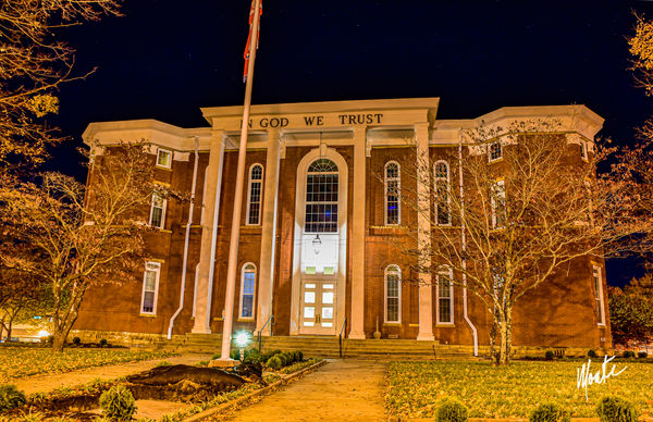
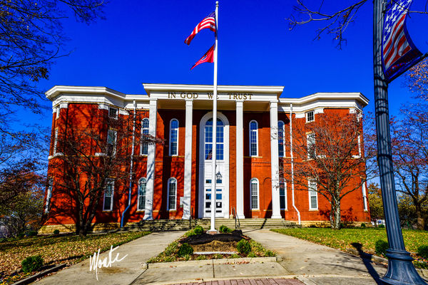
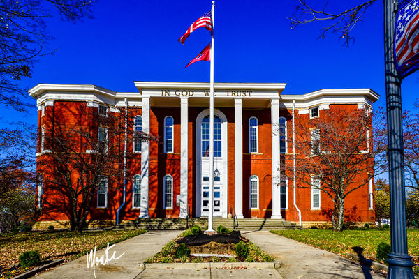
I was asked to try a picture of our local courthhouse. The norm is a daylight, thus I wanted to try something a little different. Which do you prefer? The nightshot is a HDR with 5 shots blended in Lightroom and the day shot is also a blend of 5 shots in LR. Forgive the distortion and the unlevel. These were shot with a Nikon D810.
Nov 18, 2019 10:02:42 #
Nov 18, 2019 10:05:07 #

Nov 18, 2019 10:07:09 #

Nov 18, 2019 10:07:55 #

I'm not sure I like either one. Neither of them looks "natural".
--Bob
--Bob
HillbillyHiker wrote:
I was asked to try a picture of our local courthhouse. The norm is a daylight, thus I wanted to try something a little different. Which do you prefer? The nightshot is a HDR with 5 shots blended in Lightroom and the day shot is also a blend of 5 shots in LR. Forgive the distortion and the unlevel. These were shot with a Nikon D810.
Nov 18, 2019 10:08:25 #

I do prefer the second one, but the sky should be toned down a bit. IMHO
It's hard to forgive the distortion and unlevel. Software should be able to deal with most of it.
The inclusion of the post on the right side is nice. If you decide to reshoot it would be nice if you didn't clip the top of the flag pole. Also, try to position yourself so the flag pole doesn't block any of the letters on the building.
----
Nov 18, 2019 10:13:29 #
Nov 18, 2019 10:20:48 #
Neither, both images need to be straightened, lens corrected. Poles are bowed or leaning as are the two buildings. Bad color cast on first. Keep trying😎
Nov 18, 2019 10:28:53 #

Nov 18, 2019 10:37:41 #

HillbillyHiker wrote:
I was asked to try a picture of our local courthhouse. The norm is a daylight, thus I wanted to try something a little different. Which do you prefer? The nightshot is a HDR with 5 shots blended in Lightroom and the day shot is also a blend of 5 shots in LR. Forgive the distortion and the unlevel. These were shot with a Nikon D810.
The daytime scene is best here, but is over-saturated.
Sodium vapor lighting in the night scene is almost pure yellow... It is VERY ugly.
Nov 18, 2019 10:59:03 #
scootersurfs wrote:
Neither, both images need to be straightened, lens corrected. Poles are bowed or leaning as are the two buildings. Bad color cast on first. Keep trying😎
He stated that in his post.
Nov 18, 2019 11:00:36 #
By whom were you asked to take the shot? And what is the final use of the shot to be?
If this is an art class, it's all up to you.
If the Town asked you for a shot for some purpose, I would expect they would want something more like #2.
Since you asked which we prefer, I will give you my take (assuming the photo is for a purpose other than an art class).
The first one is too different. The colors are unreal. The second one shows that the pillars are white, but in the first shot they're kind of brown, a color cast that extends to the grass. It almost looks like a film color negative with the orange base. LR can do some straightening of the perspective. It's unrealistic to expect the photo to have the sides of the building perfectly vertical, but they should be pushed a bit closer to vertical. The position from which you took the shot should be adjusted. The motto on the facade of the building is partly obscured by the flagpole. You could easily move a bit to the right to avoid that. There are stars in the sky which don't show up in your treatment, but would show that it is night. The light over the door casts light on the front of the building in a pattern that appears to be blown out. On the whole, without a lot of work I don't think the night shot works.
The second one is more like it, but the colors are a bit too saturated for my taste (remember, you asked for our opinion). Once again, centering the flagpole on the facade obscures a bit of the motto on the top. An off-center shot would be better here. The sides of the building and the light post holding the flag-themed Cookeville sign have a curvature, which should be corrected. The flagpole in front of the building should have a bit more sky above it. The top of the flagpole is too close to the margin of the photo for my taste and the top of the Cookeville sign is cut off a bit. Personally, I prefer sky with clouds to cloudless skies, which always appear to me to be just a painted background, unnatural. There's a tilt to the sidewalk in the front relative to the lines of the building. You could crop out the sidewalk or warp it to mitigate the tilt.
Nov 18, 2019 13:34:39 #
Nov 18, 2019 13:40:48 #
Thank you for responding to the two pictures. There have been some interesting comments. I will agree that the sky has the appearance of over saturation. There are possibly two reasons for this. The shot was made about noon toward the northern sky (45 degrees from the sun) and the other was that being a 5 shot stack with 1 stop per shot variance the sky just stacked dark. There were no clouds in the sky. Some said that I should have moved a little to the side to not cover the sign at the top. I should have taken more time but being in the middle of a US highway I was doing things in quick fashion.
The convergence of lines bothers me and I tried in LR and PS to straighten them but my skill level is lacking to make them work. It is amazing that even though I mentioned it in my opening it was thrown back at me like I did not see it.
The shots were made for a company that wants to display pictures of the buildings they had work on. It was my intent to be a little dramatic with them to get their customers and potential customers attention.
I do understand that we all have different taste and I find it interesting that over the years in observing the critics on this site, that some of these are really good “Monday morning quarterbacks”and some not so good. I have hesitated to put photos in this forum for this reason. Some times it is good to put yourself in the photographer’s shoes when looking at a picture. Even though some of you will take this critically, I really do appreciate the feedback. I do respect your opinions. And most of all I enjoy seeing your pictures, even when I would not shoot them myself.
Nov 18, 2019 14:25:16 #
HillbillyHiker wrote:
...The convergence of lines bothers me and I tried in LR and PS to straighten them but my skill level is lacking to make them work. It is amazing that even though I mentioned it in my opening it was thrown back at me like I did not see it...
I recognized that you mentioned it but I thought it was important enough to make sure it got corrected in the final version.
Since you're using LR, try:
Import one of the images. Go to the develop module. In the right panel, go to the "Transform" section. Click "upright" and "off".
Push the "vertical" slider to the left. That will change the perspective to straighten out the vertical edges. When it does that, you will note that the edges of the image move so you have white space appearing. You will probably have to move the "y offset" to eliminate white space on the bottom of the image. You may have to adjust the "horizontal" slider to adjust the horizontal perspective. Sometimes you have to play with vertical, horizontal, and rotation.
Changing the perspective will leave white space on some edges of the image. You can crop these off or try to use PS and fill with content aware tool. Personally I think it's easier to leave selvage on the edge of the image that allows you to crop without losing parts of the image you want. Checking "constrain crop" will automatically crop off the white areas.
When it comes to curved areas, you can try the lens correction section of develop. The distortion slider will move between barrel and pincushion distortions. However, this affects the entire image and if only one element is curved it probably will curve some lines while straightening others. It would be better to use Photoshop there.
Load an image into Photoshop. Then Edit -> Transform -> Warp. That will give you a grid overlaying your image. You can move the corners of the grid around to straighten a curve on one edge but the opposite edge will stay straight. Elements in between may get curved. It might take some playing around but it's worth a try.
I played with warp for about 3 minutes and came up with a rough correction. Not perfect but the right edge has much of the curve removed.
Note: it's best to do this with a raw file if possible. If you're using a jpg, you will have to change the image mode to 16 bit to get the warp tool. Image -> mode -> 16 bits per channel.
Also, warping pushes the building edges outward so (1) you are changing the building aspect ratio and (2) you are losing elements at the edge of the image. Another reason to leave some selvage at the edges of your image.
If you want to reply, then register here. Registration is free and your account is created instantly, so you can post right away.