try to find with the following title...
images of camera aperture sizes
I think just what you are looking for...
Well, since I am not a good photographer and do not claim to be anything more than an artist, what I have to say about this is not important and I'm sure will matter to no one at all, but being one of those seniors between the ages of 80 and 90, I think I know what will be fun for them and what will bore them to the point of wishing they were somewhere else. I not only FEEL what they feel, but I sometimes teach seniors to paint at Sr. Citizens Centers and Senior Sunday School classes at Churches. I show them they CAN do it and they are thrilled to see what they have done when it's over. Their attention span is not as long as middle aged people, so holding their attention long enough to learn much is not easy. Keep it simple. Teach them about the importance of good lighting first, then teach them simple stuff, like, not to have trees or poles coming out of heads or backs and make it FUN. Teach them when to fill the frame with a subject and when to back way off. Keep the wording simple, not words they will have to ask about. It's doubtful that they are out to sell photos. Just keep foremost in your mind that they want to have FUN making better pictures, not necessarily masterpieces. I'm sure that what I have said may do nothing for anyone but those seniors who are about to either have a great time or......
 BBurns
Loc: South Bay, California
BBurns
Loc: South Bay, California
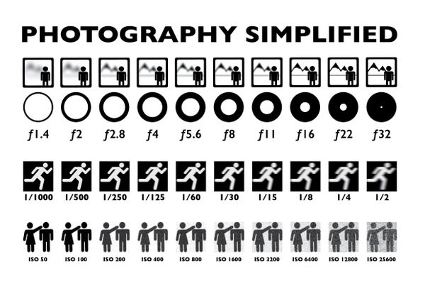
Here is an Entire Basic Photography Course For Beginners in One Image.
 big-guy
Loc: Peterborough Ontario Canada
big-guy
Loc: Peterborough Ontario Canada
I concur, think anyone can get over the tunnel vision and see the light?
Horseart wrote:
Well, since I am not a good photographer and do not claim to be anything more than an artist, what I have to say about this is not important and I'm sure will matter to no one at all, but being one of those seniors between the ages of 80 and 90, I think I know what will be fun for them and what will bore them to the point of wishing they were somewhere else. I not only FEEL what they feel, but I sometimes teach seniors to paint at Sr. Citizens Centers and Senior Sunday School classes at Churches. I show them they CAN do it and they are thrilled to see what they have done when it's over. Their attention span is not as long as middle aged people, so holding their attention long enough to learn much is not easy. Keep it simple. Teach them about the importance of good lighting first, then teach them simple stuff, like, not to have trees or poles coming out of heads or backs and make it FUN. Teach them when to fill the frame with a subject and when to back way off. Keep the wording simple, not words they will have to ask about. It's doubtful that they are out to sell photos. Just keep foremost in your mind that they want to have FUN making better pictures, not necessarily masterpieces. I'm sure that what I have said may do nothing for anyone but those seniors who are about to either have a great time or......
Well, since I am not a good photographer and do no... (
show quote)
 bdk
Loc: Sanibel Fl.
bdk
Loc: Sanibel Fl.
if they are in the 80's and 90's they are taking the class just to have something to do. but this is one I like
Horseart wrote:
Well, since I am not a good photographer and do not claim to be anything more than an artist, what I have to say about this is not important and I'm sure will matter to no one at all, but being one of those seniors between the ages of 80 and 90, I think I know what will be fun for them and what will bore them to the point of wishing they were somewhere else. I not only FEEL what they feel, but I sometimes teach seniors to paint at Sr. Citizens Centers and Senior Sunday School classes at Churches. I show them they CAN do it and they are thrilled to see what they have done when it's over. Their attention span is not as long as middle aged people, so holding their attention long enough to learn much is not easy. Keep it simple. Teach them about the importance of good lighting first, then teach them simple stuff, like, not to have trees or poles coming out of heads or backs and make it FUN. Teach them when to fill the frame with a subject and when to back way off. Keep the wording simple, not words they will have to ask about. It's doubtful that they are out to sell photos. Just keep foremost in your mind that they want to have FUN making better pictures, not necessarily masterpieces. I'm sure that what I have said may do nothing for anyone but those seniors who are about to either have a great time or......
Well, since I am not a good photographer and do no... (
show quote)
Not bad for "not anything more than an artist".

--
 BHC
Loc: Strawberry Valley, JF, USA
BHC
Loc: Strawberry Valley, JF, USA
epd1947 wrote:
When I have explained the exposure triangle I usually start out in very general terms and then gradually flesh out the settings with specifics once the concepts are clear.
For example - I would generally start out defining what we mean by "exposure" - very simple terms - how light or dark the photo is - too much exposure the photo is way too light and washed out - too little exposure the photo is way too dark and muddy looking - somewhere in between we find the "correct" exposure where the photo appears the way we want it to appear.
Next - more light into the camera results in more exposure and a lighter photo - cut back on that light getting into the camera and the photo is rendered darker.
What are the controls on the camera that regulated how much light gets into the camera?
1. Lens aperture - which is a measure of the size of the opening in the lens - bigger opening allows more light into the camera - compare to a round window on a ship (porthole) - bigger window, more light - smaller window, less light
2. how long we allow light to enter the camera - longer period of time, more light enters - lesser period of time, less light enters
Combo of the two determines how much light overall can enter.
How sensitive is the camera (or more specifically the CCD or CMOS sensor) to light - introduce concept of ISO as a measure of how sensitive the camera will be to the light entering the camera.
So far - no numbers or mathematical ideas used at all.
Once the basic concepts are clear - introduce the idea that the end result on exposure is a combination of the factors just introduced. I have found that a useful (as well as very easy to draw) diagram is as follows:
Draw three vertical lines side by side - label the three as ISO, Aperture, Time (Shutter Speed)
Draw about a half dozen hash marks to divide each vertical line into segments (make sure the hash marks all line up and are equally spaced
Indicate that as we move upward on any of these lines the photo will get lighter and when we move downward the photo gets darker
Now define each hash mark as a doubling of light for each hash mark in the upward direction or a halving for each notch downward.
Put a check mark next to one hash mark on each line (somewhere around the middle in each case) and ask the class to assume that this combo is the "correct" exposure
Now point out that a move up on any one will result in a lighter photo and a move down will darken the photo
Next concept - if we move up one of the factors by say 3 notches (leaving the others alone) the photo will get much lighter (and probably washed out) - We can correct for the now too light photo by moving either of the other two factors (or both in combo) a total of 3 notches down to achieve the same exposure as we originally had - just a different combo of the 3 factors. (Note: I often compare this to using a wall mounted dimmer switch some of which you slide up or down to change the light.)
Now flesh out the diagram with the numbers - Highest ISO, Widest Aperture and Slowest Shutter Speed at the top of each vertical line.
The "math" is really pretty simple and intuitive for ISO as well as shutter speed
For aperture - seems counter-intuitive so you will need to point out that the aperture settings are actually in the form of fractions - the top number is represented by "f" and does not vary unless you use a different focal length - so as the bottom number gets larger the value of the fraction gets smaller (as in smaller diameter lens opening letting in less light) - make the concept simple by using the slicing of a pie as an illustration - the whole pie is "1" in the numerator - as we cut the pie into more pieces (4 pieces, versus 6 pieces, versus 8 pieces) the size of the pieces get smaller.
Last concept - there are many combos of aperture, shutter speed and ISO that will give us the same "exposure" but not really an identical photo - this is where you explain how aperture effects depth of field, how shutter speed impacts motion (or lack thereof) in the photo - subject movement and/or camera movement implications, and how ISO effects overall image quality (noise, etc.)
Anyhow - hope this is helpful to you.
When I have explained the exposure triangle I usua... (
show quote)
I don't remember who said that the brilliance is in the simplicity: maybe it was you! Your idea of segmented parallel lines is great. I occasionally teach photography to seniors from the facilities of the company that owns the complex (a company I worked for for 26 years). With your permission, I will try your system next time I have a class. Thank you.
I have a photo of that myself. It actually really helped. KISS, keep it simple stupid. Not meaning you of course.
BHC
Loc: Strawberry Valley, JF, USA
stillkickin wrote:
I have a photo of that myself. It actually really helped. KISS, keep it simple stupid. Not meaning you of course.
Yeah, it's one of those terms that you really need to get across to people, but aren't sure if you'll offend them; it never offends me, just brings me back to earth. In business, though, I had to come up with something that would convey the message without, for instance, really insulting a board of directors (some of whom were worthy of the original interpretation); so I came up with "Keep It Short and Simple", a term that kept my tail out of the wringer more than once.
That's cool. For real that chart just tells the whole story. Besides reading you manual. That chart is as good as it gets. Shot and simple.
Short and simple. I can't spell
BHC
Loc: Strawberry Valley, JF, USA
stillkickin wrote:
That's cool. For real that chart just tells the whole story. Besides reading you manual. That chart is as good as it gets. Shot and simple.
It sounds like a person could construct the chart in Word or Excel, using only table border lines. I think I'll give it a try. Something like that could be posted - or possible printed to use as a study guide. I could even use different colored dots to show different, but equivalent settings. I really like the idea!
bpulv wrote:
I am preparing to teach a class to senior citizens on the basics of photography. Many of these people have no math skills and will not understand formulas. I need a graphic to show them how the f-stop numbers are related to focal length. I remember an illustration I saw many years ago where instead of showing head-on side-by-side views of diaphragms set to each f-stop (like almost all the illustrations I have found), it showed circles over layed on the centerline of an illustration of the lens to focal length distance to the film plane. E.g., f2.0 was illustrated with two circles each half the diameter of the focal length sided by side fitting the distance while f8.0, for example, had eight circles side by side on the line shown below. Each f-stop was shown in a series of separate similar drawings, one below the other on the same illustration.
I have spent hours with Google trying to find such an illustration without success. I do not have either the drafting skills or the software necessary to produce one myself. Could someone please direct me to a source for such an illustration or provide me one.
Thank you!
I am preparing to teach a class to senior citizens... (
show quote)
Sorry to burst your bubble, but senior citizens new to photography don't care a bit about stuff like that. They want to know how to take snapshots of their grandchildren without their heads cut off. Stop thinking like an expert, and think like them! Here's a serious thought: throw away tour curriculum. At the beginning of the first class ask them what they want to learn, and let that be your guide. Best of luck. >Alan
BHC wrote:
Yeah, it's one of those terms that you really need to get across to people, but aren't sure if you'll offend them; it never offends me, just brings me back to earth. In business, though, I had to come up with something that would convey the message without, for instance, really insulting a board of directors (some of whom were worthy of the original interpretation); so I came up with "Keep It Short and Simple", a term that kept my tail out of the wringer more than once.
And also, "Keep it simple, stupid."
If you want to reply, then
register here. Registration is free and your account is created instantly, so you can post right away.


