Window Shopping
Aug 17, 2017 12:00:05 #
SATS
Loc: Belgium
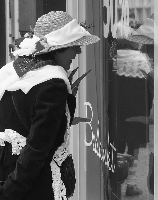
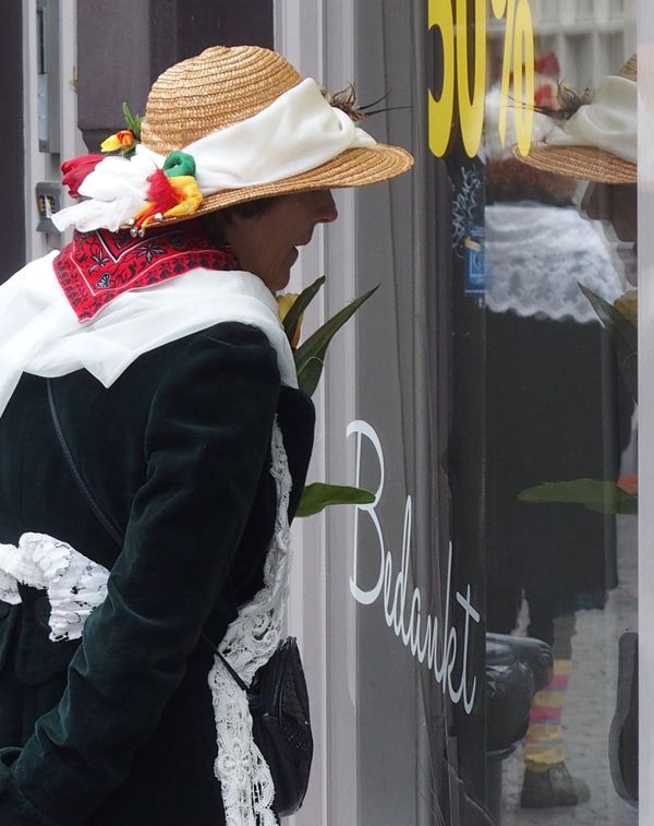
Following MikeMcK's Dumb Question on an earlier thread re B&W vs Color in street, here is a photo both in B&W and the original colour (straight out of the camera without editing). Following Apaflo's comment that colour in street is the domain of masters and before anyone thinks I have ideas above myself, I am no more than a novice, however I think this one works better in colour. What do you think?
Aug 17, 2017 12:20:14 #

Aug 17, 2017 12:26:46 #
Aug 17, 2017 12:31:50 #
Sometimes it's a tough call, and this is one of them. But I'll go with you two and say, "color."
Aug 17, 2017 12:35:25 #
SATS
Loc: Belgium
Voss wrote:
Sometimes it's a tough call, and this is one of them. But I'll go with you two and say, "color."
Thanks for looking in and giving an opinion.
Aug 17, 2017 12:50:34 #

Withe the b&w, I am forced to see the scene; with color, I see the colors first. I'm voting for the b&w.
Aug 17, 2017 13:03:23 #

SATS wrote:
Following MikeMcK's Dumb Question on an earlier thread re B&W vs Color in street, here is a photo both in B&W and the original colour (straight out of the camera without editing). Following Apaflo's comment that colour in street is the domain of masters and before anyone thinks I have ideas above myself, I am no more than a novice, however I think this one works better in colour. What do you think?
That really is a tough call, because both versions fill the bill. However, the color is too attractive! The hat and the bandana are not the subject but they are where a viewer's eye goes first. Color is a distraction rather than a primary compositional tool to highlight the relationships between objects that are significant to Street Photography.
Less saturation might help.
Aug 17, 2017 13:52:52 #
SATS
Loc: Belgium
jaymat & Apaflo
Out of the images I have as a buffer for street photography this is the only one I had problems calling. I take the point that the object of the photograph is the relationship between the old lady and whatever is in the window. The way she is dressed adds interest but is not the main focus and the color acts as a distraction away from her gaze. Thanks for taking the time to comment, I am learning from your observations.
Btw, I do not yet have editing software, than can adjust one particular area of the photograph, eg to lighten her face, that is yet to come. At the moment all adjustments a-e global
You may have guessed I am having serious keyboard problems. Will have to buy another tomorrow. I am having to use spellcheck to add the letter between Q & S that has stopped working.
Aug 17, 2017 13:59:07 #
SATS wrote:
jaymat & Apaflo br br Out of the images I hav... (show quote)
Wow, you caught it precisely!
Aug 17, 2017 14:02:33 #
Aug 18, 2017 05:54:43 #

SATS wrote:
Following MikeMcK's Dumb Question on an earlier thread re B&W vs Color in street, here is a photo both in B&W and the original colour (straight out of the camera without editing). Following Apaflo's comment that colour in street is the domain of masters and before anyone thinks I have ideas above myself, I am no more than a novice, however I think this one works better in colour. What do you think?
Thanks for posting your two images. I much prefer the one in color, but that is just me.
Aug 18, 2017 06:48:53 #

Aug 18, 2017 09:43:58 #

jaymatt wrote:
Withe the b&w, I am forced to see the scene; with color, I see the colors first. I'm voting for the b&w.
I also prefer the B&W. Too many colors otherwise.
Aug 18, 2017 10:52:44 #
SATS
Loc: Belgium
MikeMcK wrote:
Thanks for posting your two images. I much prefer the one in color, but that is just me.
And for aaciolkowski and Rab-Eye also.
Thanks for taking part guys. Apaflo said this was likely to happen. If I stay out of it for now, that is 4 votes for color and 3 for B&W so color wins the vote by a short head up to now. The color sure has more of an immediate visual impact and is more initially satisfying. If the the photograph has a 'point' or is to demonstrate a purpose then the B&W demonstrates that more directly so it is horses for courses. With the software I have available at the moment, I could not lighten her face too much without burning something out on her shawl. I am afraid I was a bit stuck with that. The intention is to get better editing software in the near future.
On a side note, I am back in business with the keyboard. I knew if I went to the Muslim quarter of town I would pick one up right away. I have nothing against Muslims folks but it just amused me that this keyboard is, well, a bit glitzy. It has white keys as normal, the background plate is gold and it has a silver band running around the outside. It seems to be a metal construction and is a more solid job than the all plastic one I had before, so that is good.
Holland and north Belgium (they have a French layout in the south) are the only two countries that have azerty keyboards instead of the more usual qwerty set up so I have spent an hour changing the software and the keys to what my fingers are used to. Essentially, A & Q are swopped as are Z & W and M is to the right of the L. The punctuation is what my fingers are used to but none of it is what it says on the keys. Why is life like this?
Aug 18, 2017 18:51:29 #

I am usually on the B&W side for street images but in this case I have to go with the color version.
Don
Don
If you want to reply, then register here. Registration is free and your account is created instantly, so you can post right away.