Advantages of a Gradient Map layer
Jun 15, 2017 10:04:49 #
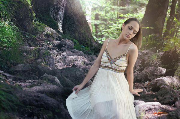
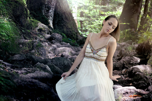
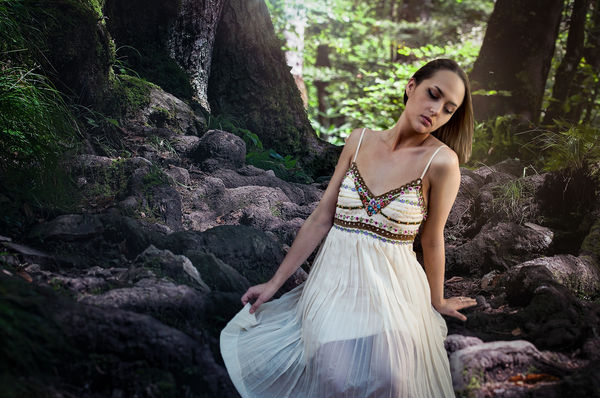
I just learned this technique today and wanted to test the advantages. The original picture was made to have a soft look to it but if I wanted to get a stronger details I could add a gradient Map. Using it you can control the highlights mid tones and darks. I have presented the before and after here. This adds just one more way to make these variations. I like this control. I learned this from this video: https://www.youtube.com/watch?v=VXyl_2U2nqI
Jun 15, 2017 10:07:28 #
Very nice work. There's a pleasing and striking difference in the photos using a gradient layer. Good job.
Jun 15, 2017 10:12:10 #
Thank you David and by the way this process does not change the color hues.
Jun 15, 2017 12:54:53 #
I don't know what you need a gradient map for. Just darken the blacks a little in Curves.
Jun 15, 2017 13:03:02 #

Jun 15, 2017 13:23:40 #
Fotoartist wrote:
I don't know what you need a gradient map for. Just darken the blacks a little in Curves.
I thought you probably were correct so I tried both, as I said many ways to do the same thing in Photoshop. I did the comparison and in my findings I found this Gradient Map process keep more detail and sharpness while holding color. When I used the curves as you suggested is looks to have a matte look and highlights somewhat lost.
Thanks for making the suggestion Fotoartist I am sure others will agree with you just my humble opinion.

Jun 15, 2017 13:43:15 #
I checked the black point from the download file. There were no pure blacks, none. Open Levels, hold the Alt. key and move the left slider till you start to see some black. Good blacks make for good colors also. My feelings are there should be some pure black in the deep shadows of most pictures otherwise there is no feeling of mystery to it either
I use gradient maps a lot too.
I use gradient maps a lot too.
Jun 16, 2017 07:17:05 #

Jim-Pops wrote:
I just learned this technique today and wanted to test the advantages. The original picture was made to have a soft look to it but if I wanted to get a stronger details I could add a gradient Map. Using it you can control the highlights mid tones and darks. I have presented the before and after here. This adds just one more way to make these variations. I like this control. I learned this from this video: https://www.youtube.com/watch?v=VXyl_2U2nqI
Thanks for sharing, that was a great lesson in gradient mapping.
Jun 16, 2017 08:31:19 #
ejrmaine wrote:
Thanks for sharing, that was a great lesson in gradient mapping.
I'm glad you got something out of it. On this example I duplicated the gradient layer because the left side was not strong enough. I only needed it above her head and to the left, I masked off all other areas, made a simple final fix.
Jun 16, 2017 08:46:41 #

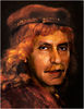
While the post is about gradient mapping, I wondered if picture had more artistic potential. Here is my take on it. The raw probably has more potential.
Jun 16, 2017 11:16:48 #
I like the deeper tones but I would lighten the shadows on the subjects face--eyes and under chin.
Jun 16, 2017 11:19:27 #
Fotoartist wrote:
I like the deeper tones but I would lighten the shadows on the subjects face--eyes and under chin.
I think a good portraitist would do a bit more than that but this was a start. I think the face is a tad too contrasty.
If you want to reply, then register here. Registration is free and your account is created instantly, so you can post right away.