Why do Hi ISO pictures lose saturation of color?
Mar 27, 2017 11:19:22 #

oldtigger wrote:
Lets rephrase the question:
If a scene is dim and you need more exposure, which will give better saturation, more ISO or slower shutter.
Or will it make any difference?
If a scene is dim and you need more exposure, which will give better saturation, more ISO or slower shutter.
Or will it make any difference?
It depends on how dim, and on the sensor.
For example with modern cameras at any ISO lower than 1600 or even higher it simply isn't going to make any difference that is visible. When the dynamic range actually gets down to perhaps 6 to 8 fstops the black point setting will begin having a significant effect, and if properly processed there won't be much change. But at ISO's higher than that a larger portion of the range is either desaturated or has enough noise to dilute high saturation.
Hence higher exposure is always preferred over higher ISO, but at low ISO's it is not a visible difference.
Probably one of the most significant advances in sensor and image processing over the last decade has been improving color purity in high ISO images.
Mar 27, 2017 11:20:32 #
Mar 27, 2017 11:24:44 #

selmslie wrote:
It has nothing to do with ISO, dynamic range or no... (show quote)
This is just an opinion, but aside from looking at extremes of saturation in color, what about the nature of severely underexposing an image, then turning up the "volume" (gain) to amplify the signal that the sensor records? I would think that as you amp up the signal you are cutting signal to noise, and ultimately the artifacts of the noise compete with the recorded signal, in effect reducing it's clarity. When an image is correctly exposed at base ISO you see 99% of the recorded image, but when you go and look at that image at high ISO, part of what you see is image, and the rest is noise, and that proportion of noise to image increases as you increase the gain.
I was just thinking about this because of the concept of ISO invariance, where the camera contributes so little noise on it's own that on some cameras you can underexpose an image by 6 stops and the image will look similar to one that has had the ISO increased by 6 stops. Just a thought.
Mar 27, 2017 11:25:26 #
selmslie wrote:
Either one will make the image brighter. Just don't blow the highlights.
You usually give good advice so perhaps you didn't understand my question:
"If a scene is dim and you need more exposure, which will give better COLOR SATURATION, more ISO or slower shutter.
Or will it make any difference?"
Mar 27, 2017 11:31:57 #
Hi, The reply is interesting from a technical point of view. But how does one reset the black point and adjust the jpeg value on a Nikon D5100?
Mar 27, 2017 11:40:13 #
Herbyderby wrote:
Hi, The reply is interesting from a technical point of view. But how does one reset the black point and adjust the jpeg value on a Nikon D5100?
That gets slightly complicated on a camera, and is very easy to do using a curves tool in an editor.
The Picture Controls available on Nikon cameras allow setting both brightness and contrast, and in that way "set" the black point. That is not easy to do before seeing the results. It is much easier to shoot in RAW mode and striving merely for the maximum exposure possible without clipping any desired highlights. Then in post processing, and this is best done with tools in the RAW converter, it is relatively easy to adjust everything to produce exactly the effect desired.
Mar 27, 2017 14:21:27 #
Apaflo wrote:
True for ISO and dynamic range, but noise definite... (show quote)
The chart is correctly labeled for the primary RGB colors. Notice that I said "Darker" and "Lighter" without reference to saturation of the darker version. As the red value in the first row drops, the red gets darker (the lower it goes the closer it gets to zero) and the redness or saturation goes away. We don't think of a red value of 7,0,0 as saturated red. It's almost too dark to make out that it actually has a color.
The theory is also correct for the complimentary CMY colors but that is where the trouble starts. Whereas the brightest yellow might appear saturated at 255,255,0 it will also appear quite light. It might appear more saturated at a darker 127,127,0 and even darker at 63,63,0 and if you continue down it will look brown before it becomes black at 0,0,0.
We think of an intermediate color like orange as a blend of red (255,0,0) and yellow (255,255,0) but you can't simply add these together. A bright saturated orange might then be 255,127,0 while a darker version might be 127,63,0.
It's even more complicated for colors like chartreuse, indigo, maroon, lavender, beige, salmon, lime, etc. How do you make these colors more saturated? All you can do is adjust their brightness until they look more saturated and that's a judgement call.
So the bottom line is that you can't really express saturation numerically. It's more of a relative term. An intense color will appear more saturated than a pastel color, particularly when they appear side-by-side. What's more, we usually see colors in an image more clearly when their brightness is close to middle gray. Above middle gray they are going to appear lighter - more white and less saturated. Below middle gray they are simply going to appear darker until they reach the point where saturation is no longer a term that can be applied.
Mar 27, 2017 15:33:46 #
Apaflo wrote:
... The third column is not as saturated as the other two, but is no lighter than the first column. ...
Of course 255,127,127 is lighter than 255,0,0! What were you thinking? And 255,191,191 is even lighter and less saturated.
Mar 27, 2017 16:21:13 #
Gene51 wrote:
This is just an opinion, but aside from looking at... (show quote)
The signal to noise ratio (S/N) is set when you take the exposure. Increasing the exposure will increase it. Adjusting only the gain does not affect it.
Changing the gain does not change the ratios among the primary colors either. Adjusting the ISO (gain) will change them proportionately without changing their ratios.
Saturation of a particular color is all about its level in relation to the other colors. When you double the ISO you also double the values in the raw file proportionately. That includes all three primary colors as well as the noise.
As a simple example, here is what might happen. Of course you are not going to get precisely these values but they will serve to address your question:
Raw value JPEG value
1. Bright red 16383,0,0 255,0,0
2. Darker red 4095,0,0 195,0,0
3. Bright orange 16383,8191,0 255,225,0
4. Darker Orange 4095,2047,0 195,165,0
If the raw file contains the values on row 2 and 4 you might get the JPEG values in column 2. If you add two stops of exposure, the S/N ratio will be 4 times greater and noise will be less visible. You will end up wih the values in row 1 and 3.
If you increase the ISO by 4x without increasing the exposure, you might end up with the raw values in rows 1 and 3 instead of the values in rows 2 and 4. The S/N ratio will not have been improved because you also amplified the noise by 4x.
But none of these adjustments will have affected the degree of saturation recorded in the raw file and later in the JPEG image.
All of this is true if your camera is ISO invariant. However, ISO invariance does not solve the noise issue. Those considerations are still in play. The reason you can get away with a great deal of under exposure with a D610, D810 or their siblings is that those cameras are also very good at keeping the base noise from becoming visible.
Mar 27, 2017 16:49:07 #
oldtigger wrote:
You usually give good advice so perhaps you didn't understand my question:
"If a scene is dim and you need more exposure, which will give better COLOR SATURATION, more ISO or slower shutter.
Or will it make any difference?"
"If a scene is dim and you need more exposure, which will give better COLOR SATURATION, more ISO or slower shutter.
Or will it make any difference?"
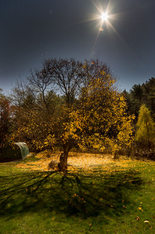
I have often shot by moonlight in autumn. Try to shoot by full moon sometime. Point the camera away from the moon and towards moon-lit trees. If you increase exposure and keep ISO to, say 800-1600, a 5-20 second shot at f4 will look like it was exposed during the day with all the color brilliance that a day-lit shot will have. Except that the sky will be quite a bit darker, with stars.
So, to answer your question, to keep color fidelity, use longer exposure times, not higher ISO. See below shot taken at ISO 800, f5.6, 10 seconds with a 14mm Rokinon lens.
W
Mar 27, 2017 17:29:04 #
Djedi wrote:
...So, to answer your question, to keep color fidelity, use longer exposure times, not higher ISO. ...
Ok, that was a dim scene: use slower shutter for color saturation.
If the scene were well or brightly lit and you wanted an open iris and good color saturation;
would it be better to speed up the shutter or lower the ISO?
Mar 27, 2017 17:33:41 #

Mar 27, 2017 17:47:21 #
oldtigger wrote:
You usually give good advice so perhaps you didn't understand my question:
"If a scene is dim and you need more exposure, which will give better COLOR SATURATION, more ISO or slower shutter.
Or will it make any difference?"
"If a scene is dim and you need more exposure, which will give better COLOR SATURATION, more ISO or slower shutter.
Or will it make any difference?"
Unfortunately, neither will actually give more saturation. The saturation comes from the scene.
But once you get the brightness levels more or less where you want them, you can make adjustments in post processing to increase or decrease the saturation. The program does this by adjusting the color and brightness values to make the scene appear to be more or less saturated.
Mar 27, 2017 17:51:47 #
selmslie wrote:
We don't think of a red value of 7,0,0 as saturated red.
FACT: By definition a red value of 7,0,0 is 100% saturated red.
You can do a Google search for "hsv rgb calculator" to find any number of conversion calculators, and every single one of them will show that as 100% saturated red.
selmslie wrote:
The theory is also correct for the complimentary CMY colors but that is where the trouble starts. Whereas the brightest yellow might appear saturated at 255,255,0 it will also appear quite light. It might appear more saturated at a darker 127,127,0 and even darker at 63,63,0 and if you continue down it will look brown before it becomes black at 0,0,0.
But your self defined "might appear" has nothing to do with what the colors actually are! 255,255,0 and 127,127,0 and 63,63,0 are all exactly the same saturation. Any calculator will show all three as 100% saturated yellow.
selmslie wrote:
We think of an intermediate color like orange as a blend of red (255,0,0) and yellow (255,255,0) but you can't simply add these together. A bright saturated orange might then be 255,127,0 while a darker version might be 127,63,0.
But of course 255,127,0 has exactly the same saturation as 127,63,0, both of which are 100% saturated.
selmslie wrote:
It's even more complicated for colors like chartreuse, indigo, maroon, lavender, beige, salmon, lime, etc. How do you make these colors more saturated? All you can do is adjust their brightness until they look more saturated and that's a judgement call.
It is no more complicated with these colors than with others. Take for example a salmon color. A search of the Internet shows that an RGB value commonly accepted as salmon color is about 242,90,102. It happens that is 63% saturated. If adjusted to have 10% saturation the RGB value is 242,218,220 and at 90% saturation the RGB value is 242,24,41.
selmslie wrote:
So the bottom line is that you can't really expres... (show quote)
You need to learn what saturation actually is. That paragraph is not even close to correct in any way.
selmslie wrote:
Of course 255,127,127 is lighter than 255,0,0! What were you thinking? And 255,191,191 is even lighter and less saturated.
The HSV value for 255,127,127 is 0,50,100 (50% saturated and a brightness of 100%). The HSV value for 255,0,0 is 0,100,100 (100% saturated and a brightness of 100%). Again you simply are not aware of how either saturation or brightness is actually defined, nor of how to calculate it.
Then in another article you gave this chart, which is way off the mark:
" Raw value JPEG value
1. Bright red 16383,0,0 255,0,0
2. Darker red 4095,0,0 195,0,0
3. Bright orange 16383,8191,0 255,225,0 ...
Raw values are linear (correct above), JPEG values gamma corrected (incorrect above).
Mar 27, 2017 18:06:12 #
selmslie wrote:
... But none of these adjustments will have affected the degree of saturation recorded in the raw file and later in the JPEG image.
Not really true. You are apparently assuming that "noise" is some fixed constant, but it isn't. It is random in location and in value. Hence with lower SNR a high ISO shot is increasingly affected in terms of color dilution from noise. At any relatively low ISO up to some sensor dependent high ISO there is no visible difference because noise that is 6 dB or more lower than the instantaneous signal levels does not affect those levels visually. However the noise figures we see are mean averages, and the actual peak values are probably more than 12 dB higher. If the ISO is high enough that the total dynamic range is only 12 dB, then literally the entire tonal range might well have visible noise that is reducing saturation of colors.
If you want to reply, then register here. Registration is free and your account is created instantly, so you can post right away.